The scatterplot titled “2018 AL WAR vs OPS (Colored by Position)” visually explores the relationship between Wins Above Replacement (WAR) and On-base Plus Slugging (OPS) for players in the American League during the 2018 season. Each point on the plot represents a player, with OPS on the x-axis and WAR on the y-axis, and the points are colored according to the player’s position. This allows us to observe how players across different positions performed in terms of their offensive output and overall contribution to their teams.
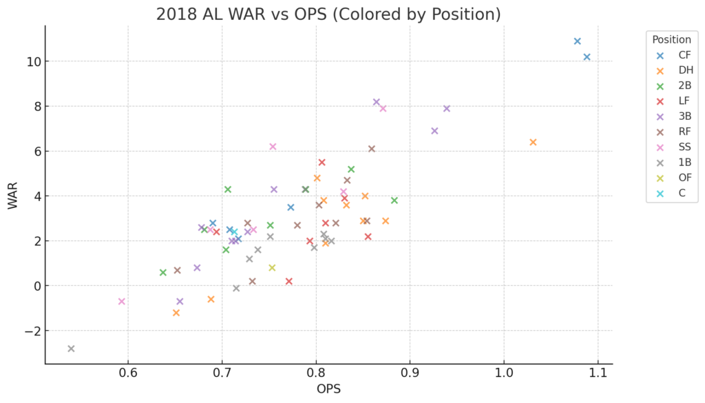
Notably, the plot highlights standout players such as Mookie Betts and Mike Trout, who are positioned in the upper right corner, indicating their exceptional performance. Betts, then an outfielder for the Boston Red Sox, and Trout, still a center fielder for the Los Angeles Angels, both had extremely high OPS and WAR values. Their positions in the plot underscore their status as two of the most valuable players in the league during the 2018 season.
In contrast, Chris Davis, a first baseman for the Baltimore Orioles, is positioned in the lower-left corner of the plot. Davis had one of the lowest OPS and WAR values in 2018, indicating his struggles. The spread of points across the plot also reveals how different positions cluster in certain areas, with players like Davis standing out as outliers in underperformance. At the same time, Betts and Trout exemplify top-tier performance. This is a pretty cool visualization of this type of data. I find scatterplots useful.
![]()