Season-Level Validation: Do Third-Base Offensive Z-Scores Predict wRC+?
Introduction
The first wRC+ validation study used a career-level FanGraphs export.
That study was useful. It showed that, among regular third basemen, average Model C offensive score per qualified season strongly predicted career wRC+. It also showed that traditional defense did not predict wRC+, which was exactly what we wanted from a negative-control test.
But the career-level study had one limitation.
wRC+ is fundamentally a season-level offensive rate statistic. Our offensive z-score system is also built season by season. So the cleanest validation test is not career score against career wRC+.
The cleanest test is:
Does a third baseman’s season-level offensive z-score predict his season-level wRC+?
This chapter answers that question.
The answer is yes.
Using the season-level FanGraphs export, the Model C offensive season score explains about 69 percent of the variation in season wRC+ among qualified third-base seasons.
R^2 = 0.692The fitted model is:
wRC^+ = 101.47 + 5.86(\text{Model C Offensive Season Score})That is a strong result.
Just as important, the traditional defensive score does not predict wRC+:
R^2 = 0.002This is exactly the pattern the project needed.
Offensive z-scores predict offense.
Traditional defensive z-scores do not.
That means the Model C offensive score is not merely identifying generally good players. It is measuring offensive quality.
Data Used in the Season-Level Study
The FanGraphs season-level export included:
9,152 player-season rows through 2025
Season
Name
Team
PA
wRC+
PlayerId
MLBAMID
The broader third-base season dataset included:
3,188 qualified third-base seasons
Season range: 1880–2025
The merge was very strong:
Matched seasons: 3,163
Unmatched seasons: 25
Match rate: 99.2%
The remaining unmatched seasons were mostly older Negro Leagues or historical ID cases. The modern and post-integration major-league seasons matched very well.
This makes the season-level validation much cleaner than the first career-level wRC+ test.
Why Season-Level Validation Matters
The career-level wRC+ test asked whether accumulated third-base offensive separation was related to career offensive quality.
The season-level test is more direct.
It asks:
In a given season, does the offensive z-score model identify the same kind of offensive performance that wRC+ identifies?
This is a better test because both measures are season-specific.
The z-score model compares a third baseman to other third basemen in the same season. wRC+ compares a hitter’s offensive production to the league and park context of that season.
They are not the same statistic.
But they should be related.
If Model C is measuring offensive quality, high Model C scores should correspond to high wRC+ values.
That is what the data show.
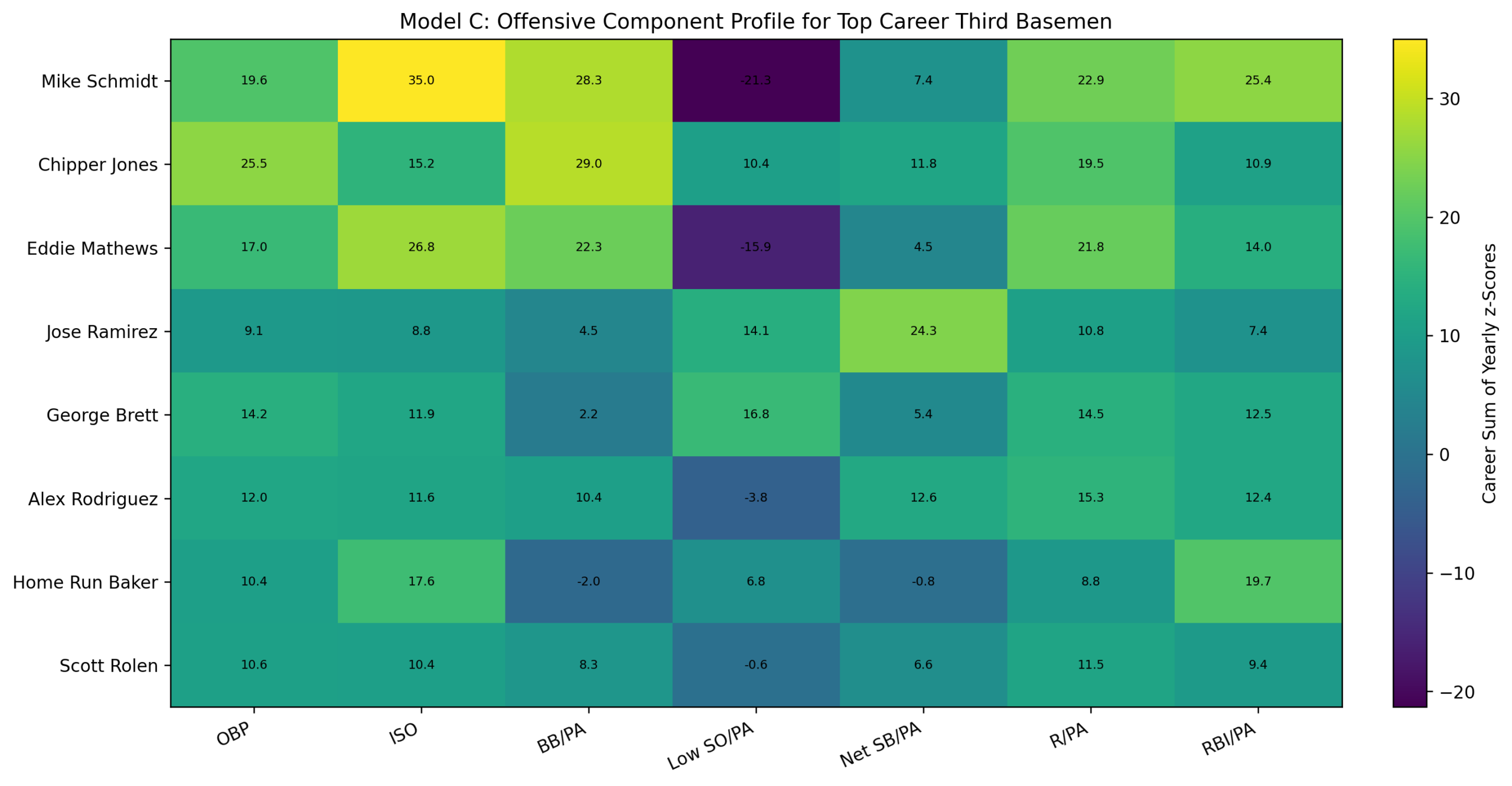
The Model C Offensive Score
The Model C offensive score uses seven components:
OBP
ISO
BB/PA
SO/PA, inverted
Net SB/PA
R/PA
RBI/PA
Each component is converted into a same-position, same-season z-score.
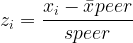
The basic z-score formula is:
z = \frac{x - \mu}{\sigma}Where:
x = \text{the player's value} \mu = \text{the same-position, same-season peer-group mean} \sigma = \text{the same-position, same-season peer-group standard deviation}This is the central idea of the study.
Raw numbers ask how large a number is. Z-scores ask how far a player separated from his peer group.
Offensive Component Equations
On-base percentage is:
OBP = \frac{H + BB + HBP}{AB + BB + HBP + SF}Slugging percentage is:
SLG = \frac{TB}{AB}Isolated power is:
ISO = SLG - AVGWalk rate is:
BB/PA = \frac{BB}{PA}Strikeout rate is:
SO/PA = \frac{SO}{PA}Net stolen bases are:
NetSB = SB - CSNet stolen-base rate is:
NetSB/PA = \frac{SB - CS}{PA}Run rate is:
R/PA = \frac{R}{PA}RBI rate is:
RBI/PA = \frac{RBI}{PA}The strikeout component is inverted because lower strikeout rates are better:
z_{\text{Low SO/PA}} = -\left( \frac{ (SO/PA)_i - \overline{(SO/PA)}_{\text{peer}} }{ s_{SO/PA,\text{peer}} } \right)The full Model C offensive season score is:
\begin{aligned} \text{Season Score} &= z_{\text{OBP}} + z_{\text{ISO}} + z_{\text{BB/PA}} + z_{\text{Low SO/PA}} \\ &\quad + z_{\text{NetSB/PA}} + z_{\text{R/PA}} + z_{\text{RBI/PA}} \end{aligned}This score measures offensive separation from same-season third-base peers.
Regression Framework
The main validation model is:
wRC^+_s = \alpha + \beta_1(\text{Model C Offensive Season Score}_s) + \varepsilon_sWhere:
wRC^+_s = \text{FanGraphs wRC+ for season } s \alpha = \text{intercept} \beta_1 = \text{slope for the offensive z-score} \varepsilon_s = \text{residual error}The coefficient of determination is:
R^2 = 1 - \frac{ \sum_s \left( wRC^+_s - \widehat{wRC^+}_s \right)^2 }{ \sum_s \left( wRC^+_s - \overline{wRC^+} \right)^2 }A higher value of R^2 means the model explains more of the variation in wRC+.
Main Season-Level Result
The fitted offense-only model is:
wRC^+ = 101.47 + 5.86(\text{Model C Offensive Season Score})The result is:
R^2 = 0.692This means the Model C offensive season score explains about 69.2 percent of the variation in season-level wRC+ among matched qualified third-base seasons.
That is a strong validation result.
The slope is also meaningful:
\beta_1 = 5.86Each additional point of Model C offensive season score corresponds to about 5.86 additional points of wRC+.
For example, a player with an offensive score of 0 projects as:
wRC^+ = 101.47 + 5.86(0) wRC^+ = 101.47A player with an offensive score of 5 projects as:
wRC^+ = 101.47 + 5.86(5) wRC^+ = 130.77A player with an offensive score of 10 projects as:
wRC^+ = 101.47 + 5.86(10) wRC^+ = 160.11This is exactly the pattern expected if Model C is capturing offensive dominance.
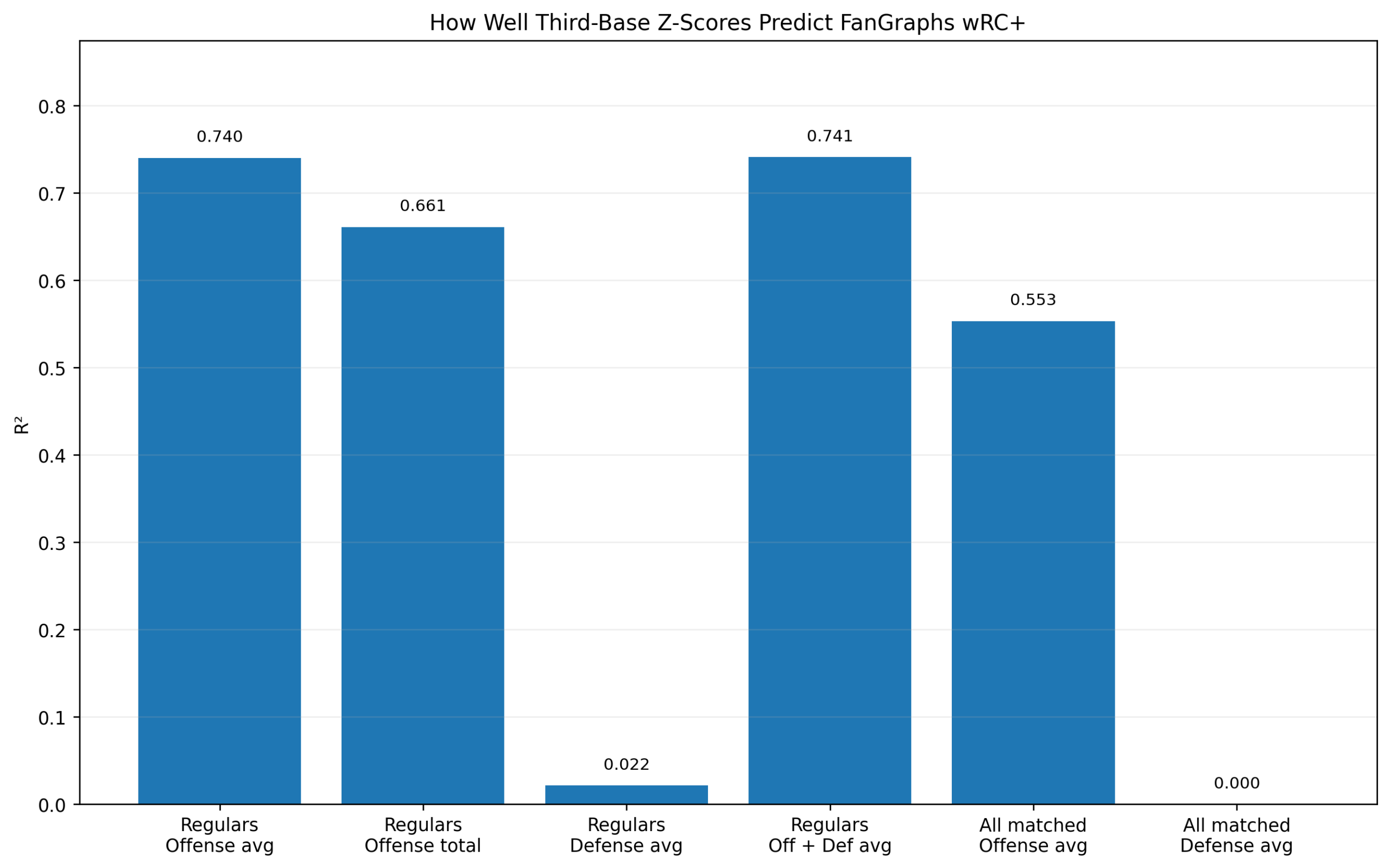
Figure 1: Model Comparison
Figure 1. How well season-level third-base metrics predict wRC+.
The first figure compares several models.
The offensive z-score model performs well:
R^2_{\text{Offensive z-score}} = 0.692The traditional defensive score performs almost not at all:
R^2_{\text{Traditional Defense}} = 0.002Adding traditional defense to offense does not meaningfully improve the result:
R^2_{\text{Offense + Defense}} = 0.692Adding plate appearances produces only a tiny improvement:
R^2_{\text{Offense + PA}} = 0.695The WAR_off benchmark is higher:
R^2_{\mathrm{WAR}_{\mathrm{off}}} = 0.846That is expected. WAR_off is already a sophisticated offensive value measure. It is included only as a benchmark, not as a competing z-score model.
The important comparison is offense versus defense.
The offensive z-score score predicts wRC+ strongly. The defensive score does not.
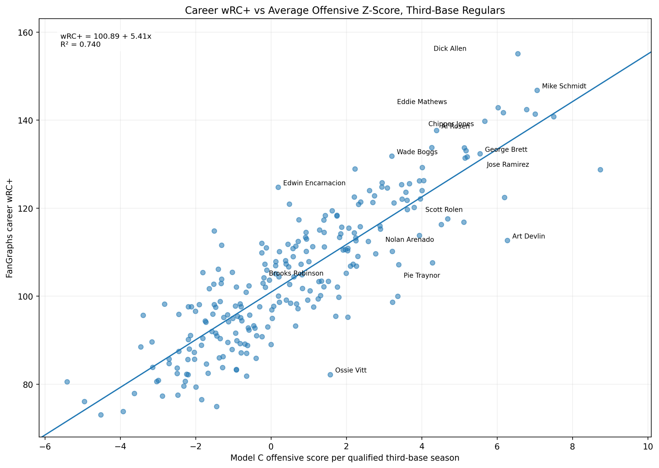
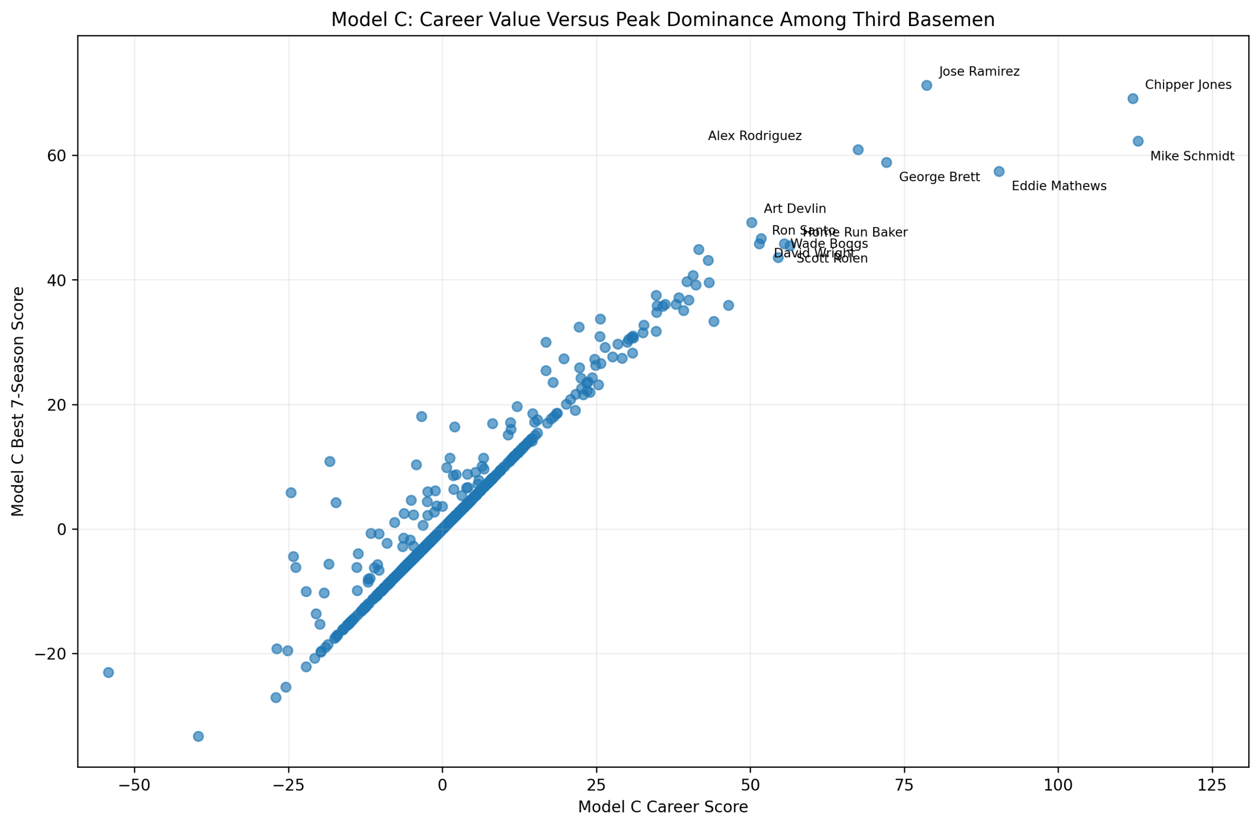
Figure 2: Offensive Z-Score Versus wRC+
Figure 2. Season wRC+ versus Model C offensive season score among third basemen.
This figure shows the main relationship directly.
The x-axis is:
\text{Model C Offensive Season Score}The y-axis is:
wRC^+The fitted line is:
wRC^+ = 101.47 + 5.86x R^2 = 0.692The pattern is clear.
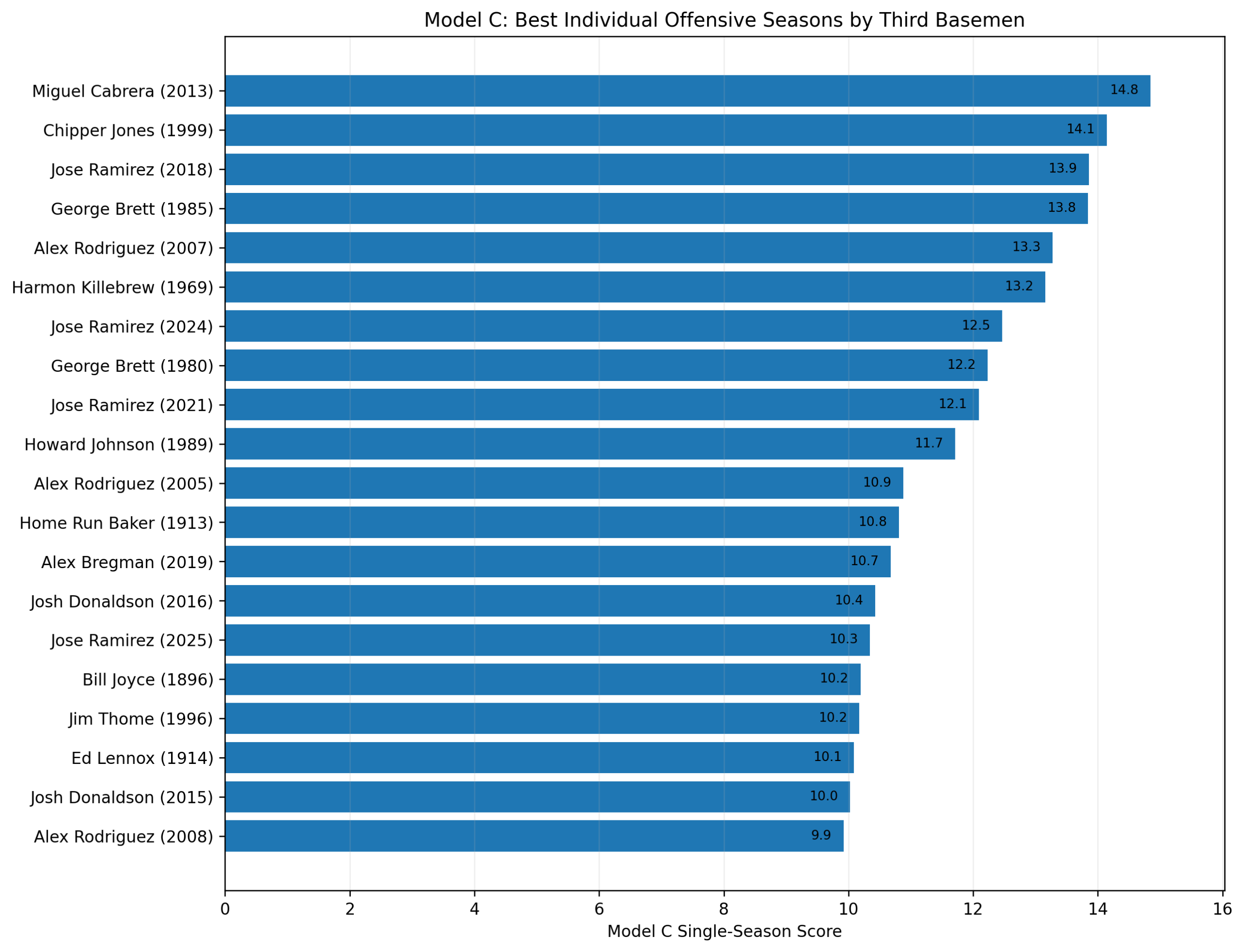
High offensive z-score seasons generally produce high wRC+ seasons. Miguel Cabrera’s 2013 season, Chipper Jones’s 1999 season, Mike Schmidt’s 1980 and 1981 seasons, George Brett’s 1985 season, and Alex Rodriguez’s 2007 season all sit in the upper-right region.
That is exactly where they should be.
The plot also shows interesting residual cases. Some seasons have high wRC+ relative to their Model C score. Others have lower wRC+ than the z-score model predicts.
Those differences are not necessarily errors. They show that Model C and wRC+ measure offense from different angles.
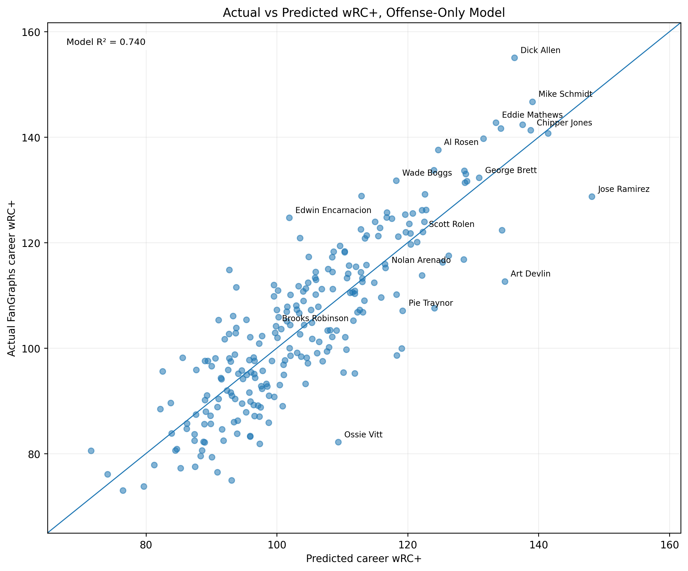
Figure 3: Actual Versus Predicted wRC+
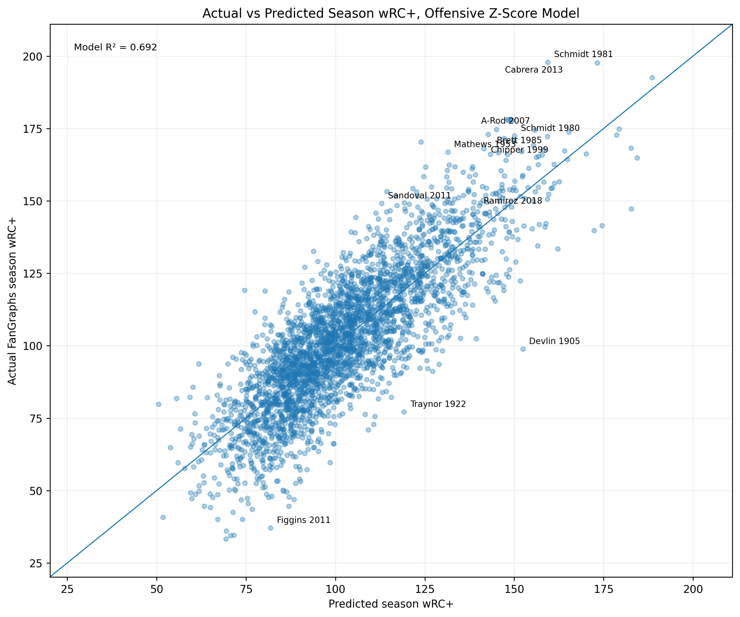
Figure 3. Actual versus predicted season wRC+ using the offensive z-score model.
The prediction equation is:
\widehat{wRC^+}_s = 101.47 + 5.86(\text{Model C Offensive Season Score}_s)The residual is:
\text{Residual}_s = wRC^+_s - \widehat{wRC^+}_sPlayers near the diagonal are well predicted. Players above the diagonal have higher wRC+ than the z-score model predicts. Players below the diagonal have lower wRC+ than the z-score model predicts.
The figure shows that most seasons fall around the diagonal, which is why the model produces a strong R^2.
It also shows the value of residual analysis. The most interesting seasons are often the ones that do not land exactly where the model expects.
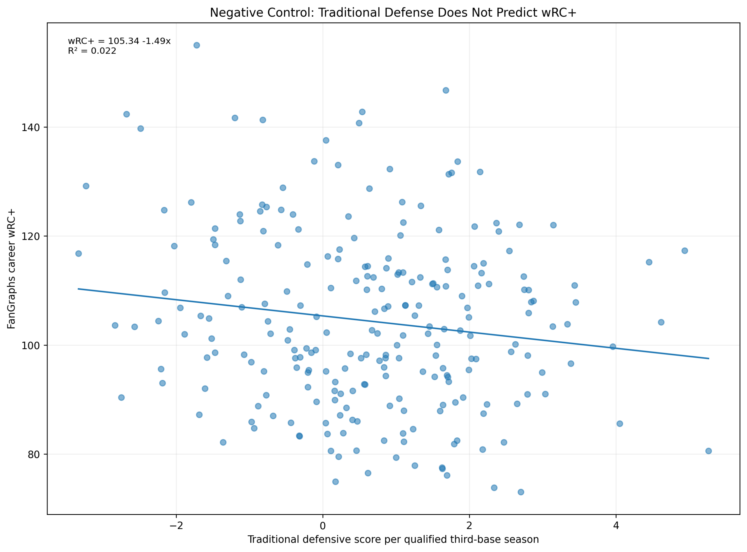
Figure 4: The Defensive Negative Control
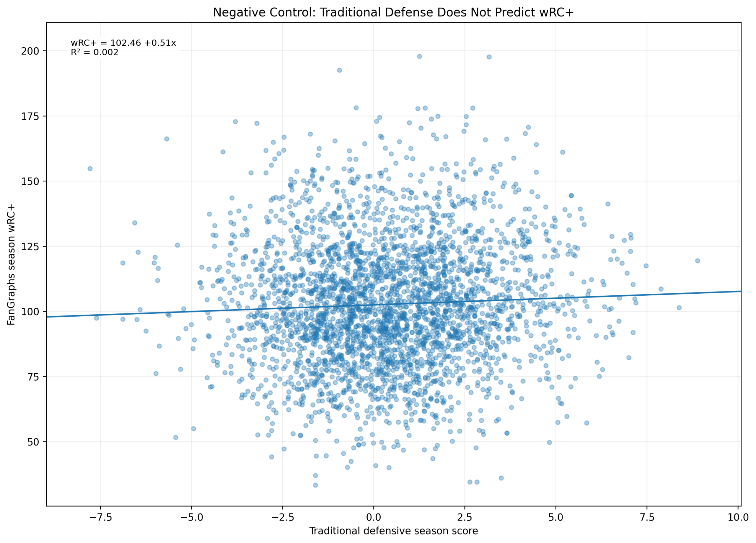
Figure 4. Traditional defensive score does not predict season wRC+.
The negative-control model is:
wRC^+ = \alpha + \beta_1(\text{Traditional Defensive Season Score}) + \varepsilonThe fitted result is:
wRC^+ = 102.46 + 0.51(\text{Traditional Defensive Season Score}) R^2 = 0.002This is one of the most important results in the chapter.
The traditional defensive score explains almost none of the variation in wRC+.
That is exactly what should happen.
wRC+ is an offensive metric. A traditional defensive score should not meaningfully predict it. The fact that it does not strengthens the validation.
It shows that the Model C offensive score is measuring offense specifically, not simply general player quality.
Figure 5: Residuals
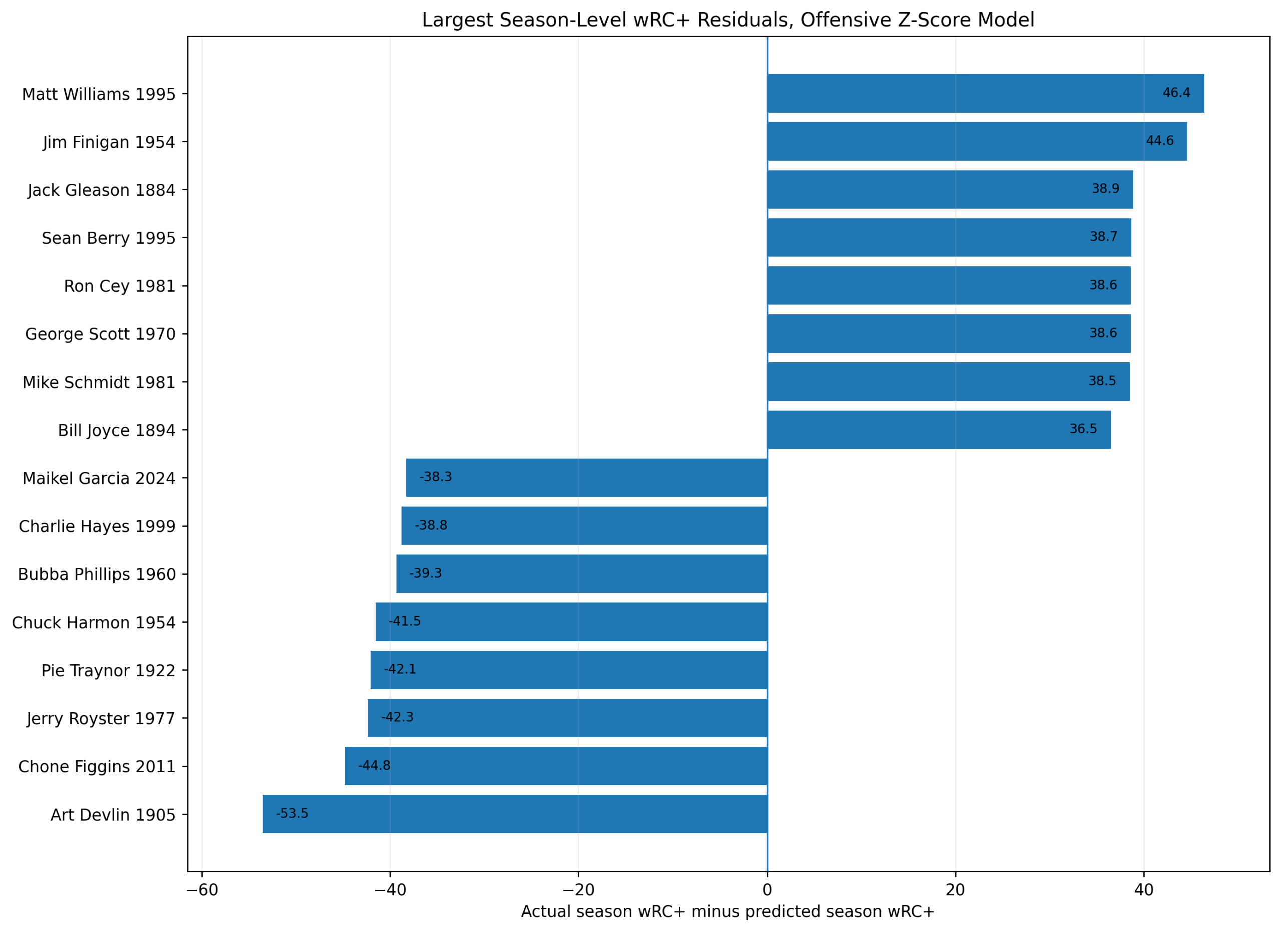
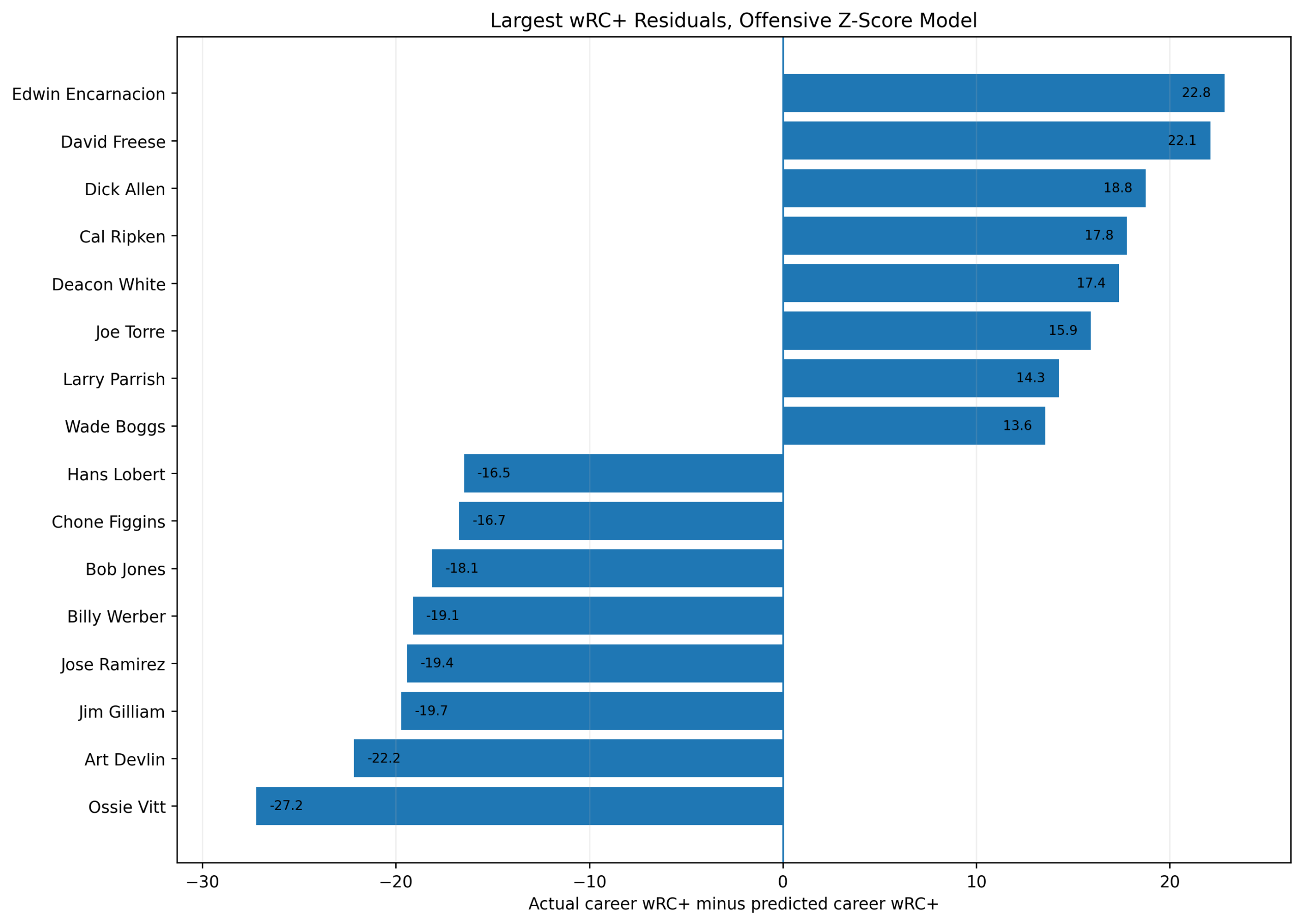
Figure 5. Largest season-level wRC+ residuals from the offensive z-score model.
The residual equation is:
\text{Residual}_s = wRC^+_s - \widehat{wRC^+}_sPositive residuals mean the season had a higher wRC+ than predicted by the z-score model.
Negative residuals mean the season had a lower wRC+ than predicted.
The largest positive residuals include:
Matt Williams 1995
Jim Finigan 1954
Jack Gleason 1884
Sean Berry 1995
Ron Cey 1981
George Scott 1970
Mike Schmidt 1981
Bill Joyce 1894
The largest negative residuals include:
Art Devlin 1905
Chone Figgins 2011
Jerry Royster 1977
Pie Traynor 1922
Chuck Harmon 1954
Bubba Phillips 1960
Charlie Hayes 1999
Maikel Garcia 2024
These residuals are worth studying because they show where the z-score model and wRC+ disagree most.
Interpreting Positive Residuals
A positive residual means wRC+ sees more offensive value than the z-score model predicts.
There are several possible reasons.
First, wRC+ is built from run values and is park- and league-adjusted. Model C is built from peer separation in selected categories. The two systems overlap strongly, but they are not identical.
Second, Model C includes runs and RBI rates. Those are useful for describing offensive dominance, but they can also be influenced by lineup context. wRC+ is more directly centered on offensive production independent of team context.
Third, partial seasons can create interesting differences. Matt Williams 1995, for example, had a very high wRC+ in fewer plate appearances than a full season. The z-score model includes playing-time weighting, so a shorter season can be pulled downward relative to a rate statistic.
That does not mean either measure is wrong.
It means they are answering slightly different questions.
Model C asks:
How much offensive separation did this third baseman produce in this season?
wRC+ asks:
How strong was this hitter's offensive production after league and park adjustment?
Those are related questions, not identical questions.
Interpreting Negative Residuals
A negative residual means the z-score model predicted a higher wRC+ than the player actually had.
This can happen when a player scores well in the Model C components but not as well in wRC+.
For example, a player may separate from third-base peers in runs, RBI, baserunning, or contact profile without producing the same level of park- and league-adjusted offensive value.
Art Devlin 1905 is the largest negative residual in this run. Pie Traynor 1922, Ossie Vitt 1915, and several other early-era or context-sensitive seasons also appear in the negative tail.
This is not surprising.
The farther back the data go, the more differences we expect between a transparent peer-z-score model and a modern run-value metric such as wRC+.
The residuals are not a failure of the model. They are a useful diagnostic tool.
Why This Season-Level Result Matters
This season-level validation is probably the cleanest offensive test in the project.
The WAR validation showed that the combined offense-defense model predicts total value.
The career wRC+ validation showed that average offensive z-score predicts career offensive quality.
But this season-level wRC+ validation is even more direct.
It compares:
\text{Season Offensive Z-Score}to:
\text{Season } wRC^+The result is strong:
R^2 = 0.692That means Model C captures a substantial share of the same offensive signal captured by wRC+.
The defensive negative control confirms the interpretation:
R^2_{\text{Defense Only}} = 0.002That is almost zero.
Offensive z-scores predict offense. Traditional defensive z-scores do not.
That is exactly the validation pattern we wanted.
How This Fits With the Earlier Validation Studies
The validation sequence now has three layers.
First, the WAR study showed that offense and traditional defense together predict total value:
R^2_{\text{Career WAR, Offense + Defense}} = 0.814Second, the career-level wRC+ study showed that average offensive z-score predicts career offensive quality:
R^2_{\text{Career wRC+}} = 0.740Third, this chapter shows that season-level offensive z-score predicts season-level wRC+:
R^2_{\text{Season wRC+}} = 0.692Together, these results give the project a strong methodological foundation.
The z-score model is not WAR.
It is not wRC+.
It is a simpler and more transparent peer-separation model.
But it clearly captures real value-related information.
Limitations
This chapter should still be read carefully.
The FanGraphs season-level file matched almost all qualified third-base seasons, but not every season. The unmatched cases were mostly older Negro Leagues or historical ID records.
The Model C offensive score is not park-adjusted in the same way as wRC+. It is same-position and same-season adjusted through z-scores, but that is not identical to league and park adjustment.
Model C also includes runs and RBI rates, which are not purely individual batter skill measures. They can reflect lineup and team context.
Finally, wRC+ is itself a model. It is extremely useful, but it is not a perfect measure of all offensive contribution. It does not treat baserunning the same way Model C does, and it does not ask the same positional-peer question.
So the correct conclusion is not:
Model C is the same as wRC+.
The correct conclusion is:
Model C strongly predicts wRC+, while preserving a different interpretive question.
That is exactly what we want from a validation study.
Conclusion
The season-level wRC+ validation gives the clearest offensive support for the third-base z-score project.
The main model is:
wRC^+ = 101.47 + 5.86(\text{Model C Offensive Season Score})The result is:
R^2 = 0.692That means the offensive z-score model explains about 69 percent of the variation in FanGraphs season-level wRC+ among matched qualified third-base seasons.
The traditional defensive score explains almost none:
R^2 = 0.002That negative-control result is crucial.
The offensive model predicts offense.
The defensive model does not.
The broader implication is clear.
The z-score system is not just an internal ranking device. It aligns strongly with established external value metrics.
WAR validates the two-dimensional model.
wRC+ validates the offensive model.
And the season-level wRC+ study confirms that Model C captures a real offensive signal year by year.
![]()