Shortstop is not supposed to be an offense-first position. Historically, it has been a place for range, hands, arm strength, instincts, and defensive reliability. The shortstop controls the infield geometry. He touches double plays, cutoff decisions, relay throws, and the ordinary little moments that keep an inning from becoming something worse.
That makes offensive dominance at shortstop unusually interesting.
A great-hitting first baseman or right fielder may be doing what the position expects. A great-hitting shortstop is doing something different. He is shifting from a defensive to an offensive stance.
This study asks a narrow question: Who was the most dominant offensive shortstop relative to other shortstops of his own time?
Not the greatest all-around shortstop. Not the best defensive shortstop. Not the best postseason shortstop.
The best offensive shortstop.
Methodology
Using the Lahman Database, I identified shortstop seasons through Appearances.csv. A player-season qualified if the player had:
At least 50 games at shortstop
At least 300 plate appearances
For each qualified shortstop season, I calculated six offensive measures:
OBP
SLG
HR per PA
BB per PA
Runs per PA
RBI per PA
Each category was converted into a z-score within that season’s shortstop peer group. The season score was the sum of those six z-scores.
Season Score =
OBP z + SLG z + HR/PA z + BB/PA z + R/PA z + RBI/PA z
Partial seasons were weighted by playing time, with full credit beginning at 600 plate appearances.
The idea is simple. A shortstop in 1908 is compared to other shortstops in 1908. A shortstop in 2002 is compared to other shortstops in 2002. A shortstop in 2025 is compared to other shortstops in 2025.
The model is measuring distance from positional normalcy.
Figure 1: Career Offensive Dominance
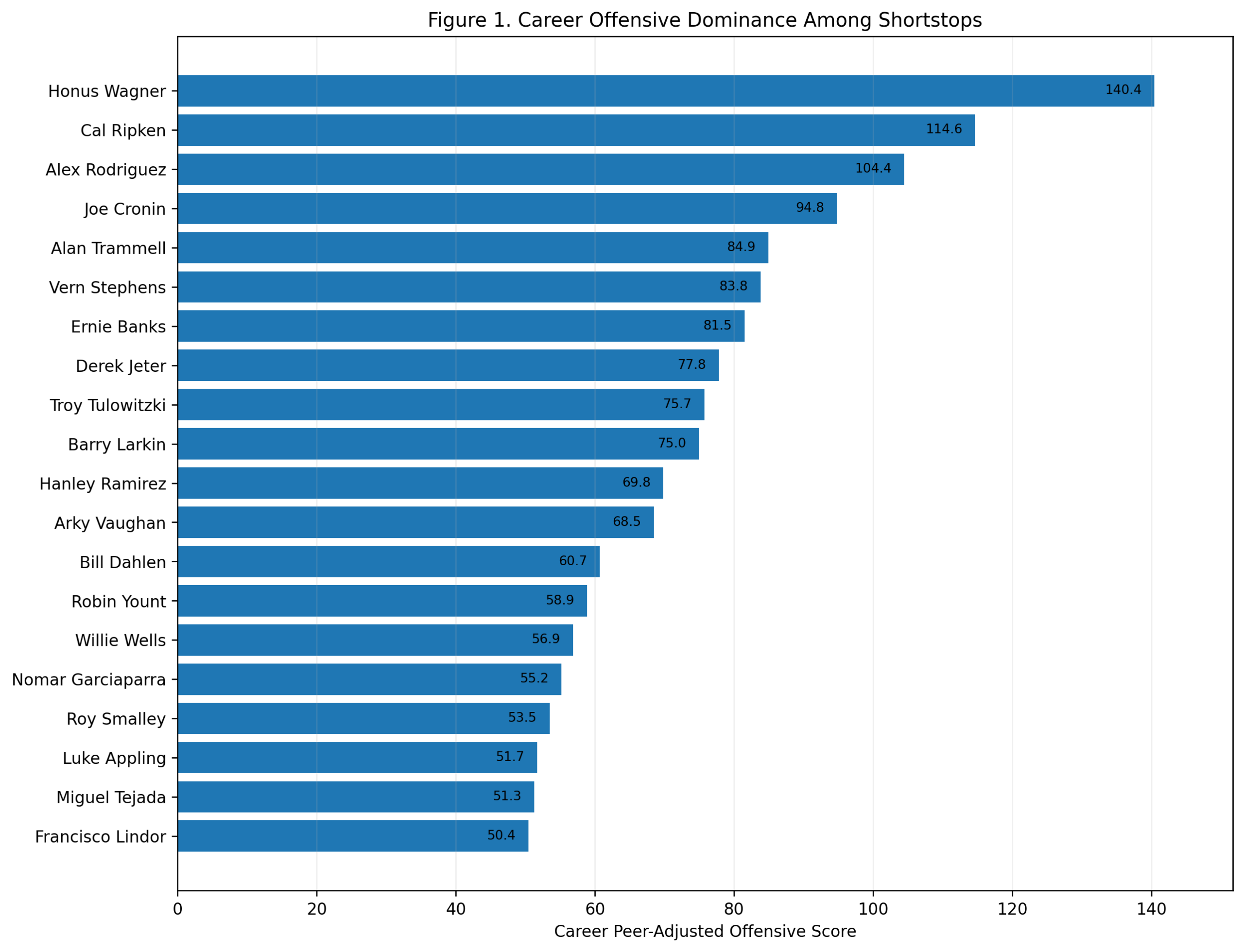 The career ranking begins with Honus Wagner.
Wagner finishes first with a career peer-adjusted offensive score of 140.4. Cal Ripken is second at 114.6, and Alex Rodriguez is third at 104.4. Joe Cronin follows at 94.8, then Alan Trammell, Vern Stephens, Ernie Banks, Derek Jeter, Troy Tulowitzki, and Barry Larkin.
This is a strong result. Wagner does not merely survive the era adjustment. He benefits from the right kind of comparison. He was not simply a great hitter in old raw numbers. He was far above what shortstops around him were doing offensively.
The top three also clarify the larger shape of the study. Wagner owns the long historical career argument. Ripken grades extremely well because of sustained shortstop offense across a long run. Rodriguez has fewer qualifying shortstop seasons, but his scoring rate is enormous.
The first major conclusion is: Honus Wagner has the strongest career offensive profile among shortstops in this model.
Figure 2: Best Seven-Season Peaks
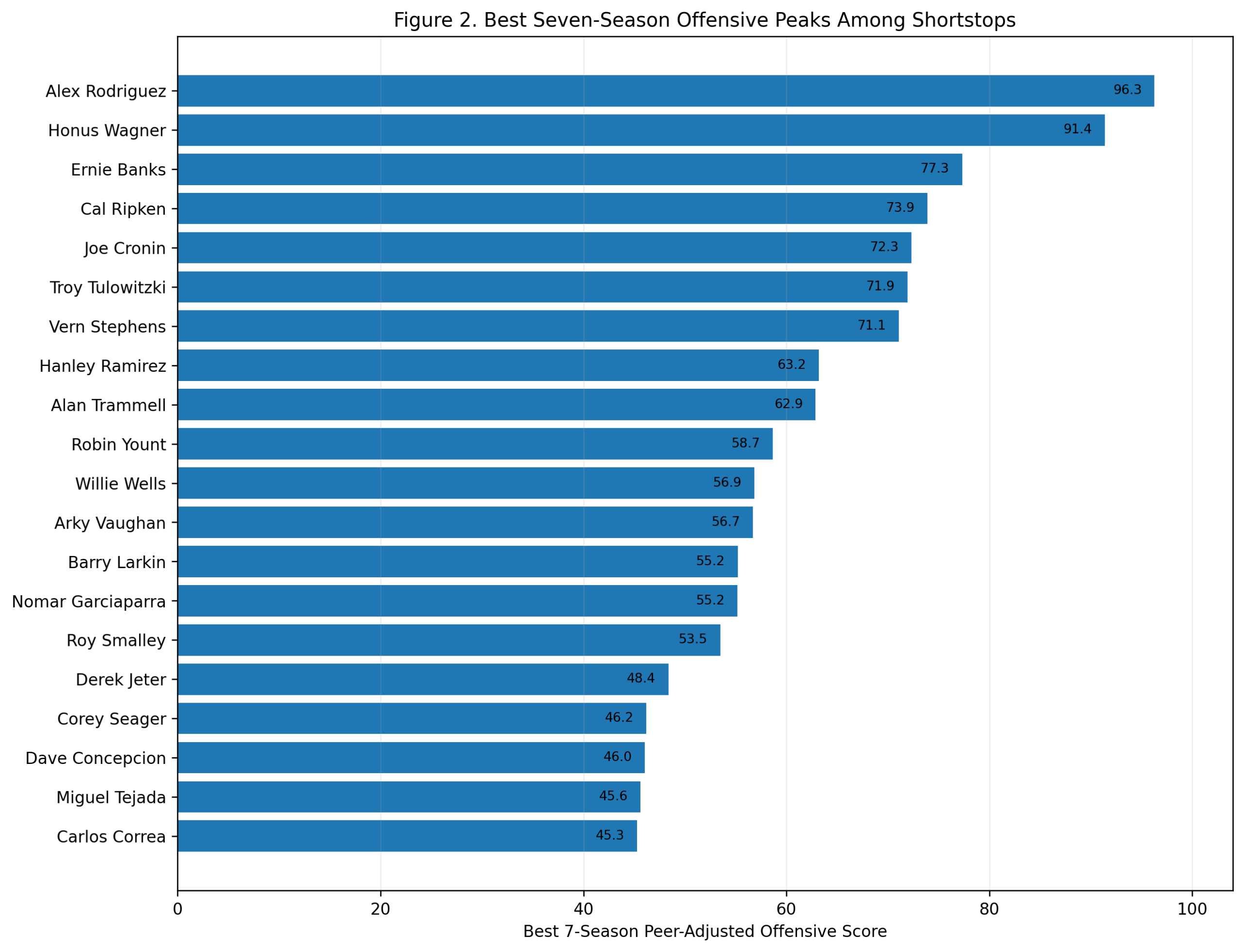
The peak ranking changes the order.
Alex Rodriguez finishes first with a seven-season peak score of 96.3. Wagner is second at 91.4. Ernie Banks is third at 77.3, followed by Cal Ripken, Joe Cronin, Troy Tulowitzki, Vern Stephens, Hanley Ramirez, Alan Trammell, and Robin Yount.
This is the A-Rod argument.
His career as a shortstop was not as long as Wagner’s, Ripken’s, Jeter’s, or Larkin’s. But while he was a shortstop, his offensive dominance was extraordinary. From 1996 through 2003, Rodriguez produced a level of shortstop offense that had almost no modern precedent.
The model captures that clearly. He does not win the career score, but he wins the peak score.
That gives us the central tension of the post:
Career offensive shortstop: Honus Wagner
Peak offensive shortstop: Alex Rodriguez
Both statements are as interesting as they are true.
Figure 3: Career Value Versus Peak Dominance
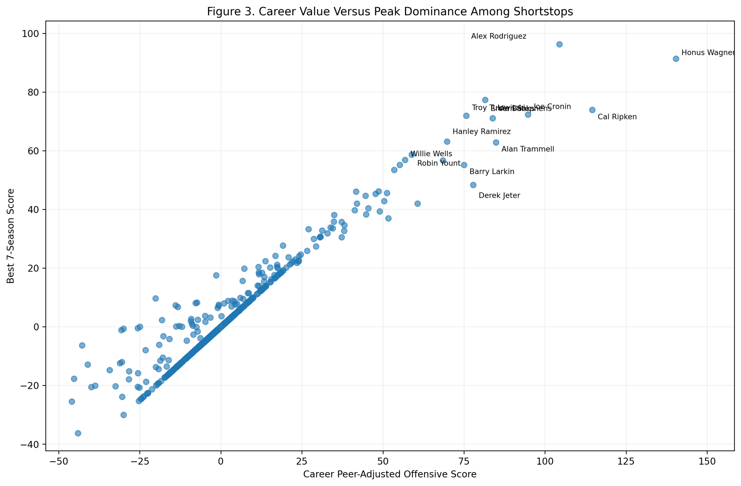
The career-versus-peak scatterplot visually illustrates the debate.
Wagner is far to the right, with a high peak and the strongest career score. Rodriguez sits higher on the peak axis, but with a shorter career total. Ripken occupies a different kind of space: strong peak, very strong career, but not the extreme top in either dimension. Joe Cronin, Ernie Banks, Vern Stephens, Troy Tulowitzki, Alan Trammell, Hanley Ramirez, Barry Larkin, and Derek Jeter fill out the high-value region.
This figure is useful because it prevents a simplistic answer.
If we only care about peak, Rodriguez wins. If we only care about career accumulation while qualifying as a shortstop, Wagner wins. If we combine the two, Wagner still comes out first, but Rodriguez moves very close.
Ripken’s result is also important. He is not usually framed as the greatest offensive shortstop ever, but in this model, his sustained value is outstanding. He was not merely durable. He was offensively valuable for a long time at a demanding position.
Figure 4: Best Individual Offensive Seasons
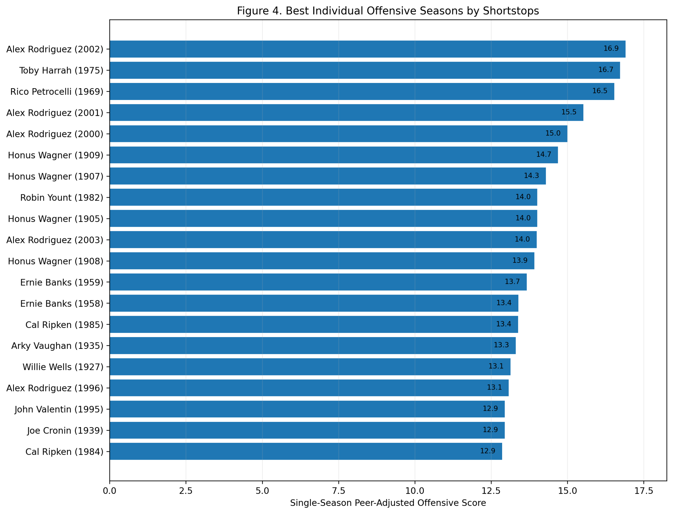
Alex Rodriguez leads the best individual seasons.
His 2002 season scores 16.9, the highest shortstop season in the study. He also appears with 2001, 2000, 2003, and 1996. That cluster tells the story. Rodriguez’s shortstop peak was not a single outlier. It was a sustained run of elite offensive separation.
There are also some fascinating names near the top. Toby Harrah’s 1975 season ranks second. Rico Petrocelli’s 1969 season ranks third. Wagner appears repeatedly with 1909, 1907, 1905, and 1908. Robin Yount’s 1982 season, Ernie Banks’s 1958 and 1959 seasons, Cal Ripken’s 1985 season, and Arky Vaughan’s 1935 season also appear.
This figure adds texture to the study. The greatest offensive shortstop seasons are not all from the same type of player. There are power seasons, OBP seasons, dead-ball separation seasons, and modern slugging seasons.
But the single-season headline is clear: Alex Rodriguez has the highest offensive season among shortstops in the model.
Figure 5: Wagner Versus the Best Non-Wagner Shortstop
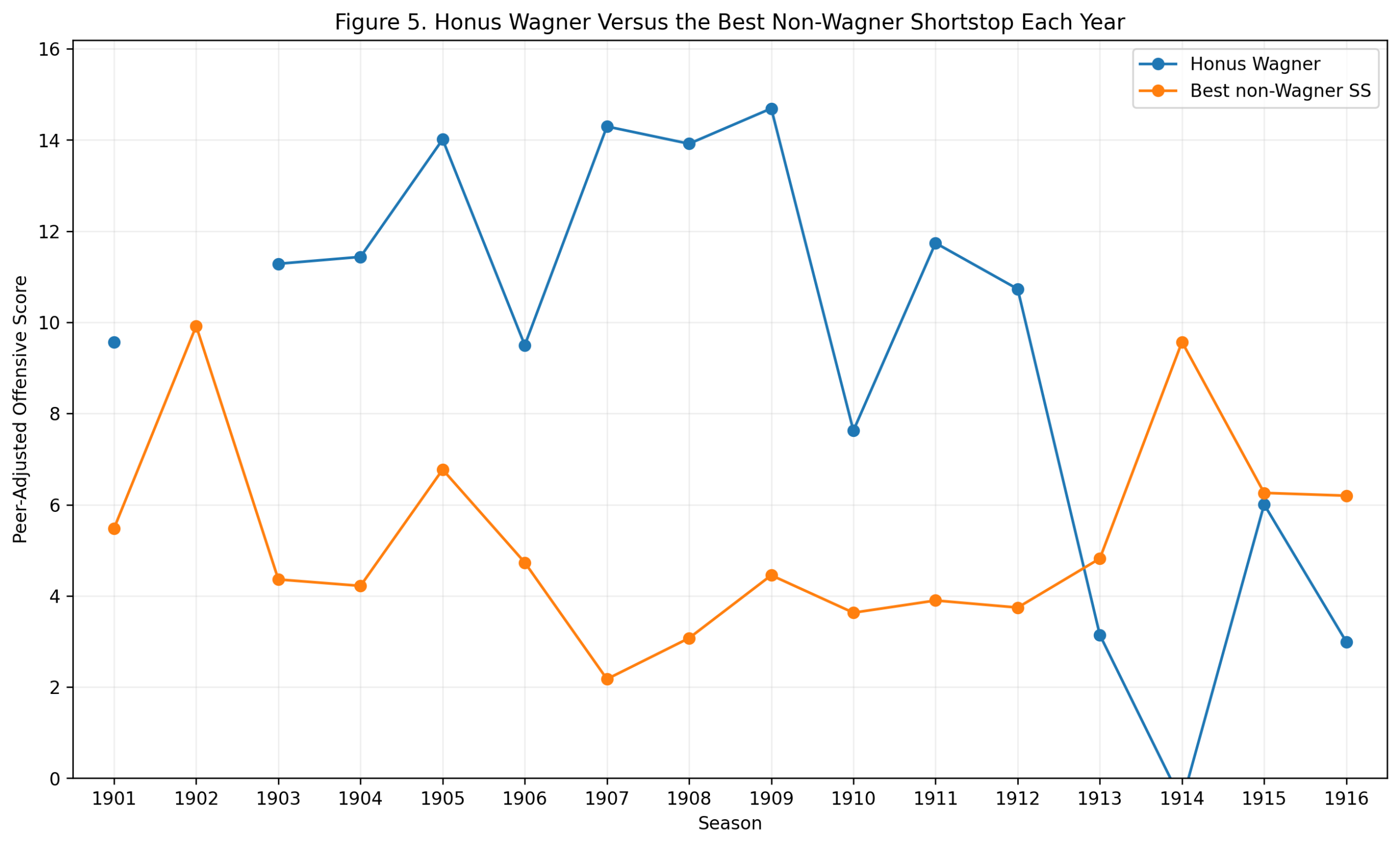
Figure 5 compares Wagner to the best non-Wagner shortstop in each season of his qualified shortstop career.
The early and middle portion of the chart shows why Wagner wins the career argument. He repeatedly stands above the best alternative at the position. From 1903 through 1912, he regularly produced large separations from the shortstop norm.
The later seasons show decline, which is expected. No player remains at peak forever. What matters is the repeated high ground. Wagner occupied that high ground for a long time.
This is where the method is especially useful. Wagner’s career can feel distant because his best seasons happened in a very different baseball world. But the peer-adjusted approach brings the question back to his actual context.
Was Wagner far better offensively than other shortstops of his time?
Yes. Repeatedly.
Figure 6: Balanced Offensive Greatness
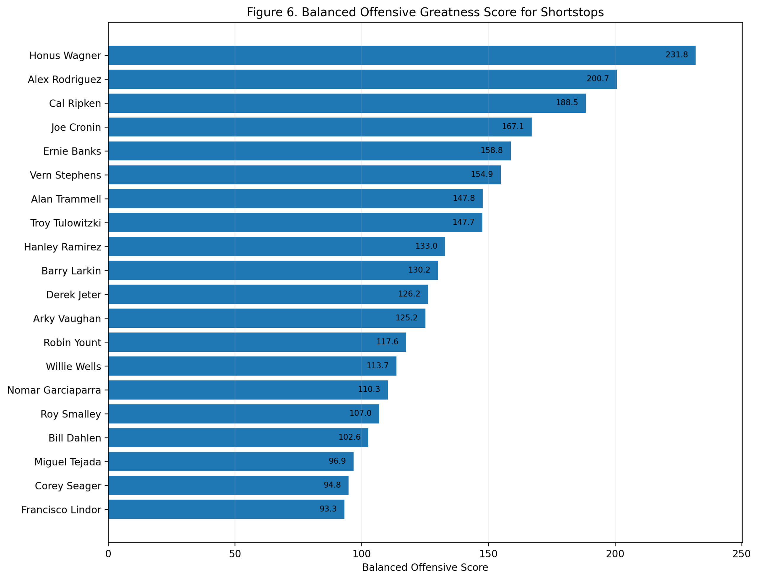
The balanced score combines career value and peak value over seven seasons.
Wagner finishes first with a balanced score of 231.8. Rodriguez is second at 200.7. Ripken is third at 188.5. Joe Cronin, Ernie Banks, Vern Stephens, Alan Trammell, Troy Tulowitzki, Hanley Ramirez, and Barry Larkin follow.
This may be the best single-number summary of the study.
It gives Rodriguez proper credit for the greatest peak. It gives Ripken proper credit for sustained value. It gives Banks proper credit for his peak shortstop power. It gives Wagner proper credit for combining peak and career.
The result is not that Wagner was the flashiest offensive shortstop ever. He was not. Rodriguez probably owns that title.
The result is that Wagner produced the best combination of peak and career offensive dominance while playing shortstop.
That is a slightly different claim, and it is the strongest one.
Figure 7: Offensive Component Profile
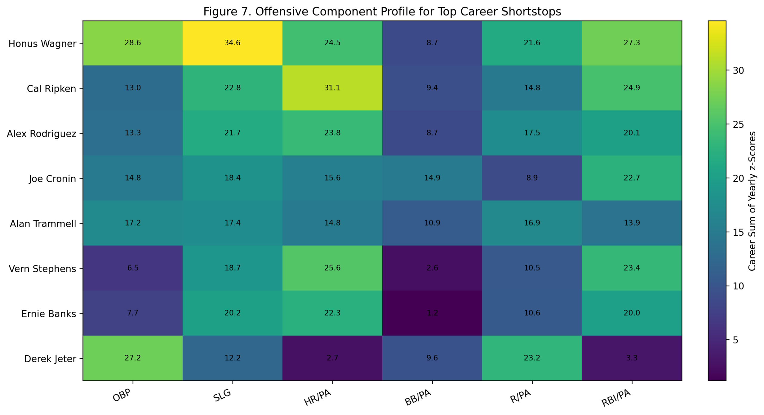
The component profile shows how the top shortstops built their value.
Wagner’s profile is broad. He dominates through OBP, slugging, runs, and RBI, with a strong HR/PA component relative to his era despite not being a modern home-run hitter. That is an important point. The model is not rewarding him for raw home-run totals. It is rewarding his offensive separation from other shortstops of his own time.
Ripken’s profile is power-and-production driven. His HR/PA and RBI/PA components are especially strong. Rodriguez has a similar power shape, with more peak intensity and fewer qualifying shortstop seasons. Cronin shows a more balanced profile with strong OBP, slugging, walks, and RBI production. Trammell and Jeter are more OBP-and-run oriented, while Banks and Stephens carry more power.
Jeter is especially interesting in this figure. His career score is strong, but his shape is very different from Ripken, Rodriguez, or Banks. Jeter’s offensive case is built around OBP and runs, not home-run dominance or RBI separation.
This figure helps explain why shortstop is such a compelling position. At this position, offensive greatness has several forms.
Figure 8: Dendrogram of Top Offensive Shortstops
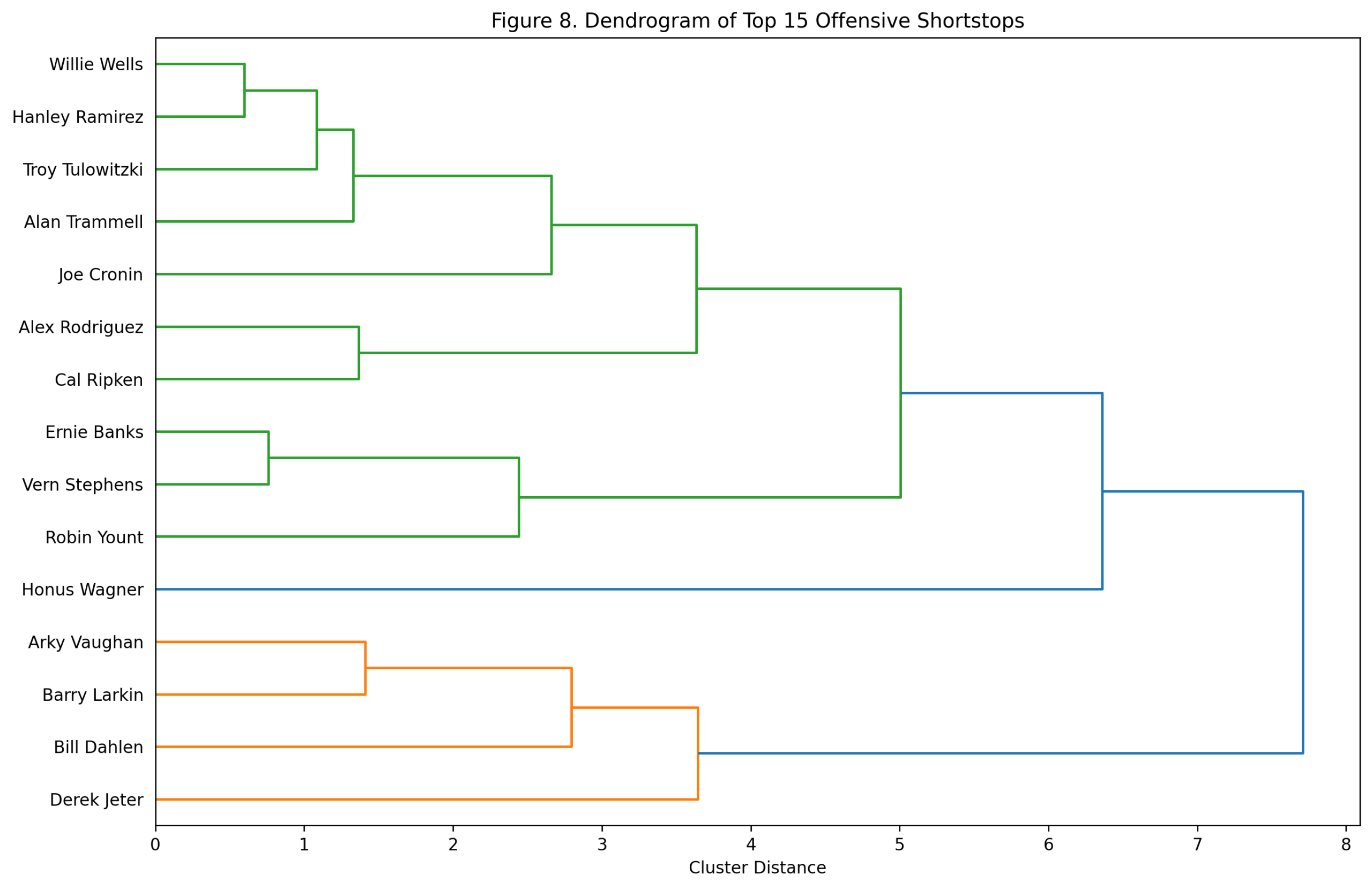
The dendrogram clusters the top 15 shortstops by offensive shape rather than by total score.
Several patterns stand out. Rodriguez and Ripken cluster together, which makes sense given their power-production profiles. Banks, Vern Stephens, and Robin Yount form another power-oriented group. Jeter, Larkin, Arky Vaughan, and Bill Dahlen cluster in a more OBP-and-run-value branch. Wagner sits as a distinctive figure, reflecting the unusual breadth of his era-adjusted profile.
This is one of the better dendrograms in the position series because the offensive types are so different. A-Rod and Jeter were both offensive shortstops, but they were not the same kind of offensive shortstop. Banks and Wagner were both elite, but their statistical routes were very different.
The rankings tell us who separated the most. The dendrogram shows how they separated.
The Jeter Question
Derek Jeter ranks eighth by career score in this offense-only model.
That is strong, but not elite at the very top. His career score is 77.8, and his seven-season peak is 48.4. His profile is more about OBP and runs than power separation.
That feels right. Jeter was an excellent offensive shortstop for a very long time, but he was not as dominant relative to his peers as Wagner, Rodriguez, Ripken, Cronin, Banks, or some of the peak-heavy candidates. His greatness includes postseason value, durability, leadership reputation, and historical visibility. This model is narrower.
Offense-only, peer-adjusted Jeter is very good. He is not first-tier.
The A-Rod Question
Alex Rodriguez is the peak answer.
His shortstop career is shorter than Wagner’s and Ripken’s, but his best seasons are enormous. He has the highest seven-season peak and the highest individual shortstop season. In fact, the top single-season chart shows that his 2000-2003 run is one of the most explosive offensive stretches ever at the position.
So if the question is:
Who was the best offensive shortstop at his absolute best?
The answer is probably Rodriguez.
But if the question is:
Who built the greatest offensive shortstop career relative to his peers?
The answer is Wagner.
What the Study Shows
The shortstop study gives us one of the clearest career-versus-peak splits in the series.
Career Score: Honus Wagner
Peak 7 Score: Alex Rodriguez
Balanced Score: Honus Wagner
Best Individual Season: Alex Rodriguez, 2002
Best long-career modern result: Cal Ripken
Most interesting power peak: Ernie Banks
Strongest OBP/run-profile modern shortstop: Derek Jeter
Wagner wins because he combines high peak value with a long period of offensive separation. Rodriguez challenges because his peak is unmatched. Ripken provides the best sustained modern career case. Cronin, Trammell, Stephens, Banks, Tulowitzki, Larkin, and Jeter all deepen the field.
The central finding is not that one player erases the others. It is that the shape of shortstop offense changes depending on whether we value career separation, peak dominance, or the balance of both.
Conclusion
Shortstop offense is special because it has always been partly unexpected. The position begins with defense. Every great offensive shortstop is, in some sense, an exception.
Honus Wagner was the first great exception at scale. He was not merely a good hitter for a shortstop. He was consistently well above the offensive standard for the position. He combined OBP, slugging, run creation, and run production in ways that made him the dominant offensive shortstop of his era.
Alex Rodriguez later pushed the peak higher. His shortstop seasons were explosive, modern, and unprecedented in their power. Cal Ripken built a remarkable long-career case. Jeter added a different kind of offensive value. Banks, Cronin, Trammell, Larkin, Tulowitzki, Vaughan, Yount, and others each occupy important parts of the map.
But by this peer-adjusted offense-only framework, the answer is clear enough.
Honus Wagner was the greatest offensive shortstop by career dominance.
Alex Rodriguez was the greatest offensive shortstop at peak.
As with most things, some subtlety and nuance are required in this instance. The answer depends on the exact question asked.
![]()