Anscombe’s Quartet
Let’s be Frank; this data set is interesting.
Buford Lister (personal communication)
Yale statistician Frank Anscombe published a short paper in 1973. As I recall, around that time, Tony Orlando hoped to see a yellow ribbon wrapped around an old oak tree while The Godfather dominated award season in the film industry. As for me, I can’t recall, but I am sure I was wearing bell-bottom pants and a flimsy shirt to the local grade school. Anscombe’s paper and The Godfather have fared much better than those bizarre jeans (the huge ones were called elephant pants, my flavor of choice).
In Anscombe’s paper, he introduced what has become known as Anscombe’s Quarter, one of the most famous data sets in the world. Pay careful attention to the summary statistics at the bottom of the table.
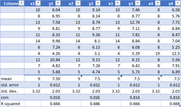
Do you see it? The summary statistics are virtually identical. Back in the day, before computers were ubiquitous, many relied upon these summaries to get a general idea of their data. After all, what else were they supposed to do? Believe it or not, Box Plots and Stem and Leaf Plots were not commonplace. Anscombe’s brother-in-law, the great John Tukey, introduced them and other exploratory data analysis techniques during this time.
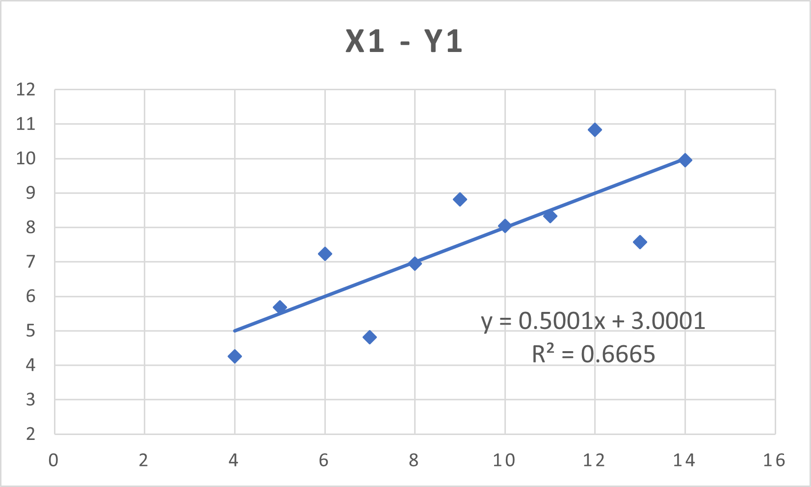
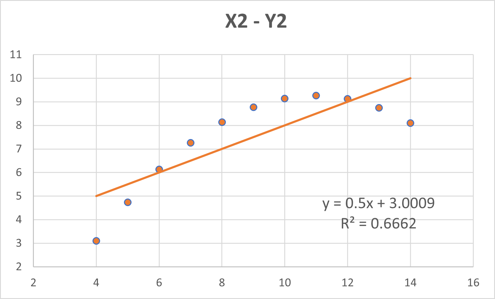
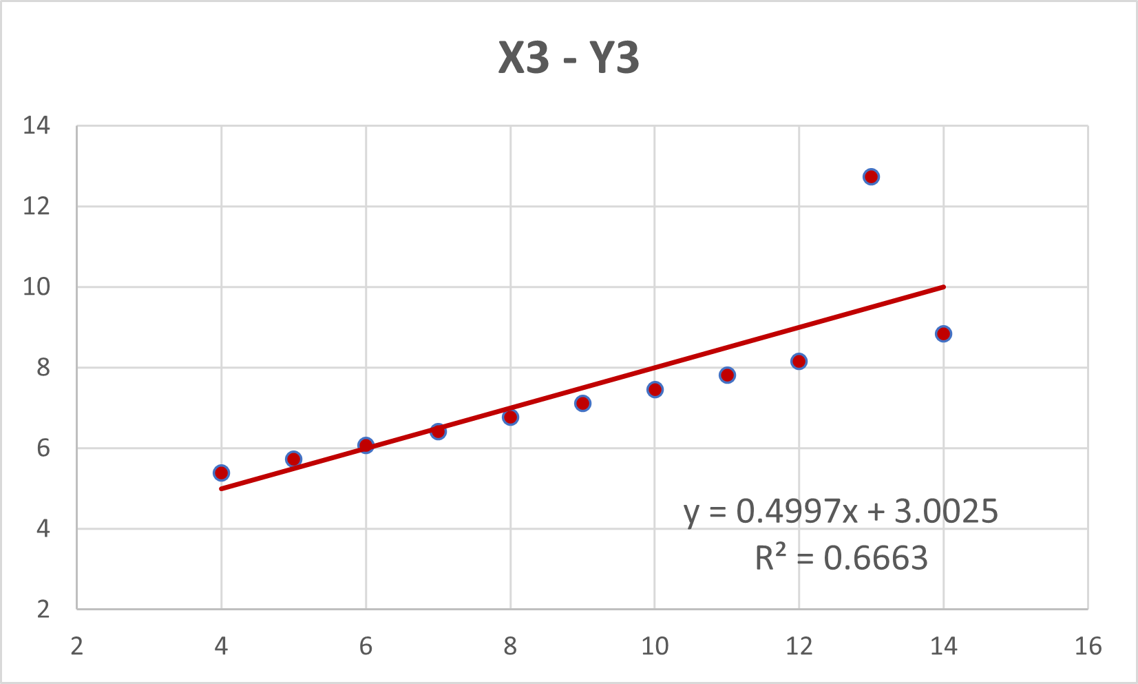
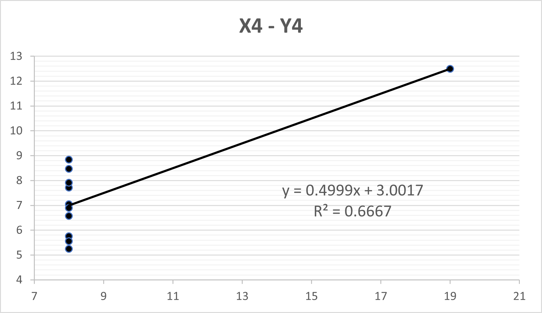
I am sure many of you are ahead of the game. You know the data set wouldn’t be famous, and I wouldn’t write about it unless there is something extraordinary about the data. Take a look at the following graphs.
I only recently came upon this dataset. I am currently learning Python and SQL. I am also brushing up on R, a statistical package I have been fighting with for decades. For those of you too young to remember the baby version of R, it consisted of a command prompt and numerous 1,400-page manuals. Things are much better today.
This data set has appeared more than once in my recent studies. It usually appears as a cautionary tale against making assumptions and refusing to think when you may be tired and want to go to bed. Also, it serves as a stunning reminder to never forget to plot your data. As you can see, the plots are essential to truly understand the data you are analyzing.
Even though I am done with this essay, I am just beginning with my “data” themed posts. I have lots of information burning a hole in my hard drives. I assure you, Anscombe’s Quartet, as brilliant and illuminating as it is, is just the beginning.
P.S. Don’t forget to check out the regression equations. Amazing.
![]()