Datasaurus!
Well…that is something.
Buford Lister (personal communication)
That is in the top seven of the coolest things I have ever seen.
Warren Andrew Slay (personal communication)
This post takes off where the last one (Anscombe’s Quartet) ended. Anscombe had four data sets, whereas the mighty Datasaurus file has 13. Yes, it is either a Baker’s Dozen or you can think of it as the dino plot along with 12 others (the Datasaurus Dozen) that illuminate its glory. Either way, prepare to be dazzled.
As with Anscombe, the summary statistics for all these plots are virtually identical. (x mean = 54.26, y mean = 47.83, x SD = 16.76, y SD = 26.93). Yeah, yeah, the 4th or 5th decimal place is different. So what? If you think that is important, I can’t help you. Please just relax and behold the Datasaurus Dataset. And yes, please be careful with your data when engaging in a project. That just might be the point of the following plots.
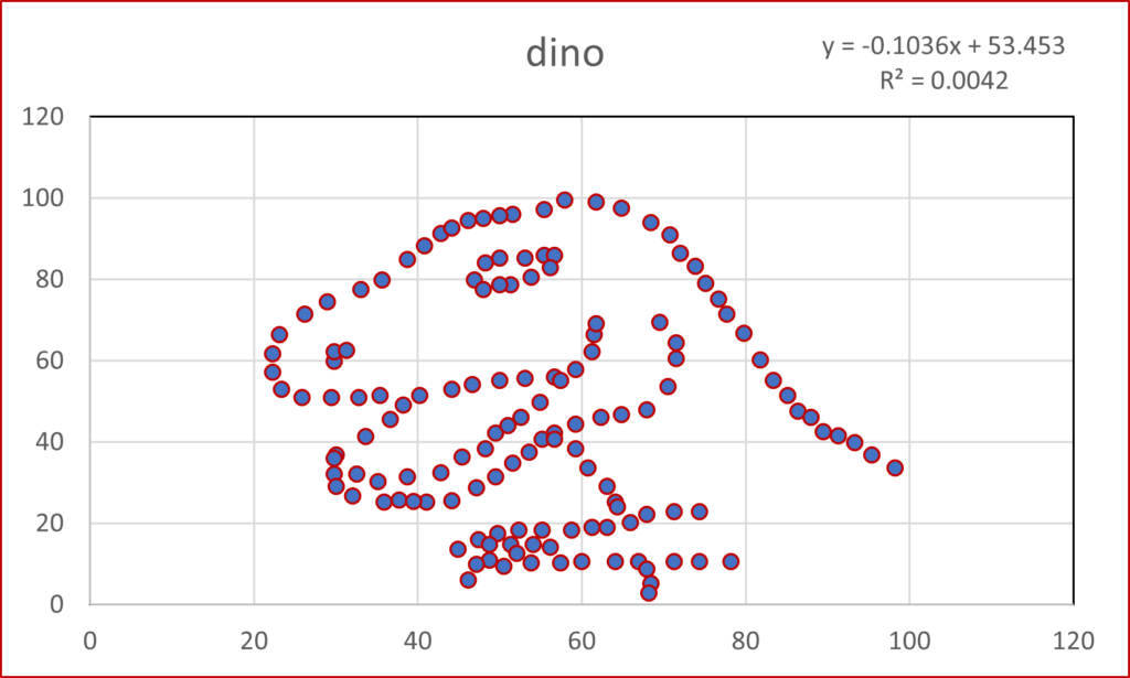
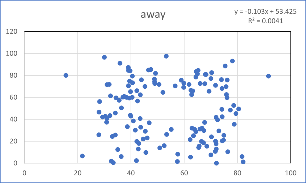
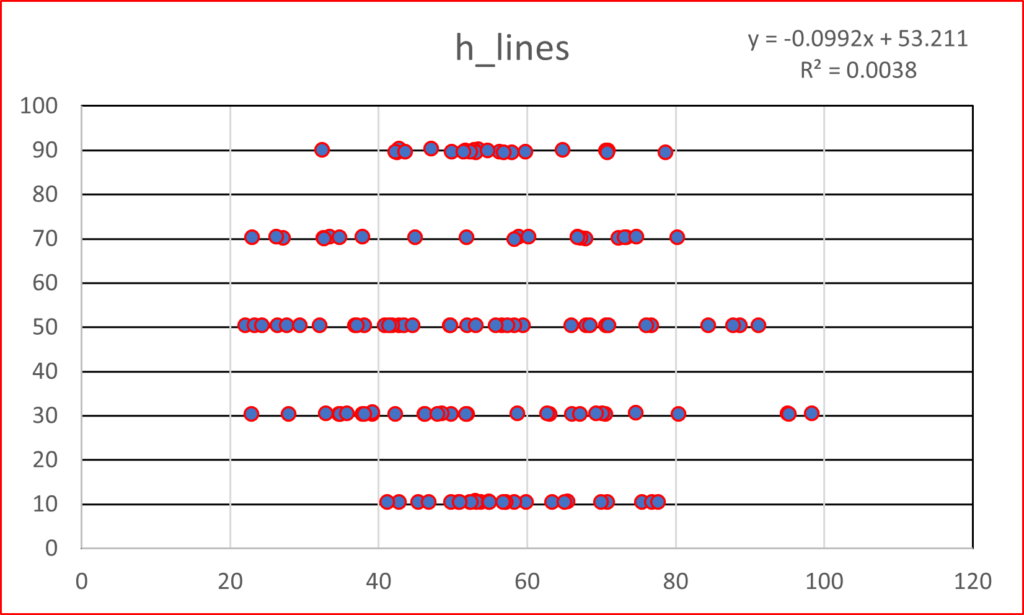
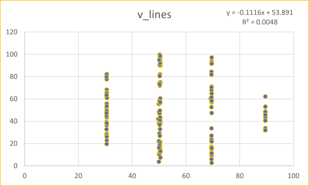
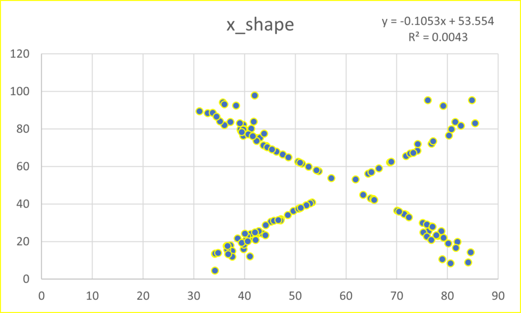
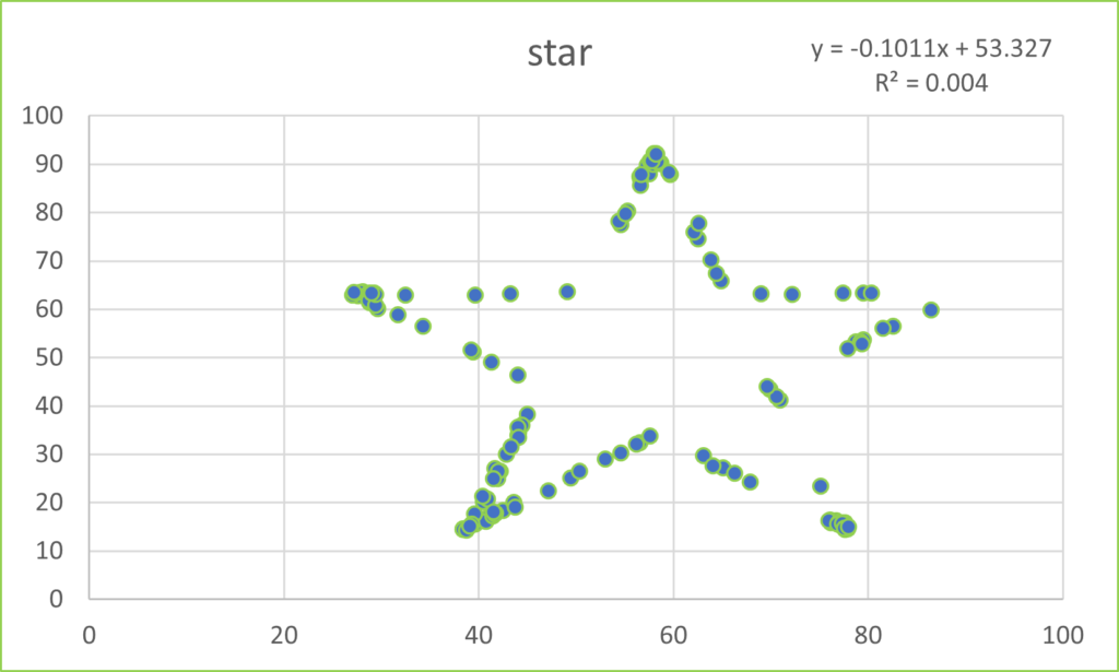
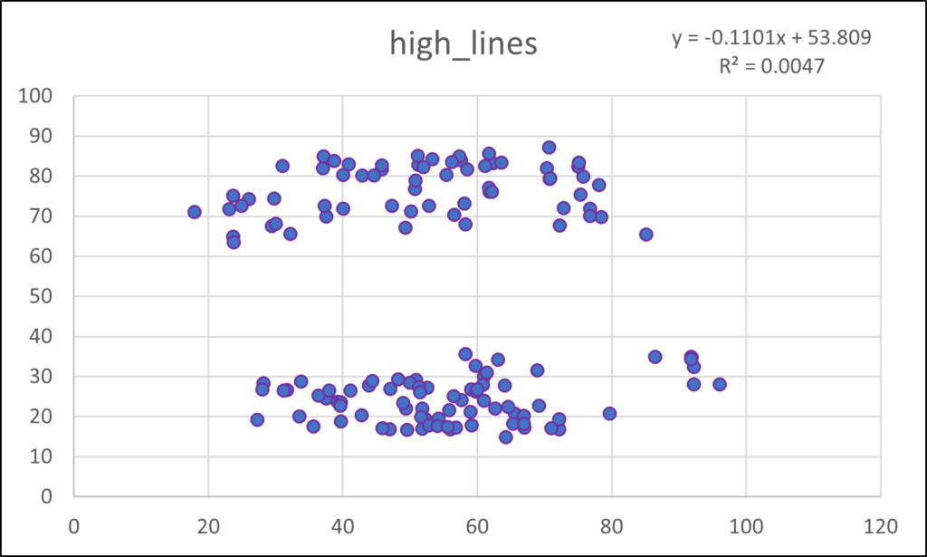
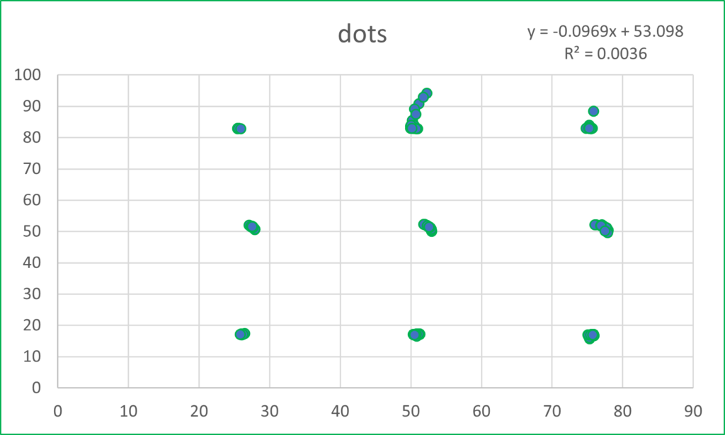
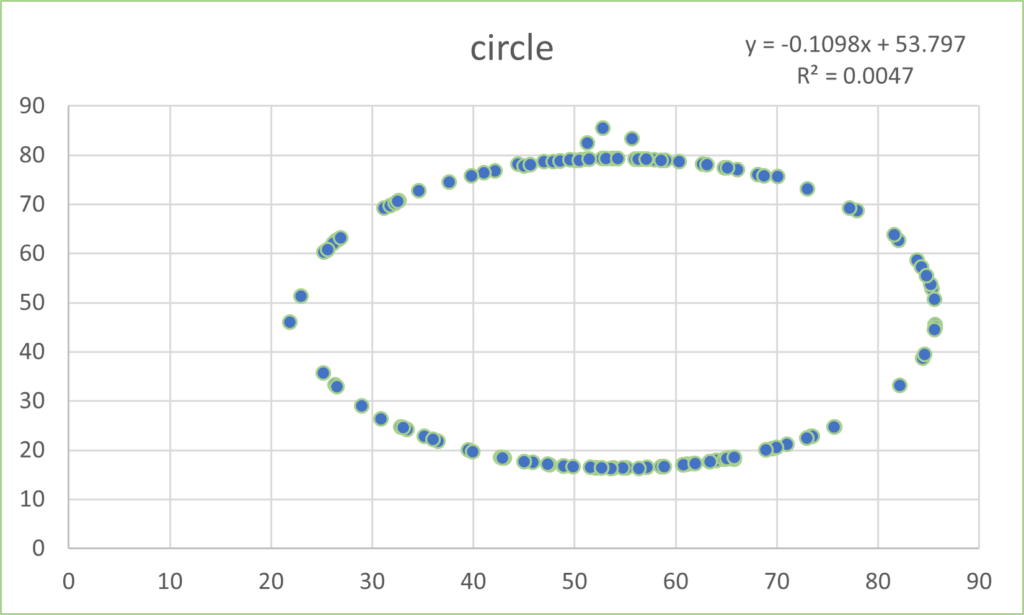
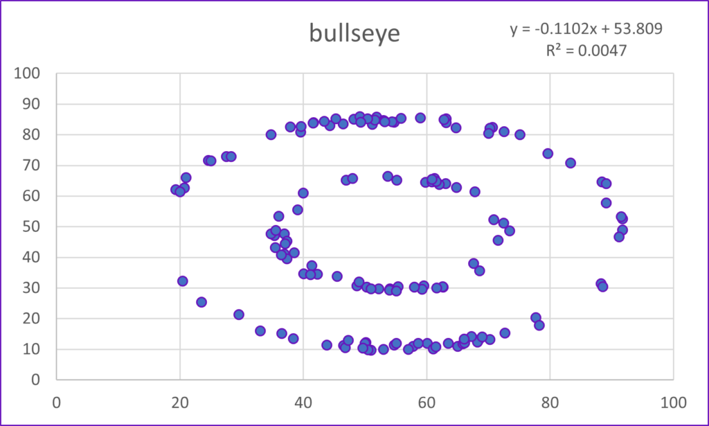
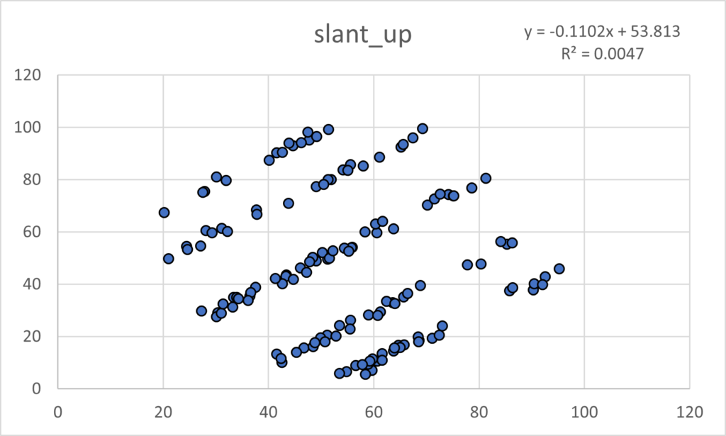
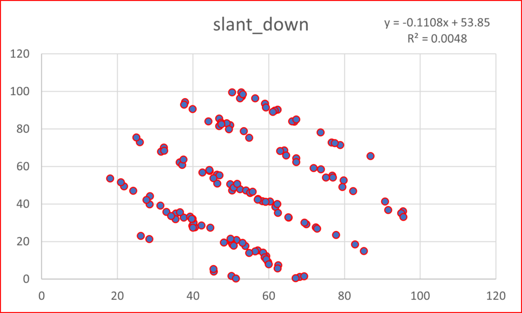
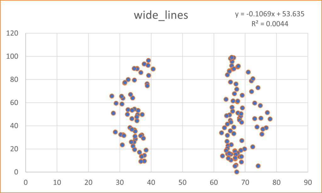
I hope you are astonished. I find it fascinating that all these plots share the summary statistics I mentioned earlier. Considering those commonalities, I wouldn’t have thought it was possible to get this kind of variability.
If you want to learn more about these graphs, search for Alberto Cairo and the team of Justin Matejka and George Fitzmaurice. They have done good work. They all want us to think carefully about our data. I could not agree more.
![]()