19 Percent…huh?
I spent a lot of time putting together the lone figure in this post. My forthcoming baseball book will be filled with plots like the one that follows. I have known many people whose eyes glaze over when presented with figures or graphs (including professors who should know better). Pay a little attention to this one; you will be rewarded.
Between 2004 and 2008, there was a growing disparity in the payrolls of clubs in Major League Baseball. Lots was written about the unfairness of this. I agree with those who thought it outrageous that one team could spend 8 or 9 times what others could afford to pay their players. Consequently, every season began with plenty of fan bases lamenting the stone-cold truth that their teams had no chance to compete for a title or make the playoffs.
Growing up as a fan of the team then known as the Cleveland Indians, I knew that as soon as a young player started to excel, he was on his way out of town. It was a simple fact that other larger market clubs could easily outbid us for a young star’s services. Such was life in the big city.
Every year, big-money teams seemed to crush the less fortunate, and no one seemed to care. The fact that always got me going was that if a team (think Yankees), signed a player to a big contract and that guy floundered, all they did was treat the signing as a sunken cost and go about their business. Clubs like Cleveland, on the other hand, could be crippled by one bad signing. That is a statement of fact.
So, let’s see if we can gain some insight. One of the great things about a scientific mindset is that we can cut through the narratives and what people think is true, and get at the mathematical heart of the issue at hand. The following figure does just that.
I plotted payroll data from 2004 through 2008 against the winning percentage of all MLB teams. I colored the data points using a playoffs variable to simplify the plot. I think it makes it more interesting and easier to read.
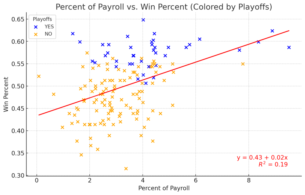
Figure 1. 2004 – 2008 MLB Payroll versus Win Percentage Data.
The scatterplot is basically a blob (yes, the Yankees are in the upper right corner). That means a minimal relationship exists between a team’s payroll and that team’s record, at least for these 5 years. Note the equation in the lower right of the plot. That means a team’s payroll explains only 19 percent of all the MLB team’s record. In other words, there was very little explanatory value in predicting the number of games a team would win if you knew their payroll. The relationship between payroll and record is minimal.
Surprised? Well…if payroll is not a predictor of a team’s success, what is? If payroll accounts for about 19 percent of the outcome; what explains the other 81 percent? I will be looking into that in my book. Perhaps I will find that left-handed middle relievers are the key to success (I doubt it), or maybe if you are putting together a team, you need batters with high exit velocities, pitchers with exceptional strikeout rates, and outfielders who can run like the wind. I am going to try my best to find out.
![]()