Analyzing Max Exit Velocity (2020)
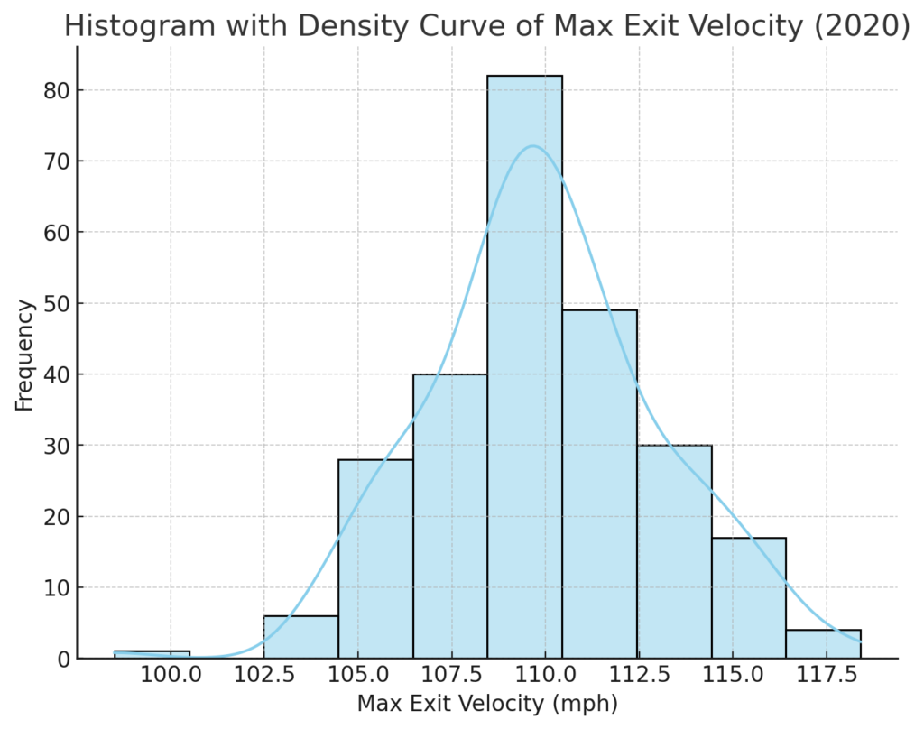
In baseball analytics, exit velocity—specifically, the maximum exit velocity—is a critical metric. It measures the speed at which a ball leaves the bat, providing insights into a player’s power and potential impact. I am looking at max exit velocity data from the 2020 season. This visualization offers a clear and detailed view of how max exit velocities are distributed among players and a smoothed density estimate to reveal underlying trends. My first observation is amazement at how hard these balls are being hit. It is truly astonishing.

Forget batting average; this metric is more diagnostic than many others that are typically (especially historically) referenced. If you are putting a team together, you want players who hit the ball hard. And yes, the harder the better. This line of reasoning is all about a player’s ceiling; it has nothing to do with the dribbling groundballs that find a spot between defenders. Such “seeing eye” base hits are of little predictive value.
In 2020, exit velocity data’s importance escalated as teams began using it for more refined scouting and player development decisions. This season saw an exceptionally high interest in advanced metrics, partly because of the pandemic-shortened season. This led teams and analysts to seek more data-driven insights into player performance.
I used a histogram with an overlayed density curve to visualize max exit velocity data. Here’s what each part of this plot conveys:
- Histogram: The histogram separates the exit velocity data into intervals (bins) and shows how many players achieved max exit velocities within each range. Each bar represents a specific range of velocities and provides a quick overview of where most data points (player exit velocities) lie.
- Density Curve: The smoothed density curve overlaid on the histogram estimates the data’s distribution, offering insights into how the data might spread beyond discrete bins. This curve helps us visualize peaks and concentration points without the rigidity of bin divisions.
Key Insights from the 2020 Max Exit Velocity Data
- Concentration Around the Mean: The density curve reveals a central concentration of exit velocities in the range of approximately 105-111 mph. This concentration suggests that most players in the 2020 season achieved max exit velocities within this range, indicating a consistent performance level among players regarding hitting power.
- Distribution Shape: The distribution is symmetric, slightly skewed towards higher velocities. This symmetry is typical in sports metrics, where most players fall near the average performance level while a few outliers achieve exceptional numbers.
- High-End Outliers: The density curve and histogram both suggest that a few players in 2020 achieved exceptionally high max exit velocities, reaching up to 118 mph. These outliers represent some of the league’s top power hitters, whose performances exceed the average exit velocities and pose a significant offensive threat to opposing teams. And in case you were wondering, Pete Alonzo of the New York Mets hit a ball at 118.4 mph to lead the league. If facing such a batter, I would point to first base and take my chances with the next guy. If first were occupied, I certainly wouldn’t put anything over the plate. I wouldn’t even see the line drive coming back at me.
Why This Visualization Matters
A histogram with a density curve provides a quantitative view of max exit velocity data. This visualization helps scouts, coaches, and analysts quickly assess the distribution of max exit velocities across players. The density curve also offers a smooth, continuous view of the data, making it easier to observe trends and concentrations without the constraints of bin width.
Closing Thoughts
This histogram with a density overlay captures a snapshot of the league’s hitting power, revealing the typical max exit velocities and highlighting exceptional outliers.
This exemplifies how data analytics can deepen our understanding of baseball. By looking beyond averages and focusing on distribution, we gain a richer perspective on the league’s players. Whether you’re a data enthusiast or a baseball fan, this analysis offers a powerful glimpse into the metrics driving modern baseball.
