Quin Houff is Causing Problems!
This is a short post about the relationship between practice times and average green flag speeds for drivers in The NASCAR Cup Series. The question is: Do practice times translate to the race? Can you predict how fast a car will be during the race based on 10 lap practice averages? And finally, if there appears to be a correlation, is it statistically valid?
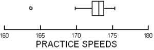
On March 1, 2020, the Auto Club 400 was held in Fontana, California. 30 cars took at least 10 practice laps, below is a Stem and Leaf Plot of those speeds.
163 6
164
165
166
167
168
169 8
170
170 6
171 04
171 55
172 1244
172 788
173 11
176 556677888999
174 1
174
175 3
At the very top of the plot (representing the slowest speed) is Quin Houff at 163.6 mph. Below is a Box Plot of the same data. Notice the circle way off to the left. Once again, our friend Quin Houff insists on being apart from the group. What does that mean? He was slow, very slow, problematically slow, and, most importantly, statistically slow. More on that in a bit…
Now that the preliminaries are out of the way, we can get to it. Perhaps the easiest and, coincidentally, the most powerful way to see if practice times translate to race speed is through linear regression. The figure below shows the relationship between 10 lap practice speed and average green flag race speed. The data shows that about 82% of the average green flag race speed can be explained as a function of 10 lap practice speed. Not bad, not bad at all. This analysis suggests that there is a pretty strong predictive relationship between practice speeds and how fast a driver’s car will be in the race.
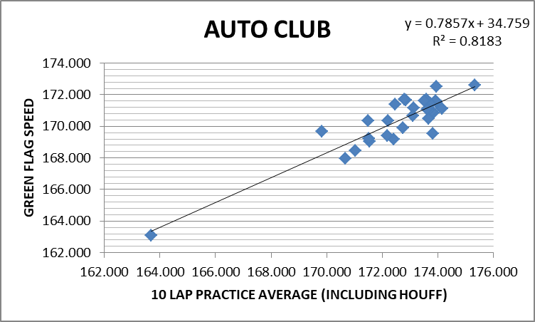
As you study the above figure, can you guess who the blue diamond in the lower left-hand corner represents? You guessed it, our good friend Quin Houff. I included the Stem and Leaf Plot and the Box Plot earlier for a specific reason. Both figures suggest that Houff’s data should be eliminated from the study because he was so much slower than all the other drivers. This is a common practice in Exploratory Data Analysis, the area of statistics I was trained in. So, in that spirit, I have included another regression analysis. This one ignores Houff and his statistically irrelevant car.
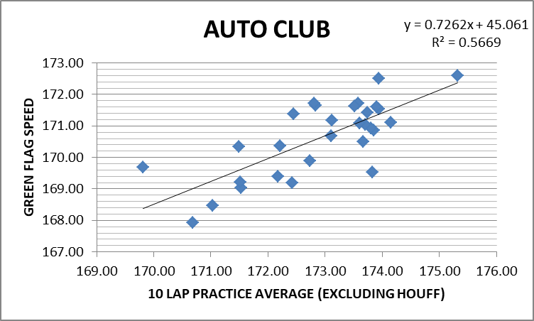
I have to admit, this surprised me. When Houff’s times are eliminated, the explanatory value of the model goes way down. Now the 10 lap practice averages only explain about 57% of the variability found in the green flag speeds. Very curious.
So, where do we stand? Are 10 lap practice averages predictive of race performance? Clearly, more data is needed, data from lots more races. Once all that is gathered up, the numbers would have to be broken down by type of track. My guess is that the relationship would not be the same for short tracks and superspeedways, nor would there necessarily be a correlation between flat tracks and those with high banks. And, of course, we would have to break the data down by the type of package being run by NASCAR at the time.
In this post, I didn’t intend to answer any big questions, I only wanted to offer a path toward better understanding. It would be quite a job to gather all the necessary information and do a suitable study. But, adequately armed, I do believe a useful answer to the question could be achieved. I know some people who would be very interested in that information…for recreational purposes only. :-)
NOTES:
On October 18, 2019, I published an essay called 1:59:40.2. That post has more information about linear regression and how it can be used. I also write about the discovery of regression analysis and the fight for who deserved credit for developing one of the most powerful statistical tools known.
If you are unfamiliar with Stem and Leaf Plots, I talk about them in my post from 2/21/20 entitled An Average Tennis Essay.
![]()