A Crush, a Data Viz, and a Book Long Postponed
I have a crush on a YouTuber. There, I said it. I hesitate because there is no chance I would ever approach her and “shoot my shot.” She is probably half my age…maybe. She might be much younger. I am not delusional; even at my advanced age, I tend to still have my wits about me, so I will choose to keep my powder dry. So, why the crush, and, even more importantly, why would I choose to write about it? Let’s get into that.
Many months ago, I was doing my thing, surfing around the internet in an attempt to find a mathematical basis for the meaning of life (cough, cough), when I came upon an astonishing young woman. Indeed, I wasn’t looking for her, but that is how these things work, right? Most of the interesting things in my life have happened to me while I was standing in a corner, minding my own business, and breathing my own air.
This mysterious YouTuber is a brilliant Ph.D. in theoretical physics who left academia because…well, that is one of the reasons why she is a content creator. She has many videos detailing why she left the academy to join the corporate world. I was instantly smitten. I was enchanted; I didn’t have a chance to surf away. The deed was done.
Was I instantly attracted to her obvious intelligence? Absolutely. Was I impressed with her charm and personality? No doubt. And I must say, it didn’t hurt that I found her very attractive.
Immediately after I discovered her, I quit watching her videos. I didn’t need to be reminded of what I was missing while living here in Hillbilly Land. I say from experience and with all confidence that there is no woman like her anywhere near where I live. If such a bright light flickered near me, I imagine we would have crossed paths at some point. As it stands, I have no recollection of such a person. In fact, I just stepped outside and looked up and down my street…nothing. There was a chance she was driving through my town and got a flat tire in front of my house, right? Hold on, I’ll calculate the odds…ah, forget it.
As many of you know, it is much too early for me to reveal the lede (or thesis statement, if you like) as it has not yet been sufficiently buried. Trust me, the payoff is not a bad one. I felt this topic deserved its own essay mainly because I find the whole story unusual and fascinating.
Now, we can leave the present (where I sit overly impressed by a woman I will never meet) and travel back to the mid to late 1980s. The setting is Cambridge, Massachusetts, on the campus of Harvard University. I then was a dude learning graduate-level statistics. Believe it or not, Stem and Leaf Plots and Box and Whisker Plots were on the agenda. Now, kids learn about these things very early. I know a young man presented with these techniques in 6th grade. There are lots of reasons for this. John Tukey, the great statistician, published the seminal book Exploratory Data Analysis in January of 1977. Things take time to filter down to the mathematical masses. The lack of personal computers had something to do with the lag, as did the fact that high school teachers don’t spend much time looking through statistics textbooks. Also, who paid attention to mathematicians back then? Who read their books? You get the idea. It was about as many people who pay attention to them now, at least on a percentage basis.
Of course, the bigger problem is how long it takes ideas, even great ones, to trickle down to society at large. An idea must go through levels of bureaucracy before it can be included in a public school textbook. No such stipulations apply to university settings. A professor can read a paper and talk about it in class the next day if they are inclined. I was known to do this a time of two. Not that it mattered; I don’t think my students even cared that they were learning something “hot off the press.” They just yawned and asked if the material would be on the test.
Back then, and to this day, I spent a lot of time studying Tukey’s previously mentioned Exploratory Data Analysis (EDA). His book greatly impacted the study of statistics in general and proved to be a revelation in my little corner of the mathematical universe. I instantly understood the value of visualizing data in the way Tukey described. I wasn’t the only one, as Box Plots are as common today as bar graphs and pie charts.
Inspired by Tukey, I went on numerous statistical “deep thinks” back in the day. I derived all the equations, both as an exercise and as a way to convince myself of the validity of the methods. It’s not that I didn’t trust the people who set the foundations of statistical thought; I simply thought it was required of me to do so. Many of my professors and I saw it as a way of paying my intellectual dues. Today, there are applied statistics programs that focus on the applications of the methods; they leave the mathematical nuts and bolts to those studying pure statistics. The applied statistics folks are experts at using the techniques; they don’t necessarily care what is under the mathematical hood. Nothing wrong with that. I think there might be an appropriate analogy with those who opt for English degrees instead of the more popular English Literature track.
A central focus of this post relates to an idea I had one day while studying Box Plots, known as Box and Whisker Plots across the pond, and Box and Dot Plots here. Mostly, they are simply called Box Plots, and that is fine. As I was studying a series of plots, not unlike those in the following figure, it started to bother me that the widths of the plots were not diagnostic; they appeared to be totally arbitrary.
Examine the plot illustrating baseball production by position. I created this in R using a dataset I compiled long ago. The individual plots show the OPS (on-base percentage plus slugging percentage) for different positions in the American League during the 2009 season. The particulars are unnecessary; I just want you to notice the width of the boxes. You will see they all are the same, imparting no valuable information. In fact, the widths reveal no information at all. Shouldn’t the widths of the boxes change to reveal something about the data used to create the plot? Doesn’t that make sense?
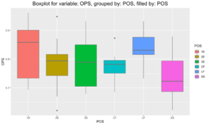 Figure 1. Box Plots of 2009 AL MLB Hitters by Position.
I considered this issue and decided that the widths could and should reveal some information. I decided to develop a plot with the attributes of a Box Plot but changed widths depending on the number of observations in the data set at each point along the vertical axis of the box. I thought of them as supercharged Box Plots, or Box Plots on steroids, even though I never got to the point where I tried to name them. More on that in a bit.
My task was straightforward and didn’t require much insight to figure out what to do. I put my head down and made some plots, such as the following ones.
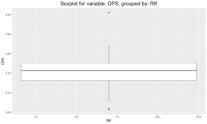
Figure 2. Box Plot of OPS for Second Basemen, AL 2009.
As usual, the nature of the data does not matter. This happens to be an OPS Plot of second basemen in the AL from 2009. I used the same data as in Figure 1. Next comes a histogram made from the same data set. Something interesting happened when I fused the two plots together. I say that with hesitation because I was in the extreme minority in my corner of the world.
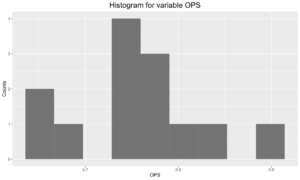
Figure 3. Histogram of same data.
I rotated the histogram 90 degrees and then mirrored it. I then placed those plots on the box plot. It was a very simple process that required no mathematical insight or leap in intuition.
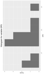
Figure 4. Rotated Histogram
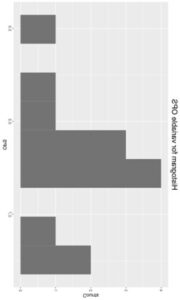
Figure 5. Flipped (Mirrored) Histogram
I came up with the following. It is simply a box plot with varying widths. I wrote up a short paper and started circulating it among my cohorts, professors, passers-by, strangers, and anyone I thought might have an opinion. The results were disappointing.
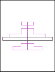
Figure 6. Histogram and Box Plot.
The typical reaction I got was one of confusion. Huh? Why are you doing this? Why are you here? Why would anyone ever need this? This isn’t necessary (the implication being that I wasn’t necessary). I received no positive feedback. I received no neutral feedback. Everyone who saw my plots hated them. I think some people who viewed my plots felt embarrassed for me. It was a disaster.
I believe it goes without saying that I shelved my “box plots on steroids” project and went on with my life. If I had heard one word of encouragement, I would have developed the idea into a publishable paper.
I didn’t think of it again…until…a few weeks ago. I was using R, my computer language of choice, when I came across something curious. That is not unusual in and of itself; it happens constantly. What caught my attention was an image of something called a Violin Plot. I instantly recognized it. The output was very similar to my old project. Sure, the edges were smoothed, but the idea was the same.
I took a deep dive into Violin Plots. I realized that my idea from all those decades ago was now a common choice for those looking to create a statistical plot or data visualization, commonly known in data analysis parlance as a Data Viz.
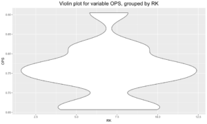
Figure 7. Violin plot of Second Base Data.
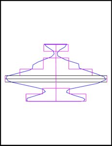
Figure 8. Violin Plot overlayed on my original plot.
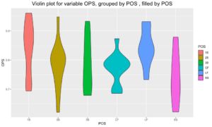
Figure 9. Violin Plot of Figure 1.
It is now time for the payoff to this essay. No, the point is not that I came up with an idea that was apparently way before its time. While interesting, I am sure that being attributed with the creation of Violin Plots wouldn’t have changed my life in any meaningful way. As mentioned, their existence requires no great insight or intuitive leap of significant consequence. No, the curious thing is what happened when I went on my deep dive of Violin Plots.
As I searched in an attempt to learn all I could about the newly revealed Violin Plots, I stumbled into a rabbit hole. I fell in face first, and as I dusted myself off and began my climb back to reality, I came across a scathing video by a young woman who HATES Violin Plots. She methodically went through her case. Many of her points were ones I had heard nearly 40 years ago, e.g., they aren’t necessary, it is easier to just use a histogram, box plots are fine, etc…
She also had one major criticism that had never occurred to me. In the last few weeks, I had spent a great deal of time looking at different Violin Plots, and I never thought they looked like anything other than violins. Seriously, I didn’t. The young woman’s main criticism of the plot is that immature males take their shape to resemble something other than a beautiful-sounding musical instrument. Unfortunately, she has a lot of anecdotal evidence to support her claim that these plots should never be used by anyone for any purpose.
I swear to you that what I will now tell you is accurate. If it wasn’t, I never would have written this essay. I almost feel stupid writing this because I am sure most of you have figured out that my YouTube crush and the young woman who hates Violin Plots are the same person. I would never have written such a scenario in a work of fiction because it sounds too contrived, yet here we are. I’ll slowly shake my head in disbelief as I crack open a beer.
What about the book, the one referenced in the title? I am guilty of more than a little foreshadowing. Yes, it is a book on baseball analytics. I started writing it in 2002. It got put off because I was compelled to write another book in its place. That entire book, The Athena Chapters, is posted on this site. My long overdue baseball book will be completed relatively soon, and much to the disappointment of my YouTuber, it will be full of Violin Plots because I find them diagnostic and beautiful. I know she disagrees, but I don’t see us arguing over their utility and functionality at some fancy dinner party. I’ll apologize in advance, place the plots where I want, and take my chances.
![]()