Scales of Unusualness: 2023 MLB Catchers (Defense)

The hierarchical cluster tree, or dendrogram, visualizes the relationships among 2023 MLB catchers based on their defensive statistics. As always, players who are closer together on the x-axis have similar defensive profiles, meaning their statistics in categories like putouts, assists, errors, and caught stealing percentage are more alike. The height of the horizontal lines (distance) indicates how similar or dissimilar players are: the lower the line, the more similar the players are in their defensive performance.

The visualization highlights individual performance and helps teams or analysts compare players across a wide range of defensive metrics. For example, catchers clustered together likely share similar defensive styles or capabilities, making it easier to compare catchers in terms of their effectiveness behind the plate. Furthermore, the dendrogram’s structure shows which players stand out as outliers due to superior or weaker performance compared to their peers, giving teams valuable insights for recruitment, strategy, or training decisions.

Note that J.T. Realmuto is off by himself. Despite not receiving a Gold Glove Award, his defensive performance in 2023 was ostensibly exceptional. In a future post, I will drill down into the advanced metrics to see why he was overlooked. Don’t be surprised if the dendrogram I created in this post is deemed suspect in a few days or so.


Posted on

Twilight Embrace (Flash Fiction)

Twilight Embrace

Roland stood on the edge of the pier, the salty sea breeze ruffling his thinning gray hair. The sunset cast a golden glow on the water, turning it into a shimmering mirror. He’d always loved this time of day, when the world seemed to slow down, the chaos of life pausing to catch its breath. But tonight, the sunset was more than just a daily spectacle; it was a backdrop to the thoughts that weighed heavily on his mind.

He heard her footsteps before he saw her, the soft patter of sandals on wood. He didn’t need to turn around to know it was Lila. She had a way of walking that was almost musical, each step a note in a melody that only he could hear. When she reached his side, she leaned on the railing, her youthful face glowing in the fading light.

“It’s beautiful, isn’t it?” she said, her voice as light and airy as the breeze.

Roland nodded, his eyes lingering on the horizon. “It is,” he agreed, though he wasn’t sure if he was still talking about the sunset.

He stole a glance at her, his heart tugging in that familiar, bittersweet way. Lila was young, vibrant, full of life—everything he no longer was. Her hair was a cascade of chestnut curls, her skin smooth and untouched by time. But it wasn’t just her youth that captivated him; it was the way she looked at the world, with wide-eyed wonder and an unshakable belief in endless possibilities.

He’d met her at the community center where he volunteered, teaching a creative writing class. She’d signed up on a whim, she’d said, looking for something to fill her summer days. But from the moment she walked in, Roland had been drawn to her. It wasn’t a sudden attraction, like a lightning strike. No, it had been gradual, a slow unfolding of admiration, respect, and something deeper that he hadn’t felt in years.

They’d spent hours talking after class, about books, music, and the dreams she had for her future. Lila was open, honest, her emotions unfiltered. Roland found himself sharing parts of himself that he’d kept hidden for decades. He felt alive in her presence, like a man much younger than his 63 years.

But as much as he cherished their connection, he couldn’t ignore the nagging voice in the back of his mind. He was old enough to be her father, perhaps even her grandfather. What could she possibly see in him? The thought haunted him, twisting his emotions into knots. Was it wrong to feel this way? Was it foolish?

Lila turned to him, her eyes catching the last rays of the sun. “Roland, you’re awfully quiet tonight.”

He forced a smile, hoping it didn’t look as strained as it felt. “Just lost in thought, I guess.”

She tilted her head, studying him in that way she had, as if she could see right through to the core of him. “You know, age is just a number,” she said softly, as if reading his mind.

His breath caught in his throat. “Lila, I—”

She reached out, placing a hand over his. It was warm, comforting, grounding him in the moment. “You make me happy, Roland. Isn’t that what matters?”

The simplicity of her words hit him like a wave. All the doubts, the fears, the self-recrimination—they seemed to dissipate in that instant, carried away on the breeze. He looked into her eyes, seeing only sincerity there, and something that might have been love.

He squeezed her hand gently. “Yes, Lila. That’s all that matters.”

And as the sun dipped below the horizon, casting the world into twilight, Roland felt something within him shift. He didn’t know what the future held for them, but for the first time in a long time, he was willing to embrace the unknown.


Posted on

Steps Forward (Flash Fiction)

Steps Forward

Sergio stood at the edge of his driveway, phone in hand, staring down the quiet, leaf-strewn road that led to the harbor. The late September air was cool, tinged with the smell of damp earth and the first hints of winter. Lake Erie was only three miles away, a place he’d gone a thousand times before, but tonight was different. Tonight, he needed the walk. He needed the beer.

He scrolled through his contacts, hoping someone might answer, someone who could drive him down to the old pub by the harbor—Murphy’s Place. It was a spot he’d frequented in better days, back when life felt less like a cage. But now, it was just a distant reminder of the way things had changed.

The first call went to voicemail. “Hey, this is Dan. Leave a message.” Sergio didn’t bother. He tried a few more numbers—each one met with the same silence, or a polite but firm excuse. “Busy tonight, Sergio. Maybe another time.”

He let out a long sigh, shoving the phone into his jacket pocket. No one was coming. It seemed fitting, really. In the last year, most of his friends had drifted away, and those who hadn’t were more like acquaintances now—people with lives too busy for someone who’d become a shadow of his former self. It was easy to let that happen, Sergio thought, when you spent more time with a bottle than with people.

He started walking, his footsteps heavy on the pavement. The streetlights were spaced far apart, leaving long stretches of darkness between them. Sergio welcomed it. The shadows felt like a shroud, something to hide in, away from the prying eyes of a world that no longer made sense.

As he walked, the memories crept in. The accident. The year he’d spent trying to piece his life back together after losing his wife, Ellen. The guilt, the what-ifs that gnawed at him day and night. He’d been driving that night, too tired from work, too stubborn to admit he needed rest. And then the truck, the blinding lights, and the sound of metal tearing like paper.

They told him it wasn’t his fault, that it was a freak accident, but the words never reached him. They couldn’t undo the damage, couldn’t bring her back. So, he’d let the grief consume him, finding solace only in the numbness that came from a bottle.

The harbor came into view, its lights flickering in the distance like tiny beacons. Sergio felt a pull toward it, like it was calling him, offering some small comfort. He reached Murphy’s Place, its neon sign buzzing in the dark. Inside, the warmth and noise greeted him like an old friend. He ordered a beer, the bartender nodding as if he knew. Everyone knew, in a place like this.

But as Sergio lifted the glass to his lips, he paused. The walk had stirred something in him, something he hadn’t felt in a long time. A small, insistent voice that whispered: enough.

He set the beer down, untouched, and walked out of the bar. The night was cold, the air sharp in his lungs as he headed back the way he’d come. Each step felt lighter, the darkness less oppressive. He didn’t know what tomorrow would bring, didn’t have any grand plans to turn his life around. But as he walked back toward his empty home, Sergio knew one thing: he was done running.

The walk had changed something in him, something vital. It wasn’t about the beer, or the harbor, or the friends who no longer answered his calls. It was about the simple act of moving forward, one step at a time. And for the first time in a long time, Sergio felt like he could keep walking.


Posted on

Pitching is (or was) more Important than Hitting? Who knew?


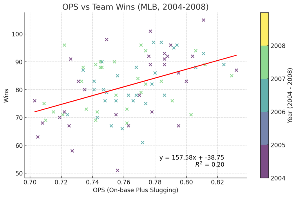
This analysis examines the relationship between a team’s On-base Plus Slugging (OPS) and their total wins in Major League Baseball (MLB) over a five-year period from 2004 to 2008. OPS is a key statistic in baseball that combines on-base percentage and slugging percentage, providing a comprehensive measure of a player’s (or team’s) ability to get on base and hit for power. The scatterplot visualizes this relationship, with each point representing a team’s OPS and corresponding number of wins for a particular season. The data points are colored by year, allowing us to observe any patterns or trends across the seasons. That factor proved not to be very useful.

A linear regression model was applied to determine if there is a significant correlation between OPS and team wins. The analysis revealed an R-squared value of 0.196. The R-squared value indicates that approximately 19.6% of the variance in team wins can be explained by their OPS, suggesting a moderate correlation. While OPS is a useful statistic, the relatively low R-squared value implies that other factors, such as pitching, defense, and managerial decisions, also play a significant role in determining a team’s success over a season.

The analysis covers data from five consecutive MLB seasons, providing a broad overview of the relationship between OPS and wins over multiple years. The consistency of the trend line and equation across the years indicates that the OPS-wins relationship is relatively stable during this time period.  However, given the moderate R-squared value, this analysis suggests that while OPS is an important metric for assessing team performance, it should be considered alongside other variables for a more comprehensive understanding of what drives a team’s success.

In a recent post, I demonstrated that WHIP is much more predictive of a team’s record than OPS, at least in the mid-2000s. I don’t think anyone will be surprised to learn that pitching is more important than hitting if you want to win baseball games. There will be more on that and related topics coming soon.


Posted on

Now, Isn’t This Interesting?


This scatterplot visualizes the relationship between a baseball team’s WHIP (Walks plus Hits per Inning Pitched) and the number of wins they achieved during the seasons from 2004 to 2008. I included both the AL and NL in this analysis. Each point on the graph represents a team in a specific year, with the color indicating the corresponding season. The WHIP is plotted on the x-axis, while the number of wins is plotted on the y-axis. This visualization allows us to observe if there is a pattern or trend between these two variables across different years.

A trendline, represented by a solid red line, has been added to the scatterplot, which provides a general indication of the relationship between WHIP and wins. The slope of the line suggests that as WHIP increases, the number of wins tends to decrease. The strength of this relationship is indicated by the R-squared value of 0.49, meaning that WHIP accounts for approximately 49% of the variability in the number of wins. This moderate R-squared value suggests a fairly significant correlation between the two variables.

In summary, the scatterplot illustrates a moderate negative correlation between WHIP and team wins, indicating that WHIP is a meaningful factor in a team’s success, though not the sole determinant. Including both leagues from 2004 to 2008 allows for an interesting, if limited, analysis over multiple seasons, with the trendline and R-squared value providing insights into the overall pattern between these two metrics. This plot highlights the importance of WHIP in predicting team performance while suggesting that other factors certainly contribute to a team’s total wins.

Here is a scatterplot illustrating wins in terms of team ERA (earned run average). When I was a kid, I didn’t think ERA was very valuable, and the following plot shows that it has less explanatory value than WHIP.

As we saw in a previous post, payroll differences explained approximately 19 percent of the variability in win totals. Team ERA explains about 44 percent of the variability, while the WHIP metric has more explanatory value (49 percent) when determining what leads to wins in major league baseball. I will keep posting more information as my research progresses.


Posted on

2018 AL WAR vs OPS


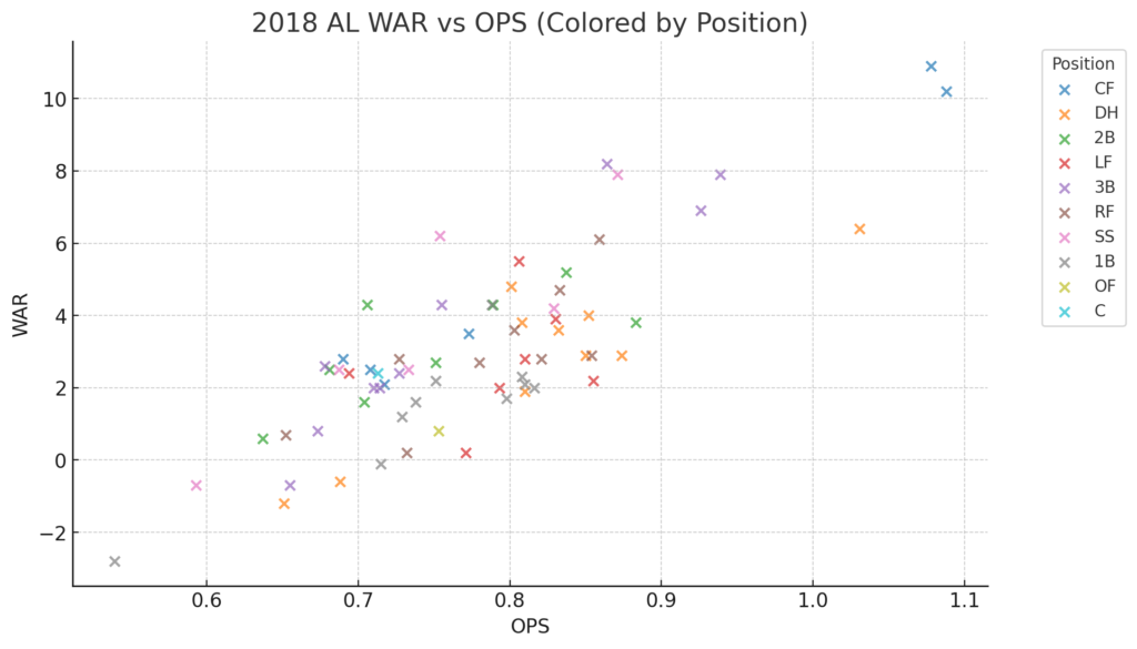
The scatterplot titled “2018 AL WAR vs OPS (Colored by Position)” visually explores the relationship between Wins Above Replacement (WAR) and On-base Plus Slugging (OPS) for players in the American League during the 2018 season. Each point on the plot represents a player, with OPS on the x-axis and WAR on the y-axis, and the points are colored according to the player’s position. This allows us to observe how players across different positions performed in terms of their offensive output and overall contribution to their teams.

Notably, the plot highlights standout players such as Mookie Betts and Mike Trout, who are positioned in the upper right corner, indicating their exceptional performance. Betts, then an outfielder for the Boston Red Sox, and Trout, still a center fielder for the Los Angeles Angels, both had extremely high OPS and WAR values. Their positions in the plot underscore their status as two of the most valuable players in the league during the 2018 season.

In contrast, Chris Davis, a first baseman for the Baltimore Orioles, is positioned in the lower-left corner of the plot. Davis had one of the lowest OPS and WAR values in 2018, indicating his struggles. The spread of points across the plot also reveals how different positions cluster in certain areas, with players like Davis standing out as outliers in underperformance. At the same time, Betts and Trout exemplify top-tier performance. This is a pretty cool visualization of this type of data. I find scatterplots useful.


Posted on

Here’s a Little 3D For You


How is this for a different perspective? The 3D Cluster Analysis of 2023 National League (NL) shortstops visually represents player performance using an extra dimension, highlighting their key differences and similarities. Using a sophisticated technique called Principal Component Analysis (PCA), the high-dimensional performance metrics of the shortstops were reduced to three principal components, which encapsulate most of the variance in the data. This dimensionality reduction (or expansion, if you prefer) allows for a clear visualization in three-dimensional space, where each player’s metrics reflect their overall performance. The players are grouped into three distinct clusters, each represented by a different color, providing insights into how these athletes compare to one another based on their statistics.

The clusters were determined using the K-means clustering algorithm (much more of that down the line), which groups players with similar performance metrics into the same cluster. As earlier, the plot reveals three main clusters: Cluster 1 in blue, Cluster 2 in green, and Cluster 3 in red. Each cluster represents a subset of players with comparable performance profiles. For instance, the player in Cluster 3 (Mookie Betts), shown in red, exhibits stronger or more consistent performance in certain areas, distinguishing him from those in the other clusters.

Unsurprisingly, Betts is once again highlighted in the analysis. Notice that he is off by himself in red, focusing our attention. This emphasis allows for a closer examination of where Betts stands relative to his peers in the 2003 NL shortstop group. While I do believe that the two-dimensional plot from the last post is more diagnostic, no one can deny how cool the 3D plot looks. And that is why I published this post.


Posted on

Scales of Unusualness: Offensive Production of NL Shortstops in 2023

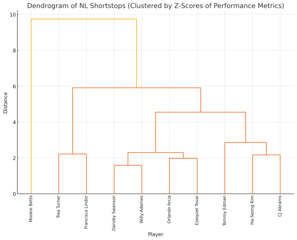
To the surprise of no one, Mookie Betts was, by far, the most unusual offensive performer last year among NL shortstops. If you study the plot, you can follow the line connecting Betts to the other players.


Betts is a cluster of one. His offensive production was so far above all the other shortstops that no one could cluster with him. And that, I must say, is highly unusual.


Posted on

Scales of Unusualness: Offensive Production of AL Second Basemen in 2009

The title of this post is unusual (you see what I did). Why? Historically, I have chosen titles inspired by the band Arctic Monkeys. They had a propensity for overly long song titles that may or may not have anything to do with the actual song. For the longest time, they were my favorite band. The last two CDs, though, have given me pause. I listened to both of them hundreds of times, and I must admit that I just don’t get it. Maybe on some deep (nearly subconscious) level, I have given this post a most unlikely title as a mild form of protest. I am dubious of my potential impact.

This short essay is about the offensive production of American League second basemen in 2009. I will view each player’s statistics through an Explanatory Data Analysis lens, specifically by creating different Scales of Unusualness.

Here is a table of some of the data used for the study. Of course, the variables would be very different if we used players from last year. In 2009, no exit velocity or launch angle data were available. Even with this partial data set, many advanced metrics were eliminated from the table to make it more legible. Variations of these variables (and the others) were used to create the plot, which will appear shortly.

Table 1. AL Second Basemen, 2009

If we were just considering batting average (BA), it would be easy to rank the players. In fact, the players happen to be ranked in descending order based on that column, with Cano leading the way at .320. What happens if we want to consider all the variables together? Human brains aren’t very good at that task, but computers have no problem.

Next comes the scale that was referenced earlier. We can take each column and standardize the data by giving each value a z-score. A z-score measures the distance of a number in standard deviations from the mean of the data sample, in this case, all the columns with a “Z” prefix. Cano had the highest batting average, and you can see that his z-score for “Z_BA” is 1.68, which is more than double the next highest number in the column. That means his batting average for that year was highly unusual compared to other AL second basemen.

Table 2. AL Second Basemen Z-Scores, 2009

One interesting note. Look at the table and see if you can determine the two most unusual players when all the data is considered. I don’t think it can be done. There are eight variables, and that is six or seven too many. Fortunately, a technique called Cluster Analysis quickly solves the problem. Below is a Cluster Tree, or Dendrogram, of the computer’s analysis.


Figure 1. Dendrogram

The plot shows two large categories, those with high and those with relatively low offensive productivity. Among the top performers, the software identified Ben Zobrist as the most unusual. That means that Zobrist had the best offensive season of any AL second baseman that year. If you study the plot, you will see that Alberto Callaspo finishes a close second.

I would like to point out a couple more things. The plot shows that Maicer Izturis and Howie Kendrick had the most similar seasons. Their statistics were highly correlated in their unusualness with respect to the other players. Who knew?

So, as you might have guessed, there is a payoff to this post. A Scale of Unusualness doesn’t just identify the best or most productive offensive player; it works equally well on both ends of the scale. The most unusual offensive second baseman in the AL in 2009 wasn’t Zobrist; it was the unfortunate Nick Punto (with Chris Getz closing fast). Punto was much more unusually bad than Zobrist was unusually good. My guess is that when I include defensive metrics, Punto will more than redeem himself. You can’t play from 2001 – 2014 (and win a World Series) without being a big-time player. This one-year snapshot does not do him justice. Maybe I will post the defensive analysis next. Perhaps I will include offense and defense together in a more comprehensive study. Now that I think of it, I should take a break and give those Arctic Monkeys’ CDs another 300 listens.


Posted on

19 Percent…huh?

19 Percent…huh?

I spent a lot of time putting together the lone figure in this post. My forthcoming baseball book will be filled with plots like the one that follows. I have known many people whose eyes glaze over when presented with figures or graphs (including professors who should know better). Pay a little attention to this one; you will be rewarded.

Between 2004 and 2008, there was a growing disparity in the payrolls of clubs in Major League Baseball. Lots was written about the unfairness of this. I agree with those who thought it outrageous that one team could spend 8 or 9 times what others could afford to pay their players. Consequently, every season began with plenty of fan bases lamenting the stone-cold truth that their teams had no chance to compete for a title or make the playoffs.

Growing up as a fan of the team then known as the Cleveland Indians, I knew that as soon as a young player started to excel, he was on his way out of town. It was a simple fact that other larger market clubs could easily outbid us for a young star’s services. Such was life in the big city.

Every year, big-money teams seemed to crush the less fortunate, and no one seemed to care. The fact that always got me going was that if a team (think Yankees), signed a player to a big contract and that guy floundered, all they did was treat the signing as a sunken cost and go about their business. Clubs like Cleveland, on the other hand, could be crippled by one bad signing. That is a statement of fact.

So, let’s see if we can gain some insight. One of the great things about a scientific mindset is that we can cut through the narratives and what people think is true, and get at the mathematical heart of the issue at hand. The following figure does just that.

I plotted payroll data from 2004 through 2008 against the winning percentage of all MLB teams. I colored the data points using a playoffs variable to simplify the plot. I think it makes it more interesting and easier to read.

Figure 1. 2004 – 2008 MLB Payroll versus Win Percentage Data.

The scatterplot is basically a blob (yes, the Yankees are in the upper right corner). That means a minimal relationship exists between a team’s payroll and that team’s record, at least for these 5 years. Note the equation in the lower right of the plot. That means a team’s payroll explains only 19 percent of all the MLB team’s record. In other words, there was very little explanatory value in predicting the number of games a team would win if you knew their payroll. The relationship between payroll and record is minimal.

Surprised? Well…if payroll is not a predictor of a team’s success, what is? If payroll accounts for about 19 percent of the outcome; what explains the other 81 percent? I will be looking into that in my book. Perhaps I will find that left-handed middle relievers are the key to success (I doubt it), or maybe if you are putting together a team, you need batters with high exit velocities, pitchers with exceptional strikeout rates, and outfielders who can run like the wind. I am going to try my best to find out.


Posted on