Baseball statistics (and related metrics) promise clarity. After all, why else would people go to the trouble of creating them?
Metrics offer great appeal; a long, messy season (or even career) gets compressed into a number. A player’s apparent value becomes comprehensible. For example, OPS gives us a quick offensive summary, wOBA improves the weighting of offensive events, and wRC+ places hitters on a clean scale, with 100 being the league average. Statcast data adds another layer, telling us not only what happened, but what probably should have happened.
Each step in the above-referenced progression appears to be progress. But toward what exactly?
The problem is not that all the available metrics are inadequate. The real issue is that they are often answering different questions.
A hitter can have strong results and weak underlying indicators. Another hitter can have excellent contact quality and disappointing production. A third hitter can look ordinary overall but deliver his best moments in the highest-leverage situations. A high BABIP, a favorable run of matchups, or a few well-timed home runs can elevate a fourth.
Which hitter is better, or at least more desirable? The answer depends on what we are trying to measure.
That is why the search for one perfect offensive statistic may be ill-advised. Baseball offense is not one thing. It is a collection of related but distinct realities: production, process, context, opposition, and sustainability.
The more interesting question may not be, “Which metric is best?” The better question may be: Where do the metrics disagree?
The first way to see this is to compare actual production with expected production. If every hitter’s season were in perfect statistical balance, the points would fall neatly along the diagonal line. They do not.
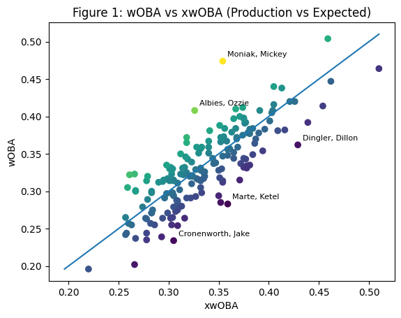
Figure 1. Data for 2026 through the end of April. R² ≈ 0.658
Figure 1 compares actual production with expected production by plotting wOBA against xwOBA for each hitter. The scatter reveals a range of divergence. Players above the line have outperformed their expected results, while those below it have produced less than their contact quality and plate appearances would suggest. Mickey Moniak, for instance, sits well above the line, indicating stronger outcomes than underlying indicators might predict. In contrast, Ketel Marte and Jake Cronenworth fall below it, suggesting that their process may be better than their results to this point. The figure does not resolve which measure is more meaningful, but it makes visible the gap between them, which serves as the starting point for a proposal I will make later in the post.
The limits of a single number
One of the best offensive metrics in wide use is wRC+ because it does something very specific. It estimates a hitter’s total offensive production, adjusts for park and league factors, and places that production on an easy-to-read scale. A 120 wRC+ means a hitter has been 20 percent better than league average. A 90 wRC+ means he has been 10 percent worse than average.
That is useful and elegant. Perhaps more importantly, it is also intentionally incomplete.
wRC+ is not trying to tell us whether a hitter’s production is sustainable. It is not trying to tell us whether he has been lucky. It is not trying to tell us whether his best events came in the most important moments. It is not trying to measure the quality of the pitchers he faced in every plate appearance.
That is not a flaw. It is a design choice.
The trouble begins when we ask wRC+ to do more than it was built to do.
The same is true of expected statistics. xwOBA can tell us something about a hitter’s contact quality and plate appearances. It can suggest whether the underlying process supports his results. But xwOBA is not the same as actual value. A lineout with a high expected value may tell us something important about skill, but it did not move the runners. It did not change the scoreboard.
The expected value and the actual value are both real, but in subtle and nuanced ways.
This is where offensive analysis becomes much more interesting.
Production, process, and context
Consider three hitters.
The first hitter has a high wRC+, a high xwOBA, strong exit velocity, a reasonable BABIP, and a stable strikeout-to-walk profile. There is not much mystery here. The production and the process agree. His production most likely matches his ability.
The second hitter has a high wRC+ but a modest xwOBA. His BABIP is unusually high. His barrel rate is ordinary. His hard-hit rate is fine but not exceptional. The results are good, but the foundation is less convincing. He may still be a good and accomplished hitter, but the numbers are not speaking with one voice.
The third hitter has a poor batting average and mediocre production, but his xwOBA is strong. He hits the ball hard. His launch angle is improving. His walk rate is stable. His BABIP is low. This is the kind of player who may be better than his surface line suggests.
Analyzing the first hitter is straightforward; the real investigation begins with the second and third hitters. They are not noteworthy because one number tells us the answer. They are interesting because several numbers are arguing with each other.
That disagreement deserves to be measured.
Offensive Friction
I am calling this idea Offensive Friction (OFx).
Offensive Friction is not meant to replace wRC+, wOBA, OPS+, xwOBA, BABIP, or Statcast indicators. It is meant to sit beside them and mediate disputes.
Its purpose would be simple: Identify hitters whose offensive indicators disagree.
A low-friction hitter is easy to interpret. His production, expected production, contact quality, plate discipline, and luck indicators all point in roughly the same direction.
A high-friction hitter is harder to interpret. His numbers contain tension. One part of the profile says breakout. Another says regression. One part says unlucky. Another says limited. One part says star. Another says mirage. That tension is the signal.
In conceptual terms:
Offensive Friction = the variance among a hitter’s standardized offensive indicators
The inputs could include:
wRC+
xwOBA
BABIP
Barrel rate
Hard-hit rate
Average exit velocity
Launch angle
Walk rate
Strikeout rate
Chase rate
Context value
Each metric would be converted into a standardized score. Then we would measure how widely those scores spread apart.
A hitter whose scores cluster together would have low Offensive Friction.
A hitter whose scores scatter across the map would have high Offensive Friction.
This would not tell us who is having the better season, but it would tell us who deserves a closer look.
Once the indicators are standardized, we can ask a different question: not who has the best offensive production, but whose profile contains the most tension.
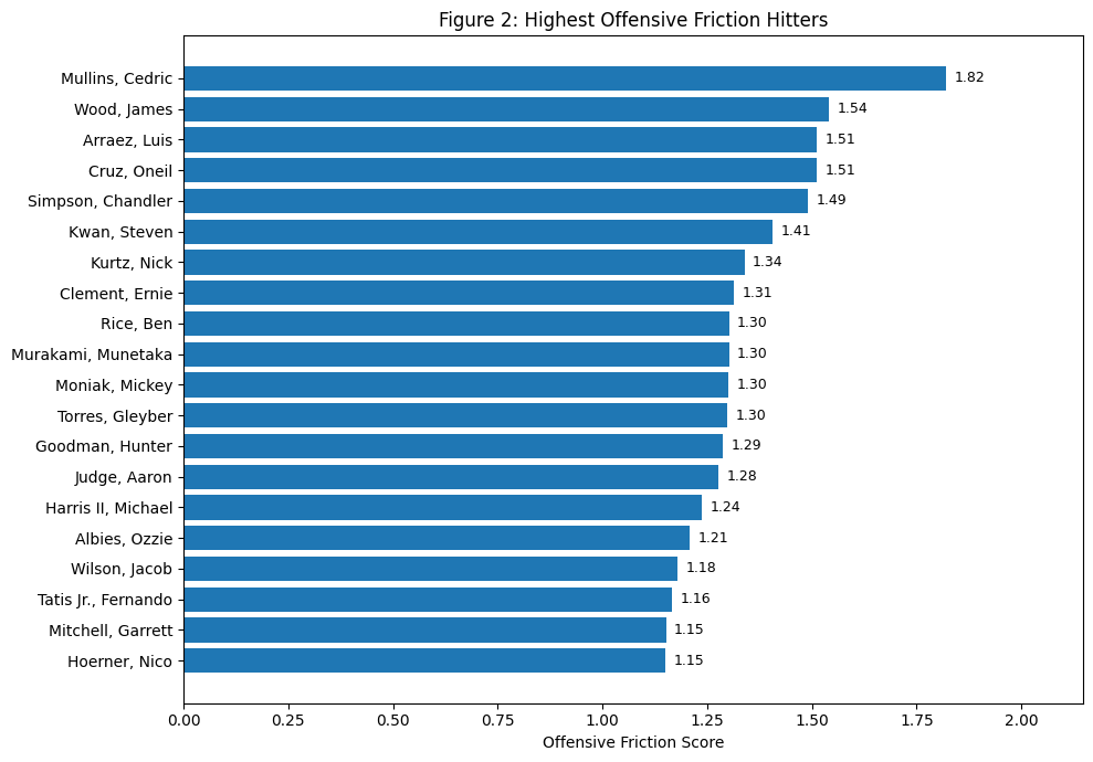
Figure 2. Data for 2026 through the end of April.
Figure 2 introduces the idea of Offensive Friction in its simplest form by ranking hitters according to the degree of disagreement across their standardized offensive indicators. Rather than asking who has been most productive, the figure asks whose statistical profile is the most internally unstable. Players at the top of the chart, such as Cedric Mullins, exhibit the widest spread across metrics, with some indicators suggesting strength and others pointing in a different direction. Others near the top, including Luis Arraez and O’Neil Cruz, show similar patterns of tension. By contrast, players further down the list have profiles in which the underlying numbers cluster more tightly together, indicating a more coherent and interpretable performance. The purpose of the figure is not to evaluate quality, but to identify where the numbers themselves are in disagreement, highlighting the players who warrant closer inspection.
Why disagreement matters
This is the part that is perhaps most interesting.
Baseball analysis usually treats disagreement as a problem to be solved. One metric says this. Another metric says that. We want to know which one is right, or at least most useful.
But maybe the disagreement itself is what we should be after.
A hitter with a 150 wRC+ and a 150 xwOBA+ is excellent, but not analytically mysterious. His results and process agree.
A hitter with a 150 wRC+ and a 100 xwOBA+ is different. His season may be productive, but the underlying indicators suggest caution. Maybe he has been fortunate. Maybe he has exploited a particular defensive pattern. Maybe he has hit a few poorly struck balls at perfect times. Maybe the expected model is missing something.
Either way, the disagreement is worth studying.
The reverse is also true. A hitter with an 85 wRC+ and a 125 xwOBA+ may be a rebound candidate. His results are poor, but the contact quality suggests something better. That does not mean improvement is guaranteed. It means the surface line may not be telling the full story.
This is where Offensive Friction could be useful. It would act as an alert system.
High friction would say: Do not stop at the leaderboard. Something interesting is happening here.
The equilibrium idea
There is another way to think about this.
Baseball performance is often moving toward equilibrium.
A hitter’s batting average may run hot for a few weeks. His BABIP may drift above his career norm. His home run rate may spike. His strikeout rate may briefly collapse. Early in a season, small samples can make ordinary players look transformed and struggling players look finished.
But over time, many numbers begin to settle.
Not always. Players do change. Swing paths change. Plate discipline changes. Strength changes. Health changes. Aging changes everything.
Still, the concept of equilibrium matters.
A hitter is close to offensive equilibrium when his production matches his process. His wOBA is close to his xwOBA. His BABIP is not wildly out of line with his batted-ball profile. His strikeout and walk rates fit his established skill set. His power output would be supported by contact quality.
A hitter is out of equilibrium when those pieces do not line up.
That disequilibrium can mean several things.
It can mean luck.
It can mean injury.
It can mean a real skills change.
It can mean a player is being misread by traditional statistics.
It can mean the model is missing something.
This is why the disagreement matters. It is not just noise. It is a clue.
A possible classification system
Offensive Friction could help classify hitters into types.
| Type | Profile | Interpretation |
| I | High production, high process, low friction | The numbers agree |
| II | High production, weak process, high friction | Results may be ahead of skill |
| III | Low production, strong process, high friction | Better than the surface line |
| IV | Ordinary overall profile, high leverage value | Value concentrated in key moments |
| V | Average production, average process, low friction | Little mystery |
| VI | Strong changes across some indicators, conflict across others | Real change or temporary spike |
This kind of framework would be more useful than another leaderboard.
It would not simply tell us who ranks first. It would tell us what kind of interpretive problem each hitter presents.
That is important because a baseball season is not just a sorting exercise, it is a diagnostic exercise. We are not only asking who has performed well. We are asking what that performance means.
Friction tells us that the numbers disagree. The Equilibrium Gap tells us the direction of that disagreement.
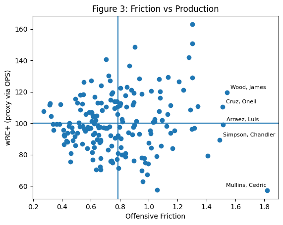
Figure 3. Data for 2026 through the end of April.
Figure 3 places Offensive Friction alongside overall production, allowing us to see not just how well a hitter has performed, but how stable or interpretable that performance is. The horizontal axis measures the degree of disagreement among a player’s underlying indicators, while the vertical axis reflects his overall offensive output. The quadrant structure provides a simple framework: hitters in the upper left combine strong production with internal consistency, while those in the upper right are producing at a high level but with profiles that contain tension, making them less certain going forward. The lower right quadrant is especially interesting, as it captures players with weak results but high friction, suggesting that their underlying indicators may point to something better than the surface line. Cedric Mullins, for instance, falls into this region, pairing low production with a highly unstable profile. Meanwhile, players like Luis Arraez and O’Neil Cruz occupy the high-friction, higher-production space, where strong results coexist with less agreement beneath the surface. The figure does not resolve which interpretation is correct, but it identifies where the most interesting analytical questions reside.
The philosophical problem
Every baseball metric contains a philosophy.
OPS values simplicity.
wOBA values proper event weighting.
wRC+ values context-neutral offensive production.
xwOBA values underlying process.
WPA values game situation and timing.
BABIP points us toward luck, contact profile, and defensive interaction.
None of these numbers is the whole truth. Each one chooses a version of its specific truth.
That is why one-number arguments can become misleading. A player can be more valuable than he is skilled. He can be more skilled than he has been productive. He can be productive in a way that is unlikely to continue. He can be unlucky without being good. He can be lucky and still be excellent.
The categories overlap, but they are not identical.
This is why I am prososing the idea of Offensive Friction. It does not pretend to solve all of this. It begins by admitting the complexity.
The goal is not to flatten the hitter into one final answer.
The goal is to identify where the narrative bends or even breaks.
What this would add
A metric like Offensive Friction would be especially useful early in the season.
In April and May, leaderboards are unstable. A few bloop hits can inflate a batting average. A few warning-track outs can suppress a slugging percentage. One series in a favorable ballpark can distort the picture. One bad week can make a good hitter look lost.
A friction model would help distinguish stable from unsettled performance.
It could identify:
- players whose hot starts are supported by process,
- players whose hot starts look fragile,
- players whose poor results hide strong underlying skill,
- players whose surface numbers and expected numbers are beginning to diverge,
- players whose profiles have genuinely changed.
That is more interesting than simply ranking hitters. It gives us a way to ask better questions.
The same friction score can come from very different profiles. A radar view helps show why one high-friction player may be a mirage, while another may be a hidden riser.
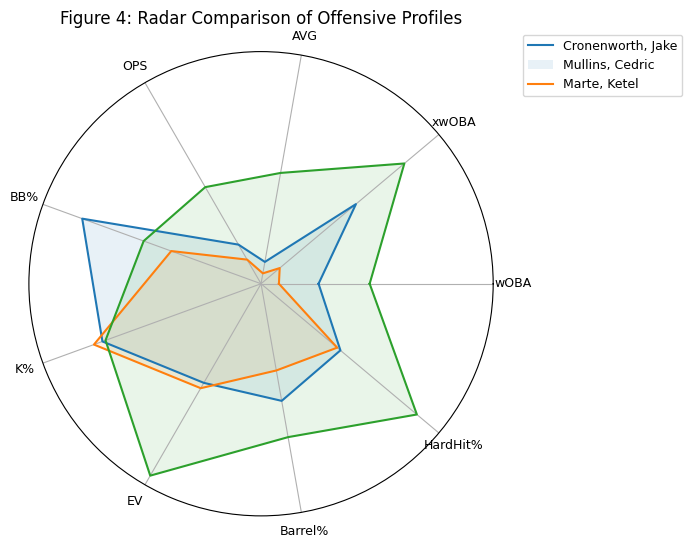
Figure 4. Data for 2026 through the end of April.
Figure 4 shifts the focus from outcomes to structure. Each polygon represents a hitter’s standardized offensive profile across several underlying indicators, allowing us to see not only how good a player has been overall, but also how his components align or diverge. A more balanced, compact shape suggests agreement among metrics and a profile closer to equilibrium. A jagged or uneven shape reveals tension, where certain indicators pull in different directions. Cedric Mullins, for example, displays a visibly uneven profile, with strengths in some areas offset by weaknesses in others, a hallmark of high friction. Ketel Marte shows a more coherent structure, with metrics that move together more consistently. Jake Cronenworth sits between these extremes. The purpose of the figure is not to rank hitters, but to reveal the internal shape of their performance, highlighting where the underlying indicators agree and where they do not.
Conclusion
The future of offensive analysis (and defensive and pitching as well) may not be another statistic that claims to replace the old ones. It just might be a model that explains why the old ones disagree.
That is the larger lesson. Baseball offense (and defense) is not a single reality. It is actual production, expected production, contact quality, plate discipline, timing, opposition, luck, and sustainability. Each metric captures part of that structure. None captures all of it.
So maybe the most interesting hitters aren’t always the best. Maybe they are the hitters whose numbers have not yet settled into agreement.
That is where the analysis should begin. Because sometimes the story is not found in the statistics themselves. Sometimes the story is found in the friction between them.
![]()