Career and Peak: Two Different Shapes of Offensive Greatness
The offensive dominance series began position by position.
Each study asked the same basic question: who separated most from his own positional peers? Catchers were compared to catchers. Shortstops to shortstops. First basemen to first basemen. Left fielders to left fielders. The purpose was not to flatten baseball history into raw totals. It was to measure distance from positional expectation.
That gave us the position winners:
C: Mike Piazza
1B: Lou Gehrig
2B: Joe Morgan
3B: Mike Schmidt
SS: Honus Wagner
LF: Barry Bonds
CF: Willie Mays
RF: Babe Ruth
But once those rankings were complete, another question became more interesting.
Not simply who won each position.
What kind of winner was each player?
That is where the career-versus-peak scatterplot becomes useful. It places every top-15 player from the eight positions onto the same map.
The x-axis measures career peer-adjusted offensive score.
The y-axis measures best seven-season peak score.
In other words:
Right = more career dominance
Up = more peak dominance
Upper right = both
Figure 1: Career Value Versus Peak Dominance Across Positions
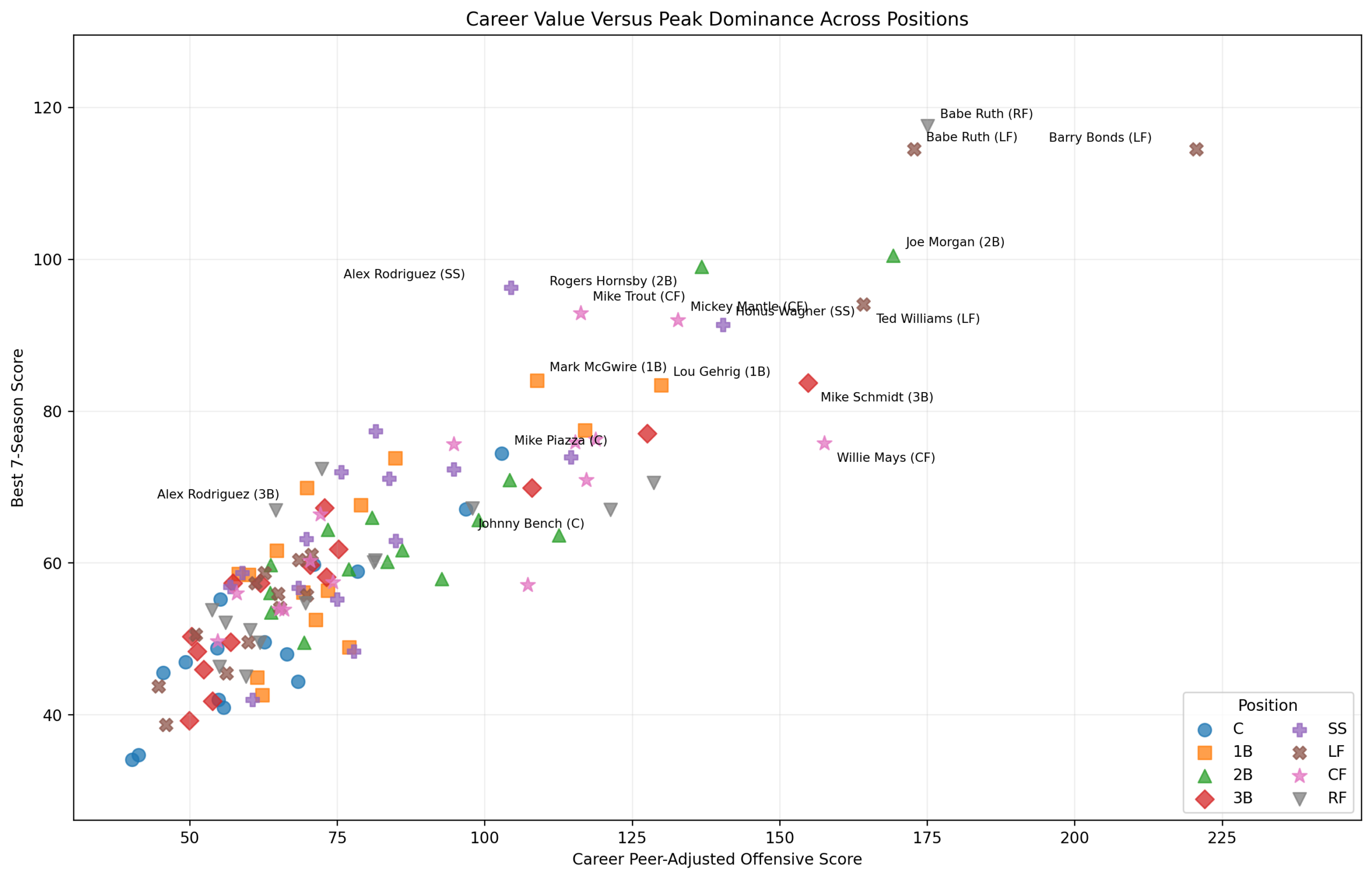
The first thing to notice is the broad diagonal pattern. Most players who have strong career scores also have strong peak scores. That makes sense. Great career value usually requires at least some great seasons.
But the figure is not just a diagonal cloud. It has regions.
There is a dense lower-left cluster: excellent players, but not historic outliers within this framework. These are top-15 players at their positions, so they are not ordinary. They are only “lower-left” because the chart includes Ruth, Bonds, Morgan, Williams, Mays, Schmidt, Wagner, Mantle, Trout, and other extraordinary cases.
Then there is the upper-middle group: players with huge peaks but less career accumulation at that position. Alex Rodriguez, Mark McGwire, Mike Trout, and Mickey Mantle fit this pattern. Their best seven-season stretches are enormous. Their career totals are strong but not as extreme as the very highest career accumulators.
Finally, there is the upper-right region.
That is where the true giants live.
Barry Bonds stands farthest to the right. Ruth stands highest. Joe Morgan sits surprisingly close to the Ruth-Bonds region. Ted Williams, Willie Mays, Mike Schmidt, Honus Wagner, and Rogers Hornsby occupy the surrounding elite space.
This is where the scatterplot becomes more than a figure. It becomes a map of offensive greatness.
Barry Bonds is the career outlier. His left-field career score of 220.6 is the highest in the full comparison. He is also extremely high on peak, but the most striking part of his profile is the x-axis. Bonds did not merely have one brilliant stretch. He accumulated peer-adjusted offensive dominance across a long left-field career.
Babe Ruth is the peak outlier. His right-field peak score is 117.5, the highest among the players in this comparison. His left-field peak is almost identical, which is fascinating. Ruth appears twice because the position-specific method treats his right-field and left-field careers separately. In both cases, the same lesson holds: Ruth’s peak offensive separation was almost beyond category.
Joe Morgan may be the most surprising point on the chart. His second-base career score of 169.3 and peak score of 100.5 place him near the greatest offensive forces in the entire study. That does not mean Morgan was a better raw hitter than Ruth, Bonds, or Williams. It means that relative to second basemen, Morgan created enormous separation.
That is exactly why positional peer adjustment matters.
Bonds: The Career Monster
Bonds’s position on the chart is unmistakable. He is the farthest-right point and still very high on peak.
That combination is rare.
Some players have extreme peaks. Some have long careers. Bonds has both. His best seven seasons rival Ruth’s left-field peak, while his career total leaves the rest of left field far behind.
This reinforces the left-field conclusion. Bonds was not just the best offensive left fielder by this model. He was the most extreme career dominance case in the entire cross-position comparison.
The caveat is obvious: the model measures performance, not the historical controversies around performance. It does not adjudicate the moral or institutional questions attached to the era. It simply measures how far a player stood above his positional peers in the data.
By that measurement, Bonds is the career outlier.
Ruth: The Peak Monster
Ruth’s point tells a different story.
Whether treated as a right fielder or left fielder, he sits at the top of the peak scale. That is important because it shows that Ruth’s dominance was not just a function of one positional classification. His offensive separation follows him.
In the right-field study, Ruth won clearly. In the left-field study, he finished behind Bonds in career value but essentially tied him in seven-season peak. In the combined scatterplot, Ruth becomes the purest symbol of peak dominance.
He is not merely great. He is the player who defines the upper edge of the y-axis.
This gives the series a useful distinction:
Bonds is the career outlier.
Ruth is the peak outlier.
Both are historically enormous, but they are enormous in slightly different ways.
Morgan: The Surprise of the Series
Joe Morgan’s location may be the most intellectually interesting result.
Most people expect Bonds and Ruth to dominate an offensive comparison. Morgan is different. He does not carry the same raw slugging mythology. He does not live in the same popular imagination as Ruth, Bonds, Williams, Mantle, or Mays.
But this is not a raw home-run leaderboard. It is a peer-adjusted positional study.
Morgan dominated second-base offense through a rare combination of on-base skill, walks, power for the position, runs, and sustained value. His career and peak scores both stand out.
This means Morgan was not simply the winner of a weak position. Second base had a strong field: Rogers Hornsby, Eddie Collins, Charlie Gehringer, Jeff Kent, Robinson Canó, Chase Utley, Roberto Alomar, and others. Morgan still separated.
The scatterplot confirms the earlier second-base finding:
Morgan’s case is not a curiosity. It is one of the strongest peer-adjusted offensive cases in the whole project.
Mays: Career Greatness in a Deep Field
Willie Mays sits high on career value, but not as high on peak as some might expect. That does not weaken his case. It clarifies it.
Mays won center field because he combined elite offense with extraordinary duration at the position. But center field is deep. Mantle and Trout have stronger peak arguments. Griffey, Cobb, DiMaggio, Speaker, and Edmonds also crowd the elite space.
Mays’s greatness in this framework is therefore not Ruth-like peak separation. It is the sustained ability to remain excellent in the deepest elite position.
That is a different kind of greatness.
Mays wins by endurance, balance, and breadth.
Trout, Mantle, McGwire, and A-Rod: Peak-Heavy Greatness
Several players sit high on the y-axis without reaching the far right of the chart.
That group includes:
Mike Trout
Mickey Mantle
Mark McGwire
Alex Rodriguez
Each represents peak-heavy offensive greatness.
Trout and Mantle are especially close. Both were center-field offensive monsters at their best. In the center-field study, Trout narrowly led the seven-season peak ranking, with Mantle just behind. Mays won the career and balanced argument, but Trout and Mantle defined the peak debate.
McGwire is the same kind of figure at first base. Lou Gehrig won the career and balanced argument, but McGwire had the highest first-base peak and the best individual first-base season.
Alex Rodriguez is the shortstop version. Honus Wagner won the career and balanced argument, but A-Rod had the strongest shortstop peak.
This group matters because it shows why “greatest” cannot mean only one thing.
Peak and career are related, but they are not identical.
Piazza and the Catcher Problem
Mike Piazza sits lower than the other position leaders in absolute terms. That is expected.
Catcher is structurally different.
The physical burden of the position suppresses long offensive accumulation. Catchers play fewer games, age differently, absorb more wear, and carry defensive responsibilities that do not show up in this offensive model.
So Piazza’s lower position on the chart should not be read as weakness. It should be read as positional constraint.
In the catcher study, Piazza was clearly the best offense-only catcher by this method. But when all positions are plotted together, the catcher ceiling is lower. That itself is important.
It tells us that offensive dominance is not equally available at every position.
The Scatterplot
The scatterplot does something that rankings cannot.
A ranking gives order.
A scatterplot gives shape.
It shows whether a player is a career accumulator, a peak monster, a balanced giant, or a position-constrained outlier.
For example:
Barry Bonds: career and peak giant
Babe Ruth: peak outlier
Joe Morgan: surprising career-plus-peak peer-adjusted monster
Willie Mays: career/depth winner
Mike Trout: peak-heavy modern center fielder
Mark McGwire: peak-heavy first baseman
Alex Rodriguez: peak-heavy shortstop
Mike Piazza: catcher-constrained offensive leader
These categories are more informative than a single list.
They help explain why two players can both “win” an argument in different ways. Wagner can be the greatest offensive shortstop by career dominance while A-Rod owns the peak. Mays can win center field while Trout and Mantle own the peak argument. Gehrig can win first base while McGwire owns the most explosive stretch.
That is the larger lesson.
The Main Finding
The chart suggests four broad types of offensive greatness.
First, there are career-and-peak giants. Bonds, Ruth, Morgan, Williams, and Hornsby belong near this region.
Second, there are career winners. Mays, Schmidt, Wagner, and Gehrig gain much of their case from sustained dominance.
Third, there are peak monsters. Trout, Mantle, McGwire, and A-Rod are the clearest examples.
Fourth, there are positionally constrained leaders, especially Piazza at catcher. Their absolute scores may be lower, but their positional meaning is still large.
This is why cross-position comparisons must be handled carefully. A catcher’s offensive dominance cannot be interpreted the same way as a left fielder’s. A first baseman’s separation is different from a second baseman’s. A center fielder’s career score means something different in a position with extraordinary elite depth.
The scatterplot does not erase those differences.
It makes them visible.
Conclusion
The career-versus-peak map may be the best summary figure in the entire project.
It shows that offensive greatness is not one-dimensional. It can be accumulated, concentrated, repeated, or constrained. Some players dominate because they rise higher than anyone else. Others dominate because they stay excellent longer. A few do both.
Bonds is the career outlier.
Ruth is the peak outlier.
Morgan is the great peer-adjusted surprise.
Mays is the deep-position survivor.
Piazza is the catcher exception.
Trout, Mantle, McGwire, and A-Rod are peak arguments made visible.
The position studies told us who won.
This figure tells us what those wins mean.
And that is the real value of the project.
![]()