Pitching is one of the most difficult parts of baseball to measure because it sits at the intersection of many things. A pitcher controls the ball, but not everything that happens after contact. A defense turns balls in play into outs, or fails to. A park changes the meaning of a fly ball. A league environment changes the meaning of a 4.00 ERA. A bullpen changes the way we understand a starter. A front office changes the way we understand a pitching staff.
That is why a long-term team pitching study has to be deliberate and careful. If we simply rank every team from 2001 to 2025 by ERA, we are mixing together very different run environments. A 3.70 team ERA in one season does not mean exactly the same thing as a 3.70 team ERA in another. The offensive environment changes. The baseball changes. Strikeout rates change. Bullpen usage changes. Even the definition of a normal starting pitcher changes.
So the goal of this chapter is not merely to ask which team had the lowest ERA. The better question is this: which organizations consistently produced strong pitching staffs relative to their own era?
That is a critical distinction. A team does not pitch in the abstract. It pitches in a particular season, against a particular league, with a particular baseball, inside a particular tactical environment. The 2001 Diamondbacks, the 2011 Phillies, the 2017 Guardians, the 2018 Astros, and the 2024 Braves all belong to the same broad story, but they do not belong to the same pitching world.
The data in this study covers MLB team pitching from 2001 through 2025. The core variables include ERA, ERA-, FIP, FIP-, xFIP, xFIP-, SIERA, WAR, K%, BB%, K-BB%, HR/9, HR/FB, complete games, quality starts, and several contact-profile measures. For 2001, xFIP, SIERA, and detailed contact data are incomplete, so the 2001 season is included in the main study but handled carefully where those variables are missing.
The central finding is straightforward: from 2001 to 2025, team pitching moved decisively toward strikeout-based run prevention. The best organizations were not simply the ones that prevented runs in a given season. They were the ones who repeatedly built staffs with strong strikeout-minus-walk rates, strong fielding-independent indicators, and enough depth to remain competitive across changing offensive environments.
The Dodgers stand out most clearly. Over the full 25-year period, they were the strongest pitching organization by average normalized pitching score. The Yankees, Astros, Guardians, Cubs, Red Sox, Phillies, and Braves also appear near the top. But the Dodgers are the outlier, not because of one spectacular season, but because of repeated organizational excellence.
Method: comparing teams within seasons
The first methodological problem is that pitching statistics are unstable over time. A league-average pitching staff in 2001 did not look like a league-average pitching staff in 2025. Strikeouts increased. Complete games declined. Velocity rose. Bullpen usage expanded. Home-run rates surged and retreated. If we compare raw numbers across all years, we risk confusing historical context with team quality.
To solve this, each team-season was compared only to the other teams from the same season. In other words, the 2011 Phillies were compared to the league as a whole in 2011. The 2018 Astros were compared with the league in 2018. The 2024 Braves were compared to the league as a whole. This allows us to ask which staffs were exceptional relative to the environment in which they actually pitched.
The basic within-season z-score is:
z_y(X_{i,y}) = \frac{ X_{i,y} - \overline{X}_y }{ s_y(X) }Here, ( X_{i,y}) is a statistic for team (i) in season (y), (\overline{X}_y) is the league average for that statistic in that season, and (s_y(X)) is the standard deviation across teams in that season.
For statistics where higher is better, such as WAR and K-BB%, the z-score is used directly. For statistics where lower is better, such as ERA-, FIP-, xFIP-, and SIERA, the sign is reversed. This keeps the interpretation consistent. A higher score always means better pitching.
q_{i,y,m} = \begin{cases} z_y(m_{i,y}), & \text{if higher values are better} \\ -z_y(m_{i,y}), & \text{if lower values are better} \end{cases}The overall pitching score is then the average of the available component scores:
\text{Pitching Score}_{i,y} = \frac{1}{|M_{i,y}|} \sum_{m \in M_{i,y}} q_{i,y,m}The metric set is:
M = \left\{ \text{WAR}, \text{K-BB\%}, \text{ERA-}, \text{FIP-}, \text{xFIP-}, \text{SIERA} \right\}This score is not meant to be the only possible definition of pitching quality. It is a deliberately balanced measure. It includes actual run prevention through ERA-, fielding-independent performance through FIP- and xFIP-, skill-based dominance through K-BB%, and overall value through WAR.
K-BB% is especially important because it captures the two plate appearance outcomes most directly controlled by the pitcher: strikeouts and walks.
\text{K-BB\%} = \text{K\%} - \text{BB\%}FIP also deserves special attention because it attempts to isolate the events most directly connected to the pitcher: home runs, walks, hit batters, and strikeouts.
\text{FIP} = \frac{ 13 \cdot \text{HR} + 3 \cdot (\text{BB} + \text{HBP}) - 2 \cdot \text{K} }{ \text{IP} } + c_{\text{FIP}}The constant ( c_{\text{FIP}} ) places FIP on an ERA-like scale. Because that run environment changes by season, FIP- and other indexed measures help compare teams more fairly.
The league changes: strikeouts become the center of pitching
The first figure shows the most important league-wide transformation: the rise of strikeouts.
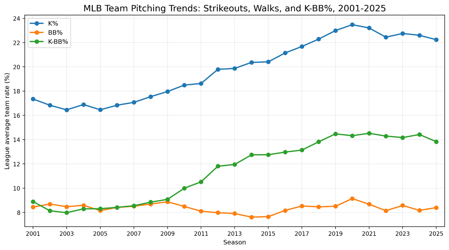
Figure 1. K%, BB%, and K-BB% trends, 2001-2025
In 2001, the league strikeout rate was about 17.3%. By 2025, it was about 22.2%. That is not a small tactical adjustment. It is a structural change in how pitching works. The modern pitching staff is built around missing bats in a way that the early 2000s staff was not.
Walk rate did not change nearly as dramatically. In 2001, the league walk rate was about 8.4%. In 2025, it was about 8.4% again. There were fluctuations in between, but the broad pattern is clear: strikeouts rose much more than walks did.
That means K-BB% increased substantially. In 2001, league K-BB% was about 8.9%. In 2025, it was about 13.8%. That is the heart of the modern pitching revolution. The best staffs are not just striking out more hitters. They are increasing the gap between strikeouts and walks.
This is why K-BB% belongs near the center of the composite score. It is simple, but powerful. It strips pitching down to a basic contest: can the staff create strikeouts without giving back too many free baserunners?
The answer, increasingly, is yes. But not all teams answered equally well.
Run prevention, FIP, and the changing meaning of ERA
The second figure compares ERA, FIP, xFIP, and SIERA over time. Note that some of the data overlaps on the same line.
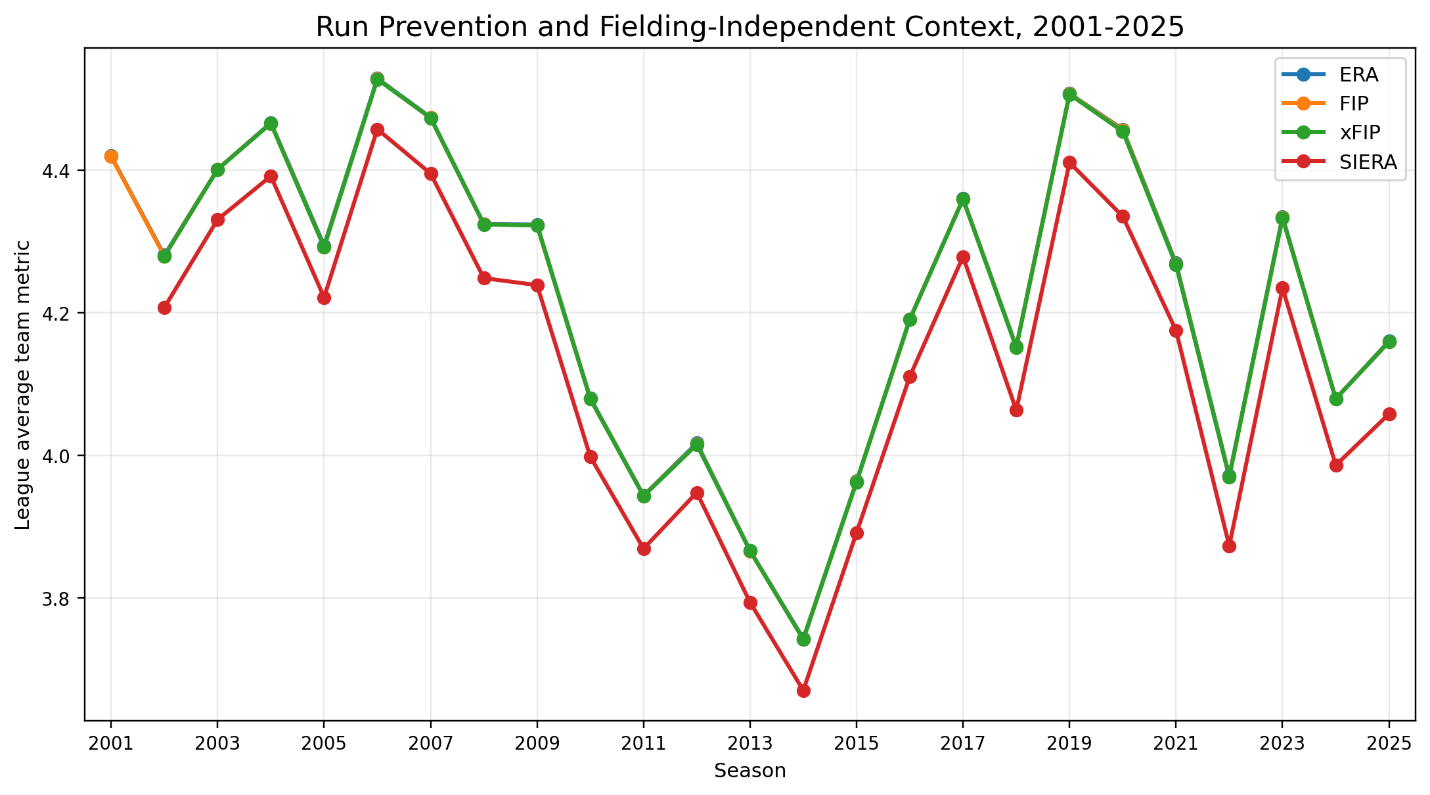
Figure 2. ERA, FIP, xFIP, and SIERA trends, 2001-2025
One of the striking features of the long-term data is that ERA does not move in one simple direction. The league ERA was about 4.42 in 2001. It fell to about 3.74 in 2014, rose to about 4.51 in 2019, and then settled around 4.16 in 2025.
That pattern matters because it reminds us that pitching quality cannot be evaluated solely by raw ERA. A team can have a lower ERA because it is genuinely better, but it can also have a lower ERA because the entire league is scoring less. Likewise, a higher ERA in a high-offense environment may not be as bad as it looks.
The 2014 season is a useful example. League run prevention was strong. ERA, FIP, xFIP, and SIERA all sat at relatively low levels. A good pitching staff in 2014 had to be judged against that lower-scoring context. The opposite problem appears in 2019, when the home-run environment pushed run scoring upward. A team that survived 2019 with strong FIP-based indicators deserves credit, given the more difficult environment.
That is why indexed statistics such as ERA- and FIP- are valuable. They tell us how a staff performed relative to league average, where lower is better.
\text{ERA-} = 100 \cdot \frac{ \text{Team ERA} }{ \text{League ERA} } \quad \text{adjusted for context}A team with an ERA- of 90 was roughly 10% better than league average by that measure. A team with an ERA- of 110 was roughly 10% worse. The same logic applies to FIP-, except the foundation is fielding-independent pitching rather than actual runs allowed.
This distinction becomes crucial when comparing staffs across 25 seasons. The 2011 Phillies and the 2018 Astros both appear as historically great staffs, but they do not look great in exactly the same way. The Phillies represent a more traditional elite rotation model. The Astros represent the modern strikeout, command, and run-prevention model.
The home-run environment
The third figure shows the home-run environment.
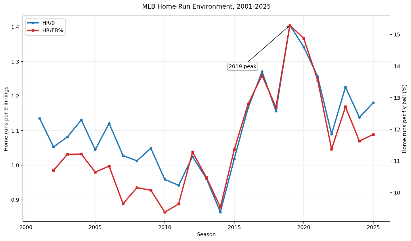
Figure 3. HR/9 and HR/FB trends, 2001-2025
Home runs are one of the most important pressure points in modern pitching analysis because they connect individual pitcher skill, batted-ball profile, park context, and league environment. In 2001, league HR/9 was about 1.14. It dipped below 1.00 in several seasons, including 2010 and 2014, then spiked dramatically in 2019, reaching about 1.41 HR/9.
The 2019 season stands out immediately. It was not merely a season with more scoring. It was a season in which the relationship between contact and damage changed. HR/FB also rose sharply, reaching about 15.3% in 2019. That created a very different environment for pitchers.
This is one reason xFIP can be useful. FIP uses actual home runs allowed. xFIP estimates performance by normalizing home-run rate relative to fly balls. Neither statistic is perfect. FIP gives pitchers the actual cost of the home runs they allowed. xFIP asks whether that home-run rate was likely to persist.
For a team-level study, the difference between FIP and xFIP can be revealing. A team with a much better FIP than xFIP may have suppressed home runs unusually well, perhaps through park effects, pitcher skill, batted-ball management, or some combination of these. A team with a much worse FIP than xFIP may have been punished by an elevated home-run rate.
The home-run environment also helps explain why season-normalization is necessary. A team pitching in 2019 faced a different kind of run-prevention problem than a team pitching in 2014. The raw numbers alone cannot tell us whether a staff was good. They have to be interpreted against the league context.
The disappearance of the complete game
The fourth figure captures one of the clearest tactical changes in baseball.
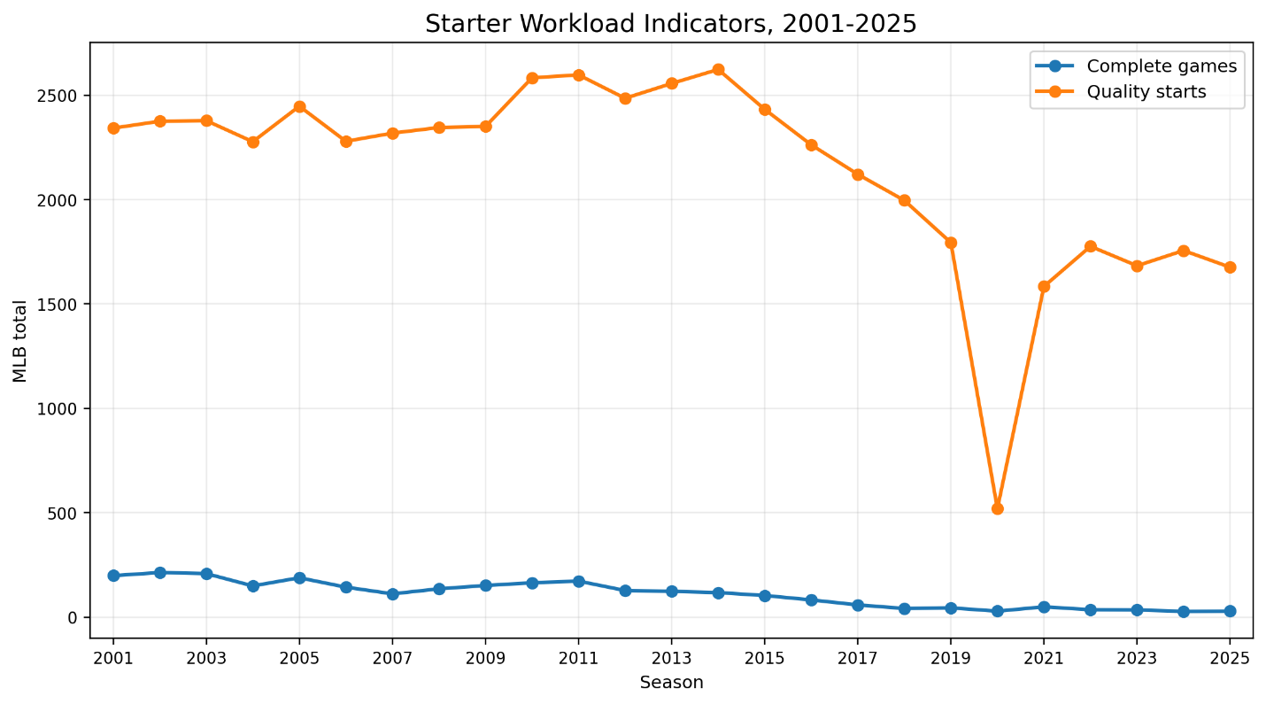
Figure 4. Complete games and quality starts, 2001-2025
In 2001, MLB teams combined for 199 complete games. In 2002, that number was 214. By 2025, it had fallen to 29.
This is not a gradual stylistic preference. It is a transformation in pitcher usage. The complete game went from a normal, if still special, part of pitching to a rare event. The starting pitcher’s job changed. The bullpen’s job changed. The manager’s job changed. The entire architecture of run prevention changed.
Quality starts also declined. In 2001, teams combined for 2,342 quality starts. In 2025, that number was 1,676. Unlike complete games, quality starts did not nearly vanish; they simply became less central to how team pitching is organized.
This matters because a traditional pitching staff was often understood through the front of the rotation. The ace mattered. The number two starter mattered. The innings-eater mattered. In the modern game, those categories still matter, but they are less complete descriptions of team pitching quality. A staff can be excellent because it has dominant starters, but it can also be excellent because it has a deep bullpen, matchup flexibility, velocity, strikeout depth, and player-development infrastructure.
This is one reason team-level pitching analysis is valuable. It captures the staff as an organization, not merely as a list of starting pitchers.
The organizational scoreboard
The franchise-level results show which organizations repeatedly built strong pitching staffs across the full period.
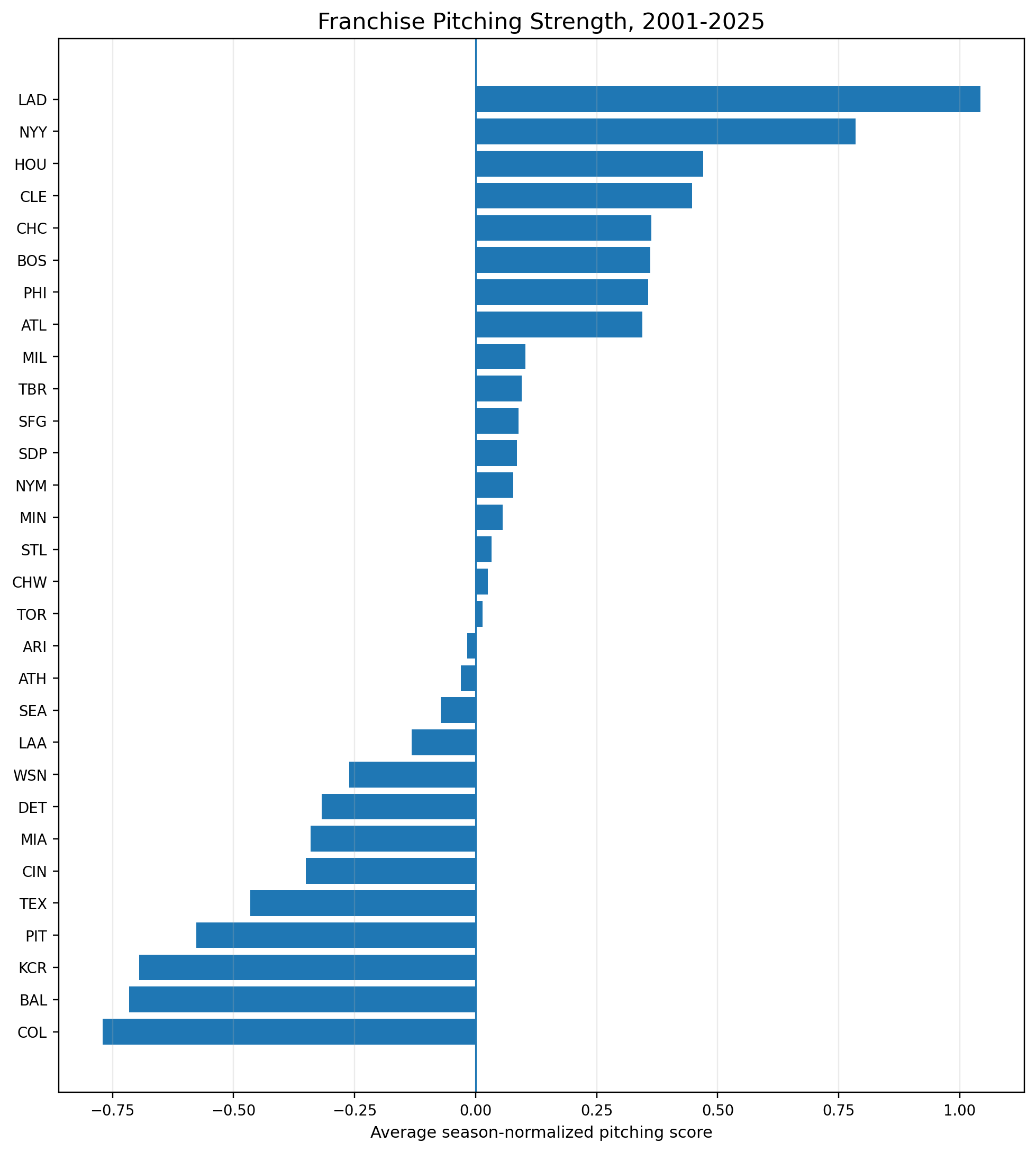
Figure 5. Franchise average pitching score, 2001-2025
The top organizations by average normalized pitching score were:
| Rank | Franchise | Avg Score | Avg Rank | Top-5 Seasons |
|---|---|---|---|---|
| 1 | LAD | 1.043 | 5.80 | 16 |
| 2 | NYY | 0.785 | 8.12 | 10 |
| 3 | HOU | 0.470 | 11.20 | 8 |
| 4 | CLE | 0.447 | 12.16 | 9 |
| 5 | CHC | 0.363 | 12.80 | 6 |
| 6 | BOS | 0.361 | 12.44 | 6 |
| 7 | PHI | 0.356 | 11.88 | 6 |
| 8 | ATL | 0.344 | 12.60 | 7 |
The Dodgers are the clear leader. Their average rank was 5.80 across 25 seasons, and they finished in the top five 16 times. That is a remarkable level of consistency.
The Yankees also stand out. They were not as dominant as the Dodgers by average score, but they were consistently strong. Their average rank was 8.12, and they had 10 top-five seasons.
Houston’s position is interesting because the Astros’ 25-year period includes both very bad years and elite years. Their full-period average ranks third, but that average hides a sharp organizational transformation. The 2013 Astros appear among the worst pitching seasons in the dataset. The 2018 and 2019 Astros appear among the strongest. That makes Houston one of the most dramatic before-and-after stories in the study.
Cleveland also deserves attention. The Guardians were not merely good in one season. They produced nine top-five seasons across the full period, including the remarkable 2017 staff and the shortened-season 2020 staff. Cleveland’s results point toward a consistent ability to develop or acquire pitching skill, especially strikeout and command skill.
The Phillies are different. Their full-period average is strong, but their story is anchored by the 2011 staff, the top single-season result in the study. The Phillies’ score is not just about consistency. It is about peak excellence.
The best team pitching seasons
The best individual team pitching seasons in the study were:
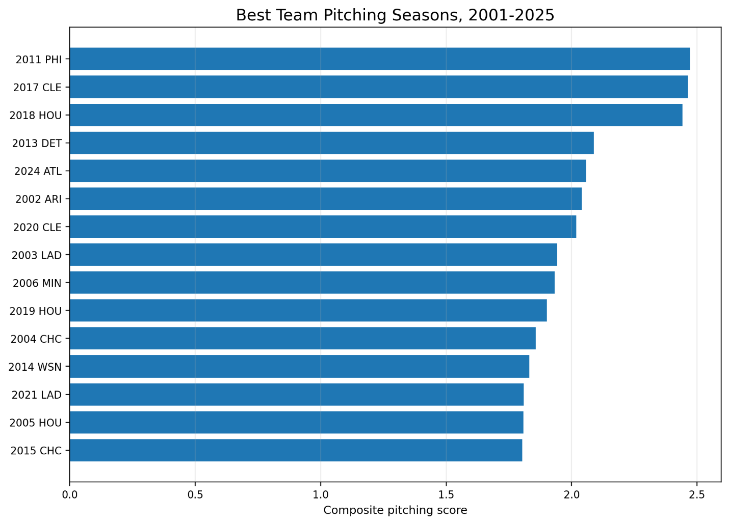
Figure 6. Best team pitching seasons, 2001-2025
| Rank | Season | Team | Score | WAR | ERA- | FIP- | K-BB% |
|---|---|---|---|---|---|---|---|
| 1 | 2011 | PHI | 2.472 | 29.45 | 78.58 | 82.88 | 14.75% |
| 2 | 2017 | CLE | 2.464 | 30.35 | 72.49 | 75.44 | 20.59% |
| 3 | 2018 | HOU | 2.442 | 28.63 | 75.89 | 78.23 | 21.17% |
| 4 | 2013 | DET | 2.089 | 26.26 | 89.31 | 82.13 | 15.79% |
| 5 | 2024 | ATL | 2.059 | 23.62 | 84.13 | 86.61 | 18.47% |
The top three are especially revealing because they show three different versions of elite pitching.
The 2011 Phillies represent the great traditional staff. Their rotation was the center of the story. Their ERA- was 78.58, meaning they were far better than league average at preventing runs. Their FIP- was also excellent at 82.88. They were not merely outperforming their peripherals. They were genuinely strong across the major indicators.
The 2017 Guardians look like a bridge between traditional excellence and modern dominance. Their ERA- was 72.49, the best among the top five listed here, and their FIP- was 75.44. Their K-BB% was 20.59%, which is extraordinary. This is a staff that combined run prevention, fielding-independent strength, and strikeout-minus-walk dominance.
The 2018 Astros are the modern model. Their K-BB% was 21.17%, the highest among these top five. Their ERA- and FIP- were both outstanding. They did not merely prevent runs. They controlled the plate appearance.
That phrase may be the key to the whole chapter: the modern elite staff controls the plate appearance. It wins by turning fewer balls into uncertain events. More strikeouts. Fewer walks. Better home-run control. Better matchup deployment. Better depth.
The 2013 Tigers are also fascinating. Their FIP- was much stronger than their ERA-, which suggests a staff whose fielding-independent indicators were better than its actual run prevention. That kind of gap is analytically useful because it may point toward defense, sequencing, bullpen leakage, park effects, or simple variation.
The 2024 Braves round out the top five, showing that the modern model remains alive. Strong WAR, strong ERA-, strong FIP-, and excellent K-BB% place them among the best team pitching seasons of the last 25 years.
The heat map view: organizational memory
The heat map shows how pitching strength is distributed over time.
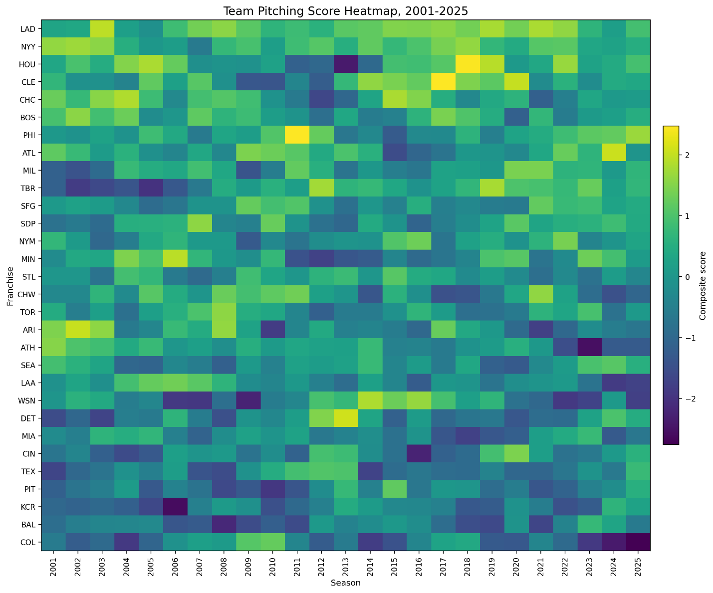
Figure 7. Team pitching score heat map, 2001-2025
A heat map is useful because it shows continuity. A table gives us leaders. A heat map gives us memory.
The Dodgers’ consistency becomes visible immediately. They do not merely spike and disappear. They remain strong across many different league environments. This suggests that their pitching success is not just the product of one rotation or one era. It is organizational.
The Yankees also show long-term strength, although with a different shape. They remain regularly above average, but the Dodgers’ top-end consistency is stronger.
Houston’s pattern is more dramatic. The Astros transitioned from poor pitching during the rebuilding years to elite pitching in the late 2010s and beyond. This makes them one of the best examples of organizational reinvention in the dataset.
Cleveland’s pattern is also compelling. The Guardians do not always (understatement) have the resources of the largest-market teams, but the pitching results are consistently strong enough to suggest a real developmental identity. Cleveland’s peak seasons are not accidents.
Tampa Bay deserves separate attention as well. The Rays do not rank at the very top over the full period, but their modern pitching identity is clear. They are one of the organizations most associated with bullpen creativity, opener usage, and flexible staff construction. A team-level study captures some of that, although a starter-reliever split would make the story even sharper.
While the heat map shows the full league, a smaller set of franchise trajectories makes the organizational story easier to see. Figure 8 follows several teams that help define the period: the Dodgers, Yankees, Astros, Guardians, Rays, Phillies, and Braves. The Dodgers show sustained excellence. Houston shows dramatic organizational reinvention. Cleveland and Tampa Bay show the value of pitching development and tactical adaptation. Philadelphia shows the difference between peak rotation dominance and long-term consistency.
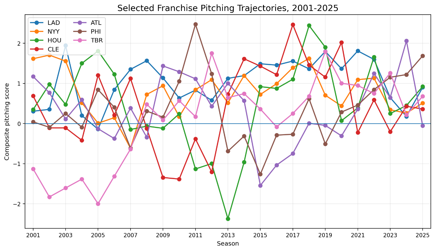
Figure 8. Selected Franchises, 2001 – 2025
Three eras of team pitching
Breaking the study into periods helps clarify the historical movement.
From 2001 to 2009, the leading organizations were:
| Period | Rank | Franchise | Avg Score | Avg Rank | Top-5 Seasons |
|---|---|---|---|---|---|
| 2001-2009 | 1 | CHC | 0.980 | 6.89 | 4 |
| 2001-2009 | 2 | LAD | 0.840 | 7.33 | 5 |
| 2001-2009 | 3 | ARI | 0.805 | 8.78 | 5 |
| 2001-2009 | 4 | BOS | 0.791 | 8.22 | 4 |
| 2001-2009 | 5 | NYY | 0.733 | 9.00 | 4 |
The early period is more rotation-centered. The Cubs, Dodgers, Diamondbacks, Red Sox, and Yankees all had strong stretches. This era still belongs partly to the older model of staff construction. Starting pitching carries more of the symbolic weight. Complete games are declining, but they have not yet collapsed to modern levels.
From 2010 to 2019, the leaders were:
| Period | Rank | Franchise | Avg Score | Avg Rank | Top-5 Seasons |
|---|---|---|---|---|---|
| 2010-2019 | 1 | LAD | 1.202 | 4.40 | 7 |
| 2010-2019 | 2 | NYY | 0.925 | 6.70 | 4 |
| 2010-2019 | 3 | WSN | 0.733 | 9.20 | 3 |
| 2010-2019 | 4 | CLE | 0.709 | 10.20 | 6 |
| 2010-2019 | 5 | TBR | 0.687 | 8.60 | 2 |
This is the period when the modern pitching environment becomes much clearer. Strikeouts rise. Velocity rises. Bullpen roles become more specialized. Cleveland, Tampa Bay, Washington, and Los Angeles all become central parts of the story.
From 2020 to 2025, the leaders were:
| Period | Rank | Franchise | Avg Score | Avg Rank | Top-5 Seasons |
|---|---|---|---|---|---|
| 2020-2025 | 1 | LAD | 1.082 | 5.83 | 4 |
| 2020-2025 | 2 | PHI | 0.941 | 5.67 | 3 |
| 2020-2025 | 3 | MIL | 0.808 | 8.00 | 2 |
| 2020-2025 | 4 | TBR | 0.808 | 6.83 | 2 |
| 2020-2025 | 5 | ATL | 0.658 | 11.33 | 2 |
The modern period is especially interesting because it includes the shortened 2020 season, the post-2020 workload reset, and the continuing dominance of strikeout-based staff construction. The Dodgers remain first. The Phillies rise. The Brewers and Rays become central examples of modern pitching development and staff management. The Braves also emerge strongly, especially with the 2024 season.
The worst seasons and the cost of weak pitching infrastructure
The worst team pitching seasons are just as revealing as the best ones.
At the bottom of the dataset are seasons such as the 2025 Rockies, 2006 Royals, 2023 Athletics, 2024 Rockies, and 2013 Astros. These seasons combine weak WAR, poor run prevention, poor FIP-based indicators, and low K-BB%.
The 2025 Rockies had a pitching score of -2.757, with a 125.19 ERA-, 119.75 FIP-, and only an 8.47% K-BB%. The 2006 Royals were similarly poor, with a 124.43 ERA-, 118.20 FIP-, and a 4.15% K-BB%. The 2023 Athletics had a 132.94 ERA-, 122.15 FIP-, and 9.49% K-BB%.
These are not merely bad ERAs. They are broad staff failures. When a team is poor in both run prevention and fielding-independent indicators, the problem is deeper than sequencing or defense. It suggests that the staff is not controlling the strike zone, not limiting damaging contact enough, and not producing enough value.
The 2013 Astros are especially important because they later became one of the strongest pitching organizations in the study. That contrast gives us a natural case study in organizational transformation. Bad pitching staffs do not have to remain bad forever. But the transformation requires more than one good pitcher. It requires a system.
What the study suggests
This first pass suggests several conclusions.
First, team pitching from 2001 to 2025 became increasingly strikeout-centered. The rise in K% and K-BB% is the central statistical movement of the period. It changed what good pitching looks like.
Second, raw ERA is not enough for a long-term study. ERA remains important because runs allowed are real. But ERA must be placed next to FIP, xFIP, SIERA, K-BB%, and indexed measures such as ERA- and FIP-. Otherwise, we risk mistaking league environment for team quality.
Third, complete games and traditional starter workload declined dramatically. This changes how we should think about team pitching. A great staff is no longer just a great rotation. It is a complete run-prevention system.
Fourth, the Dodgers are the strongest pitching organization of the 2001-2025 period. Their dominance is not just peak dominance. It is consistency. They averaged a top-six pitching rank across 25 seasons and finished in the top five 16 times.
Fifth, several organizations deserve deeper case studies. The Astros show organizational reinvention. The Guardians show player-development strength. The Rays show tactical creativity. The Phillies show the power of peak rotation excellence. The Braves show modern staff strength. The Yankees show long-term high-level stability.
Conclusion: pitching as organizational identity
The most important lesson from this study is that pitching is no longer best understood as a collection of individual arms. At the team level, pitching has become an organizational identity.
The best teams do not merely find pitchers. They shape pitching environments. They develop velocity. They manage workloads. They build bullpens. They optimize matchups. They control the strike zone. They use data to turn raw stuff into repeatable advantage.
That is why the Dodgers’ long-term record matters. It is not just that they had good pitchers. Many teams have good pitchers for a year or two. The Dodgers repeatedly built strong pitching staffs across different run environments, tactical eras, and roster cycles.
The same broader lesson applies to Houston, Cleveland, Tampa Bay, Milwaukee, Atlanta, Philadelphia, and New York. The details differ, but the underlying pattern is the same. Modern pitching excellence is systemic.
From 2001 to 2025, baseball shifted toward a game in which the best staffs increasingly controlled plate appearances. Strikeouts rose. Walks became more costly. Home runs reshaped risk. Complete games disappeared. Bullpens expanded. The old image of pitching as one starter carrying a game into the ninth inning gave way to something more distributed, more specialized, and more organizational.
The great pitching staffs of this period are therefore not just statistical outliers. They are historical markers. They show how the game changed, and how the smartest organizations changed with it.