Statistical graphics are often acts of compression.
A histogram takes individual observations and places them into intervals. A box plot goes further, reducing a distribution to a handful of landmarks. A density plot replaces the observations with a smooth estimate of their underlying shape. Each representation makes the data easier to understand by deliberately discarding some of their detail.
Usually, that is exactly what we want. A dataset containing ten thousand observations would be nearly useless if our only option were to stare at ten thousand numbers.
The stem-and-leaf plot takes a different approach.
It organizes the data visually while preserving the individual observations. Instead of choosing immediately between the raw numbers and a summarized picture of them, it gives us something of both. We can see the shape of the distribution, but we can also recover the values that created that shape.
That combination is unusual. It is also the reason the stem-and-leaf plot deserves more respect than its modest reputation might suggest.
The method is often introduced early in statistics courses and then quietly abandoned. Students learn to separate a number into a stem and a leaf, complete a few exercises, and move on to histograms, box plots, scatterplots, and regression. The stem-and-leaf display can therefore acquire the reputation of being a teaching device rather than a serious statistical tool.
That misses its deeper value.
A stem-and-leaf plot raises one of the most important questions in data analysis:
How much of the original data should we give up in order to see its structure more clearly?
That question extends far beyond stem-and-leaf plots. It lies near the heart of statistics itself.
Seeing the Distribution Without Losing the Observations
Consider a small dataset:
12, 14, 17, 21, 22, 22, 25, 28, 31, 34, 38, 39
Presented as a row of numbers, the observations are complete. Nothing has been lost.
But the structure is not particularly obvious.
We can improve matters immediately by sorting them:
12, 14, 17, 21, 22, 22, 25, 28, 31, 34, 38, 39
Now the range becomes easier to see. Repeated values are noticeable. The center is beginning to emerge.
A stem-and-leaf plot reorganizes the same information:
1 | 2 4 7
2 | 1 2 2 5 8
3 | 1 4 8 9
with the key:
2 | 5 = 25
The tens digit forms the stem. The ones digit forms the leaf.
The observation 25 becomes:
2 | 5
The observation 38 becomes:
3 | 8
And so on.
The important point is not merely that the data have been rearranged. It is that the rearrangement reveals a distribution.
The twenties contain the greatest concentration of observations. There are fewer values in the teens. The thirties contain several observations but are not as dense as the twenties. The values extend from 12 to 39.
We are seeing both the forest and the trees. That is difficult to accomplish with most statistical graphics.
Figure 1. From Raw Data to a Stem-and-Leaf Plot
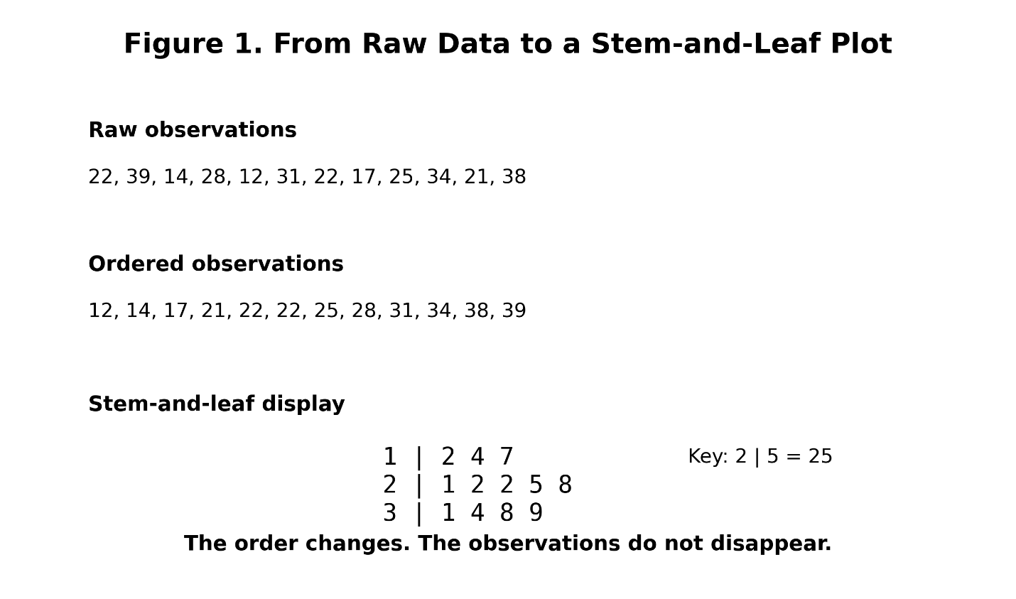
Figure 1 illustrates the transformation from an unsorted list to an ordered list and finally to the stem-and-leaf display. The important thing to notice is that the observations survive every step. Their arrangement changes, but the values themselves remain available.
A histogram would already have begun to sacrifice that information, while a box plot would sacrifice much more.
The stem-and-leaf plot delays the sacrifice, and I have always found that noteworthy.
What the Plot Reveals
Once the observations are arranged in a stem-and-leaf display, several properties of the distribution become immediately visible.
Consider another example:
1 | 8 9
2 | 0 1 1 2 3 4 5 7 8 9
3 | 0 0 1 2 3 4 6 8
4 | 1 3
5 | 9
Most of the data fall in the twenties and thirties. The distribution becomes thinner as we move toward either extreme.
The value 59 stands apart. That does not prove that 59 is an outlier in any formal statistical sense. Nor does it tell us why the value is unusual. It may be a legitimate observation, a measurement error, a member of another population, or simply an improbable value from the same population.
But the display has done something useful. It has drawn our attention to it, and that is a central purpose of exploratory data analysis.
A good exploratory graphic does not necessarily answer the question at hand. Often, its most important contribution is telling us which question to ask next.
Center
Because the values are ordered, the median can be obtained directly.
Return to the twelve observations:
12, 14, 17, 21, 22, 22, 25, 28, 31, 34, 38, 39
There are twelve values, so the median is the average of the sixth and seventh observations:
\mathrm{Median} = \frac{22+25}{2} = 23.5There is no need to reconstruct the dataset from a graph. The observations are already there.
Spread
The minimum and maximum are equally obvious.
\mathrm{Range} = x_{\max} - x_{\min}For this dataset:
\mathrm{Range} = 39-12 = 27Again, the calculation is simple because the display has preserved the values.
Quartiles
The same ordered structure gives us access to the quartiles. Once the first and third quartiles have been identified, the interquartile range follows:
\mathrm{IQR} = Q_3-Q_1This establishes a direct connection between stem-and-leaf plots and box plots.
The box plot may look like an entirely different graphical object, but its landmarks come from the same ordered data. The stem-and-leaf display allows us to see the observations from which those landmarks were calculated.
The box plot presents the summary; the stem-and-leaf plot reveals the evidence behind it.
Figure 2. From Stem-and-Leaf Plot to Box Plot
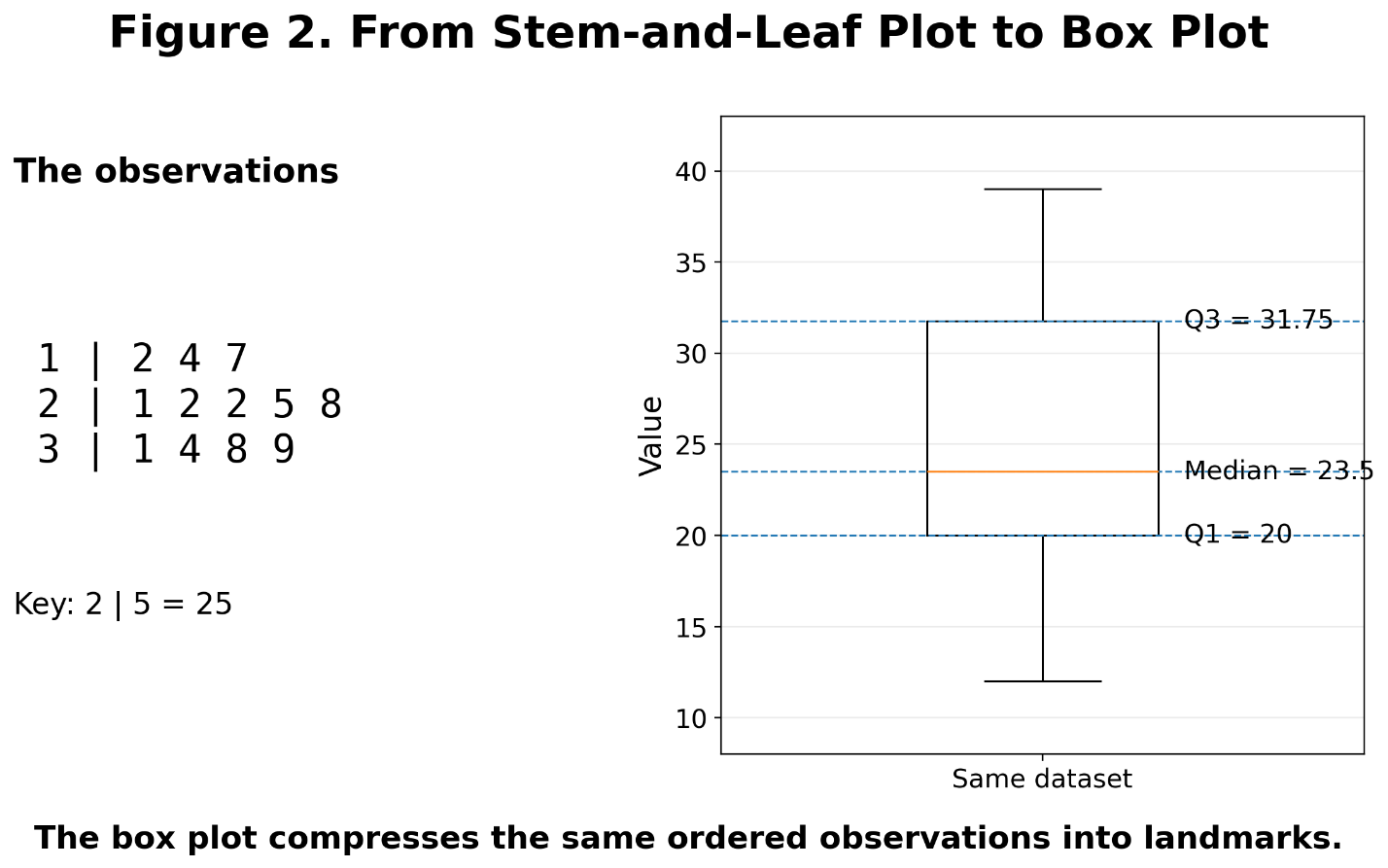
Figure 2 makes that relationship explicit. The same dataset appears first as individual observations and then as a box plot. The first quartile, median, and third quartile have not magically appeared; they were extracted from the ordered values.
This is interesting and important because every summary statistic conceals the observations from which it was derived.
The stem-and-leaf plot keeps them visible a little longer, which can be very useful.
What Gets Lost When We Summarize
There is nothing inherently wrong with losing information; statistics would scarcely be possible without it.
The mean of a dataset compresses many observations into one number. The standard deviation compresses the pattern of variation into another. A regression model may reduce thousands of observations to a handful of coefficients. A box plot may represent a large distribution with a few lines and perhaps some points indicating unusual observations.
Compression makes patterns manageable, but it always comes at a cost. The stem-and-leaf plot is interesting because that cost is unusually small.
The histogram
Suppose we have the following observations:
21, 22, 22, 23, 24, 25, 27, 28, 29
If we construct a histogram using a single bin from 20 through 29, every observation appears inside the same bar we learn that there are nine observations in the twenties.
We no longer know where they are within the twenties.
Another dataset might be:
20, 20, 20, 20, 25, 29, 29, 29, 29
Under the same binning scheme, it could produce the same bar, yet the internal arrangements of the two datasets are dramatically different.
The histogram has not made an error; it has answered a different question.
It tells us how many observations fall within an interval; it does not guarantee that the observations themselves are preserved.
Figure 3. Same Histogram, Different Data
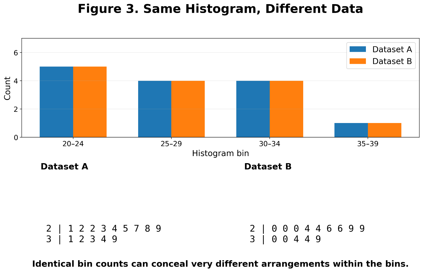
Figure 3 demonstrates the problem. Two datasets can produce identical bin counts even though the locations of the observations within those bins differ considerably.
The broader lesson is important. A histogram is partly a function of the data and partly a function of the bins we choose. Changing the bin width may change the apparent shape.
That does not make histograms unreliable. It simply means that their visual structure depends on the analyst’s decision.
The box plot
The box plot compresses even more aggressively.
Two datasets can have similar quartiles and medians while possessing noticeably different internal structures. One might be evenly distributed, another might contain clusters, a third could contain a large gap. Yet their box plots may look surprisingly similar.
Figure 4. Similar Box Plots, Different Internal Structure
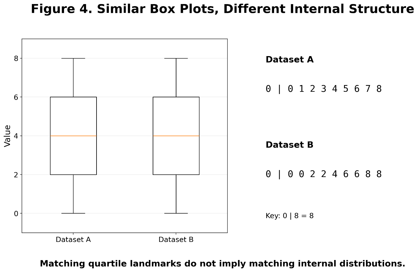
The value of Figure 4 lies in the contrast. The box plots suggest similarity because the important quartile landmarks are alike. The stem-and-leaf displays reveal differences inside those landmarks.
Neither representation is wrong, they are simply preserving different information.
The box plot asks:
Where are the important summary locations of the distribution?
The stem-and-leaf plot asks:
How are the observations actually arranged?
Those are different statistical questions.
Gaps, Clusters, and Shape
One of the strongest uses of a stem-and-leaf display is its ability to reveal local structure.
Consider:
1 | 1 2 3 4
2 | 0 1 2 3
3 |
4 | 5 6 7 8
The thirties are empty, that absence is difficult to overlook.
Perhaps the data contain two populations. Perhaps some process separates low observations from high ones. Perhaps the apparent gap is nothing more than chance.
The display cannot tell us which explanation is correct; it can tell us that something interesting has happened.
A box plot may conceal the gap almost completely. A histogram may show it, but whether it does can depend strongly on the chosen bins.
The stem-and-leaf display shows the absence directly because the missing observations remain missing in plain sight.
Figure 5. A Distribution With a Gap
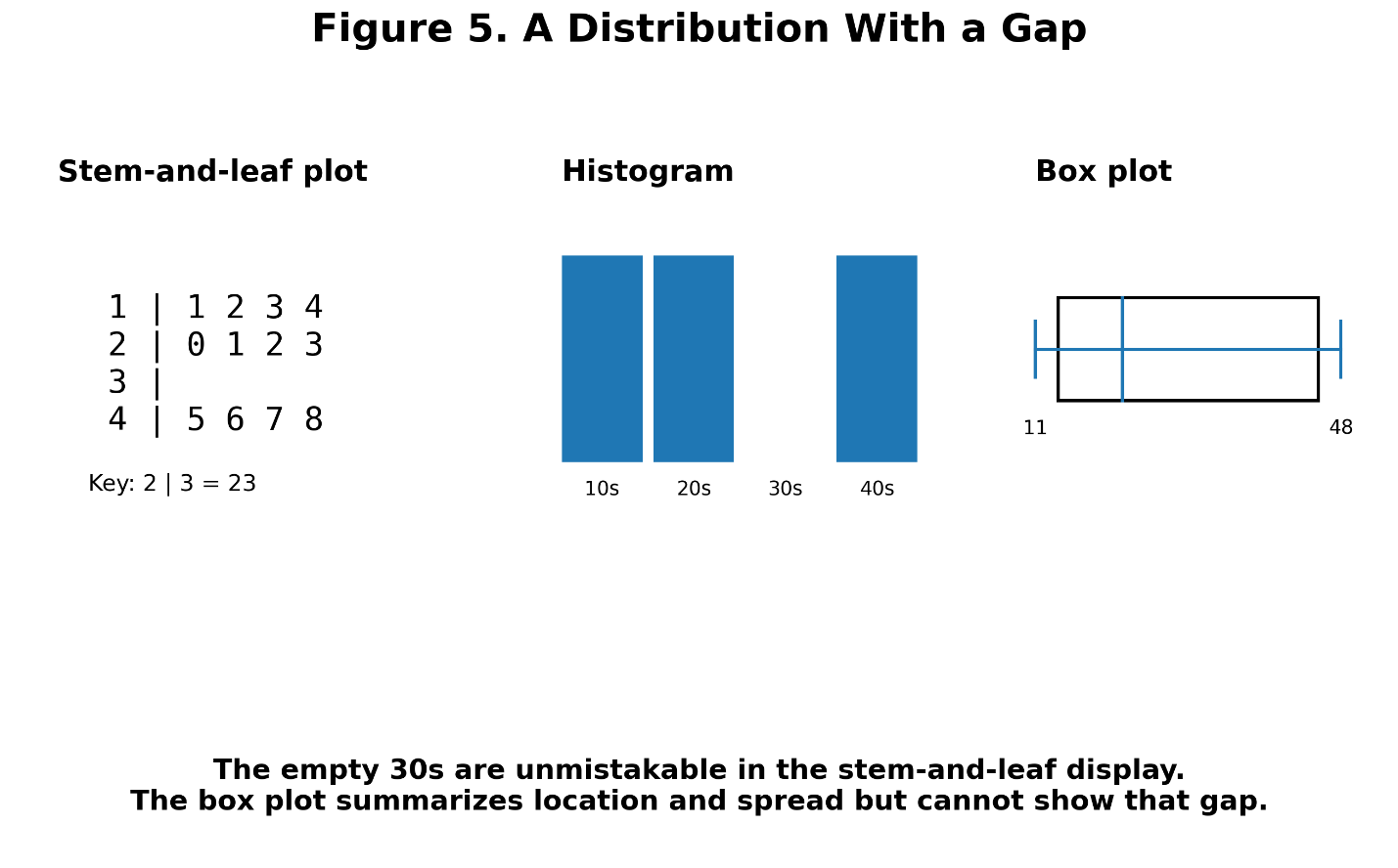
Figure 5 compares the same distribution using a stem-and-leaf plot, a histogram, and a box plot. Each display is useful, but the missing region is most literal in the stem-and-leaf representation.
This is one reason such plots are particularly valuable with small datasets. At that scale, individual observations still matter.
A gap consisting of five missing values may be statistically and scientifically interesting. When the dataset contains five million observations, preserving every value becomes much less useful. Scale changes the problem.
Resolution Is a Choice
Stem-and-leaf plots may appear objective because the observations themselves remain present. Yet even here, the analyst makes decisions.
Suppose many observations fall in the twenties:
2 | 0 0 1 1 2 2 3 4 4 5 5 6 6 7 7 8 8 9 9
The row is crowded.
We can split the stem:
2 | 0 0 1 1 2 2 3 4 4
2 | 5 5 6 6 7 7 8 8 9 9
The first line contains leaves from 0 through 4.
The second contains leaves from 5 through 9.
Nothing about the underlying data has changed. Only the visual resolution has changed.
Figure 6. Ordinary Stems Versus Split Stems
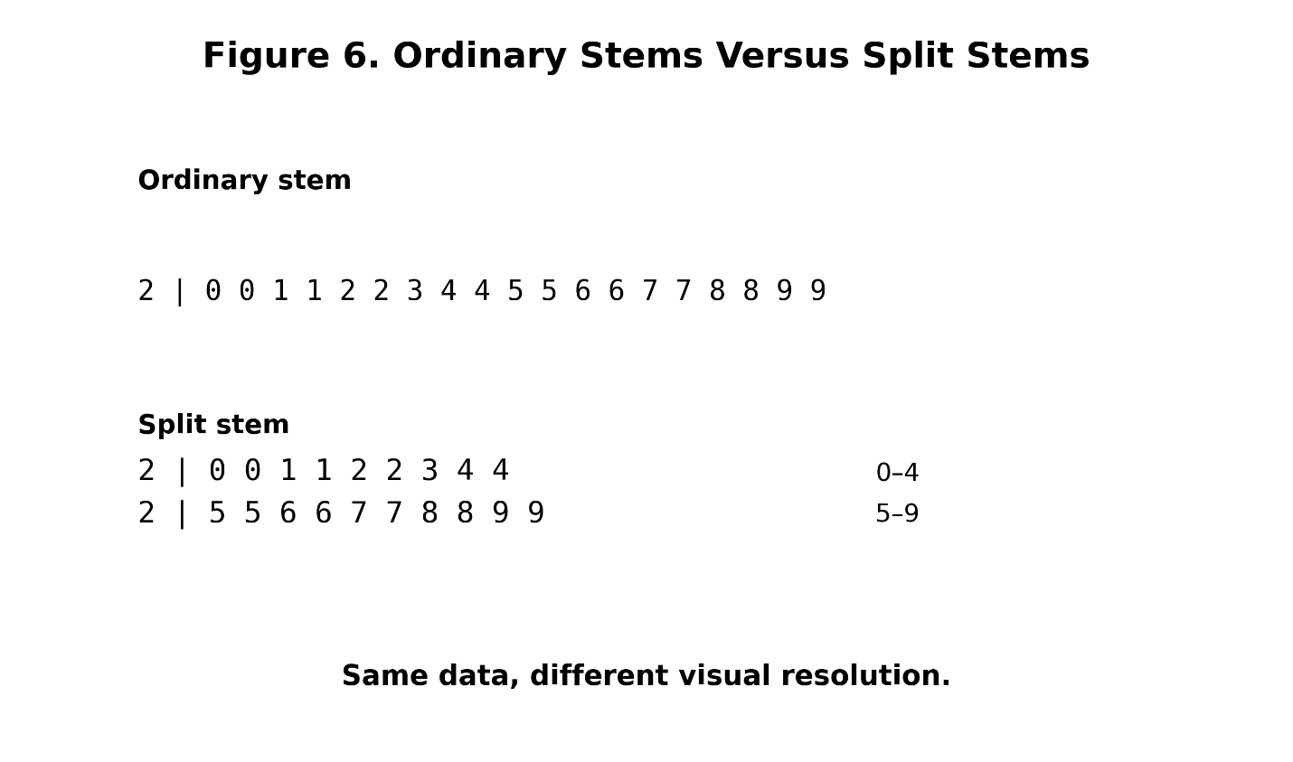
This is closely related to the choice of bin width in a histogram. Broad histogram bins conceal local variation. Narrow bins reveal more detail but can make the plot noisy.
The same tradeoff appears here. Large stems may hide structure while very fine stems may fragment the display.
There is no universal setting that is always best. This point is worth emphasizing because it applies to nearly every form of visualization. Graphs do not simply reveal data, they interpret them.
A histogram requires bins. A density plot requires a smoothing parameter. A map requires a projection. A box plot requires conventions about whiskers and outliers. Even axis limits can affect how dramatic a pattern appears.
The stem-and-leaf plot is no exception. Retaining the observations does not eliminate judgment; it merely makes one kind of information loss less severe.
The importance of the key
Another apparently trivial detail is actually essential.
Suppose we see:
12 | 3
What does it mean?
123?
12.3?
1.23?
The plot cannot tell us.
The key must.
For example:
12 | 3 = 12.3
or:
12 | 3 = 123
A stem-and-leaf display without a clear key is incomplete. This becomes especially important when the data contain decimals.
Suppose the observations are:
1.2, 1.4, 1.7, 2.1, 2.2, 2.8
We might display them as:
1 | 2 4 7
2 | 1 2 8
with the key:
1 | 2 = 1.2
The structure is unchanged. Only the decimal interpretation has moved.
Negative values can also be displayed, though the notation becomes less intuitive because the direction of numerical ordering must be handled carefully. In some situations, a dot plot or histogram will be easier to read. No statistical graphic is best in every circumstance.
Comparing Two Distributions
Stem-and-leaf plots are particularly interesting when comparing two groups. A back-to-back display places the stems in the center and the leaves of the two groups on opposite sides:
Group A Stem Group B
8 5 2 1 3 7
9 7 4 2 2 1 2 5 6 8
8 6 3 1 3 2 4 7 9
5 2 4 1 6 8
Now two distributions can be examined simultaneously without reducing either one to a few summary statistics. We can compare centers and spreads. We can look for differences in skewness, clusters, gaps, and extreme values. We can also see the degree of overlap.
Figure 7. Back-to-Back Stem-and-Leaf Plot
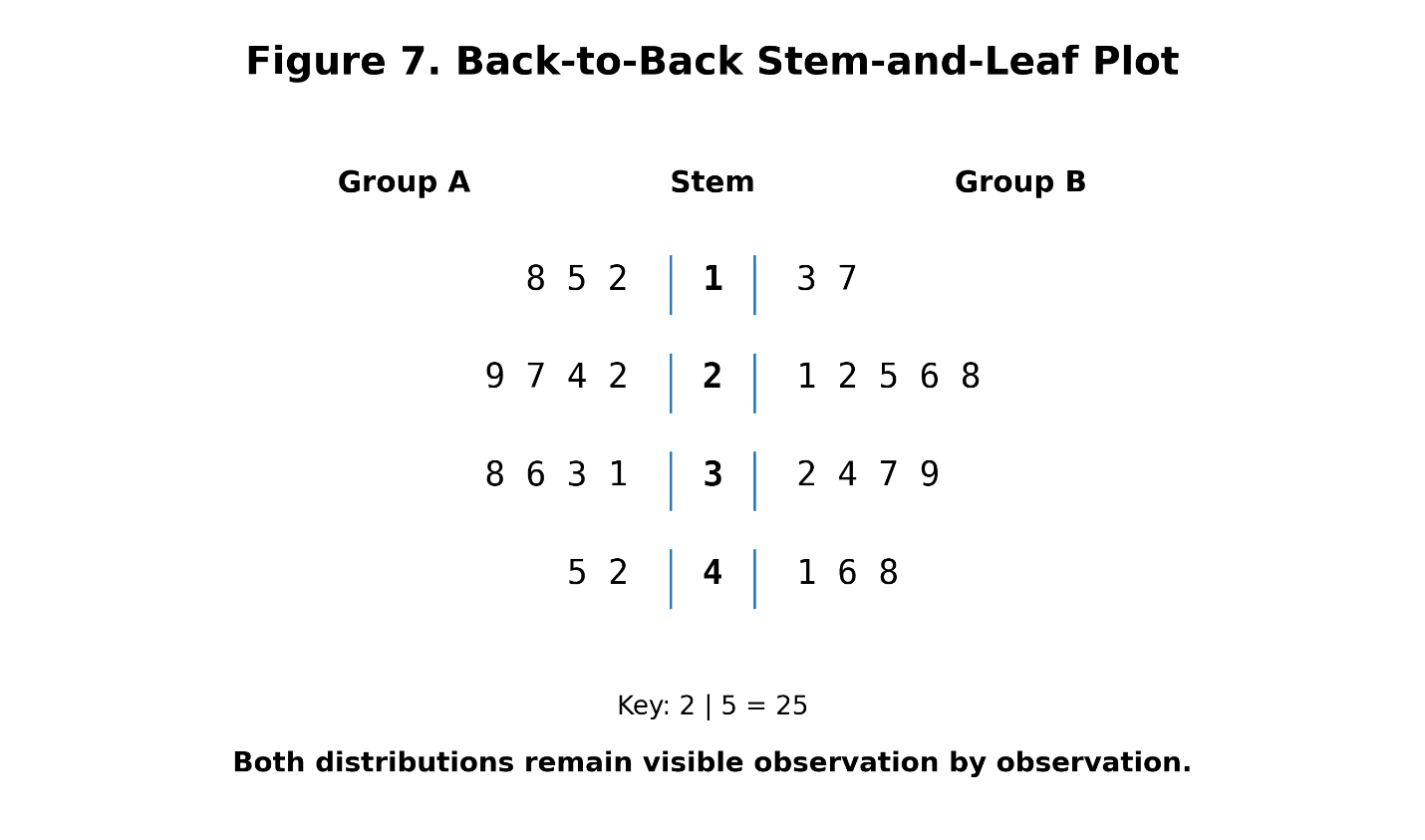
This makes the back-to-back display a useful companion to side-by-side box plots.
Suppose two box plots have different medians and relatively little overlap in their interquartile ranges. That may suggest an important difference between their central distributions.
The box plots tell us that the difference exists. The stem-and-leaf plots may help us understand what created it.
Perhaps one entire distribution has shifted upward. Perhaps the groups share a common lower range but differ in the upper tail. Perhaps one contains a cluster that the other lacks. Perhaps the apparent difference is being driven by only a few values.
The stem-and-leaf display does not replace the box plot; it provides another layer of evidence.
In exploratory work, different visualizations should often be treated as complementary rather than competitive.
When the Plot Stops Working
The great strength of the stem-and-leaf display eventually becomes its greatest weakness. It preserves the observations. That is wonderful when there are thirty observations. It may still be useful with a hundred. With a thousand, the display can become awkward; with a million, it becomes absurd.
A statistical graphic that insists on preserving every value cannot scale indefinitely.
Figure 8. The Scaling Problem
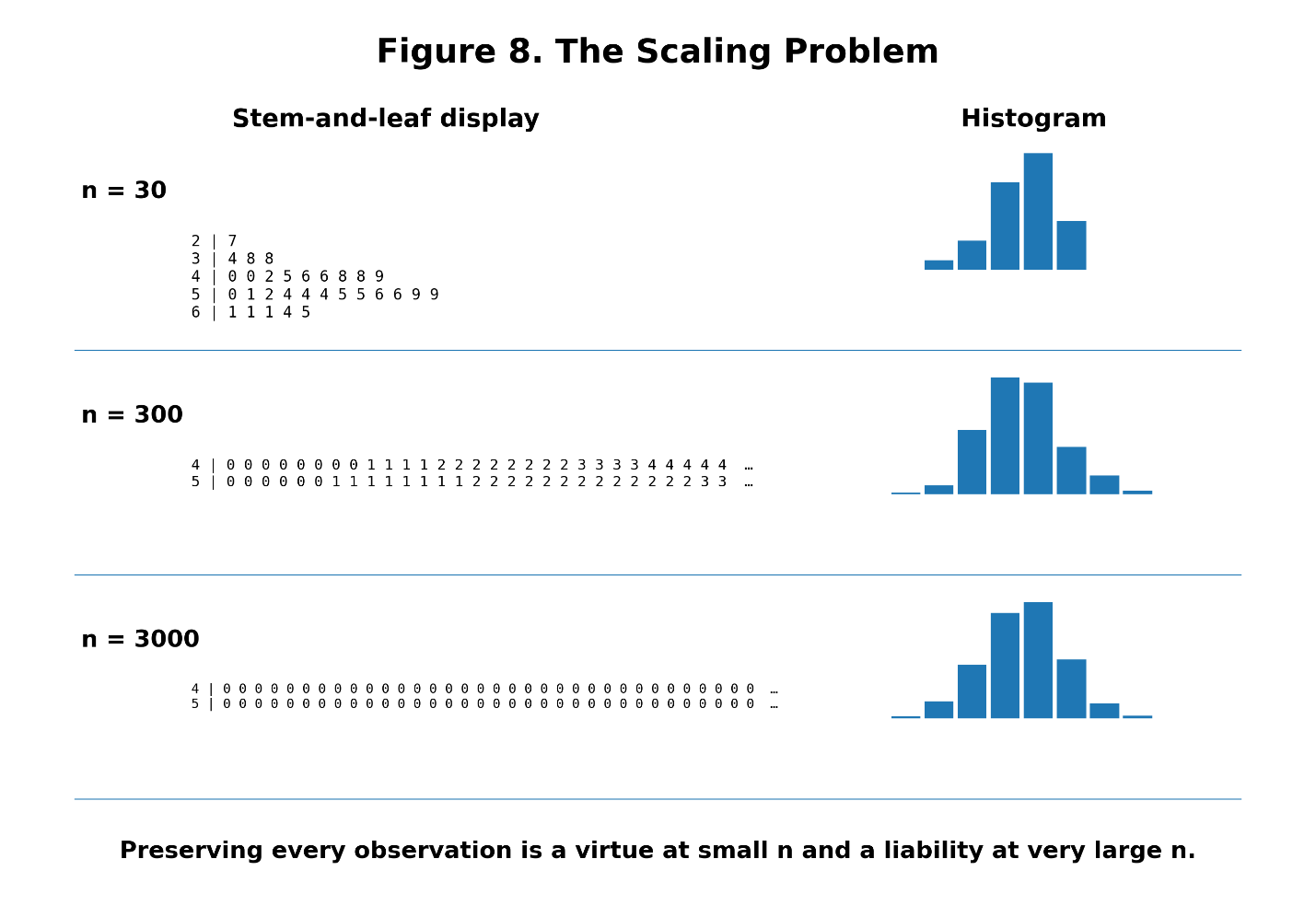
Figure 8 illustrates this transformation. With a small sample, individual leaves are meaningful. As the sample grows, the rows become crowded. Eventually, the attempt to retain every observation overwhelms the visual structure.
At that point, information loss becomes beneficial. The histogram succeeds precisely because it does not care about every observation. The box plot succeeds because it compresses even further. A density plot succeeds by replacing the observations with an estimate of shape.
An empirical cumulative distribution function can summarize the proportion of observations below each value without reproducing the data individually. The appropriate visualization changes with the scale of the problem.
This is an important principle. Plainly stated, more information is not always better. Sometimes the purpose of analysis is to decide which information can safely be ignored.
A Spectrum of Compression
We can think of several common representations as occupying positions along a continuum:
Raw Data
↓
Stem-and-Leaf Plot
↓
Histogram
↓
Box Plot
This is not an absolute ranking. A histogram and box plot summarize different properties, and under some circumstances one may preserve something that the other does not.
Still, the general direction is useful.
As we move across the spectrum, individual detail decreases and compression increases.
Figure 9. The Compression Spectrum
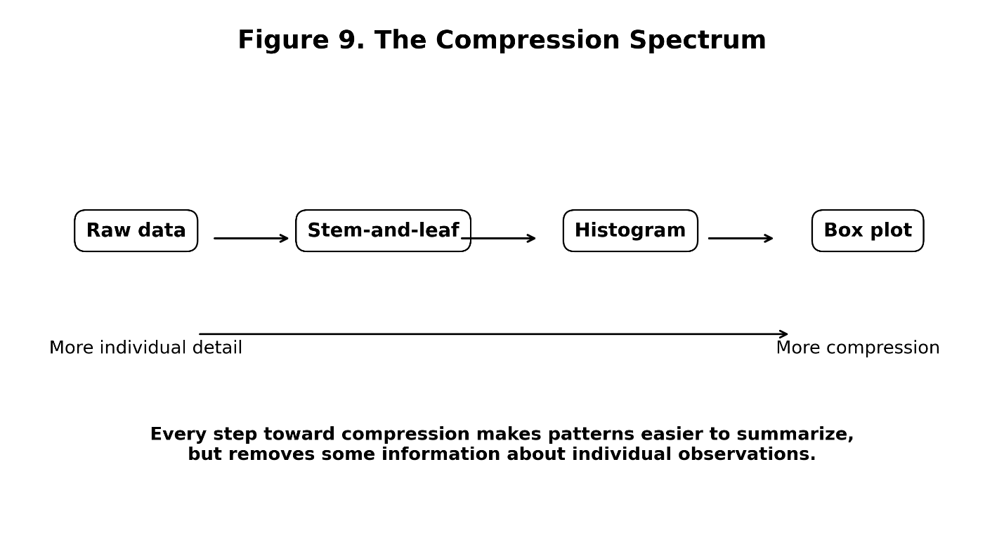
Raw data preserve everything but may reveal very little. The stem-and-leaf plot organizes the observations while preserving their recoverability. The histogram sacrifices exact values to make the distribution’s shape more apparent. The box plot compresses the distribution into a compact set of summary landmarks that can be compared quickly across many groups.
Each step gains something, and each step loses something. The question is whether what we gain is more useful than what we give up.
That is a statistical judgment, not merely a graphical one.
Same Numbers, Different Stories
One of the dangers of statistical summaries is that they can create a false sense of completeness. Suppose two datasets have the same mean, that does not mean they have the same shape.
Suppose they have the same mean and standard deviation. They can still differ. They may contain different clusters, gaps, levels of symmetry, or tail behavior. Even similar quartiles do not guarantee similar distributions.
Figure 10. Same Mean and Spread, Different Shape
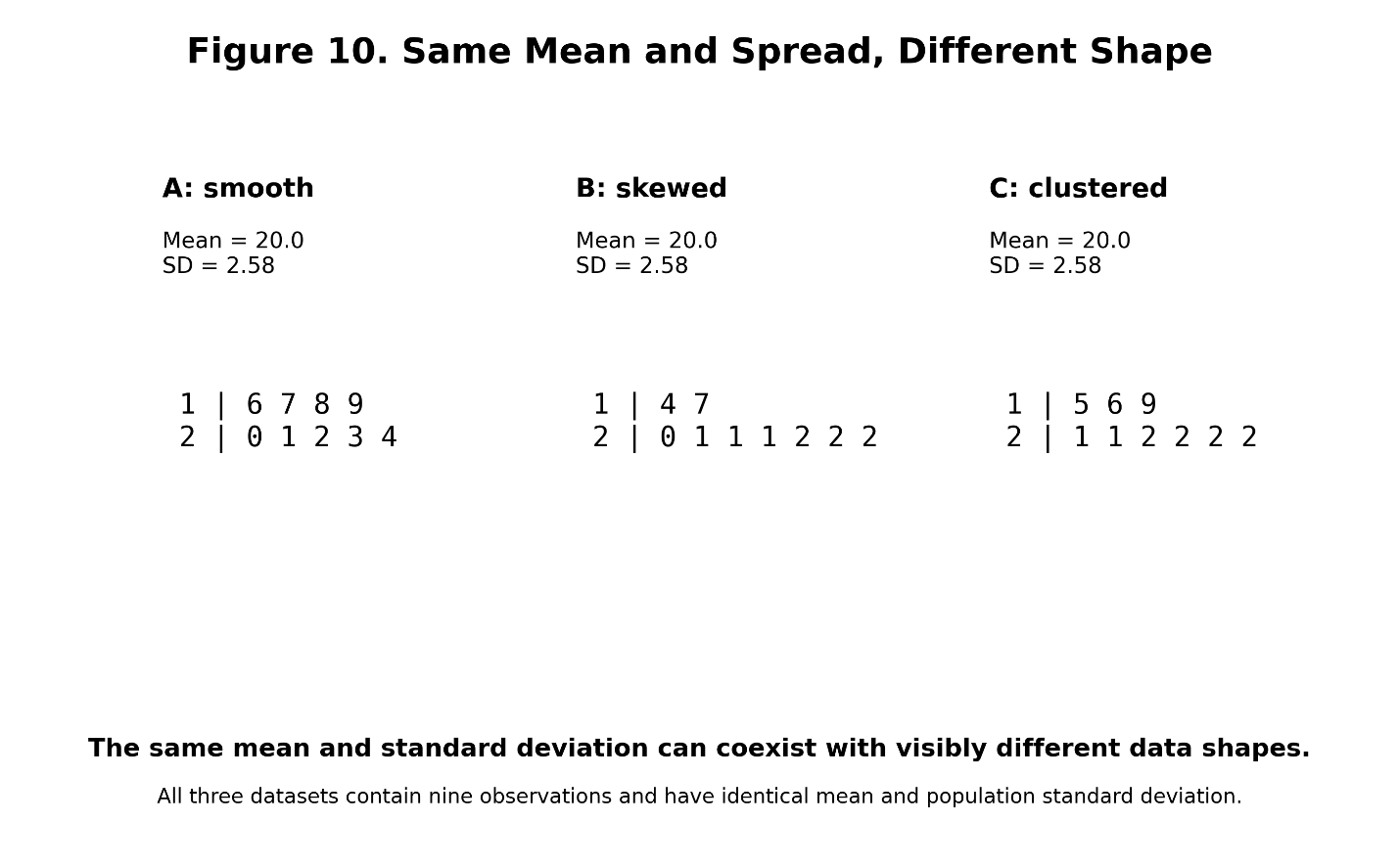
Figure 10 illustrates the idea using several small datasets with identical means and population standard deviations but noticeably different arrangements.
This is a recurring lesson in exploratory data analysis. A statistic is a description of the data, it is not the data.
The mean does not tell us everything, The standard deviation does not tell us everything.
The correlation coefficient does not tell us everything.
Even a sophisticated model does not contain every feature of the observations from which it was fitted. That is why visualization matters. And it is why looking at the data before summarizing them remains such an important habit.
Tukey and the Logic of Exploratory Data Analysis
The stem-and-leaf plot is closely associated with John Tukey and the tradition of exploratory data analysis. That connection is more important than the plot itself. Exploratory data analysis begins from a simple but powerful premise: before we impose a formal model on the data, we should examine what the data are trying to tell us.
Look for patterns. Look for exceptions, gaps, clusters, and asymmetry. Look for observations that refuse to behave like the rest.
This may sound obvious now, but it represents a distinctive way of thinking about statistics. Formal statistical analysis often begins with a model or hypothesis. Exploratory analysis begins with observation.
The stem-and-leaf plot fits that philosophy almost perfectly because it does not rush to compress the evidence. It organizes the values just enough for their structure to become visible.
The box plot, another graphic strongly associated with Tukey’s exploratory tradition, takes the next step. It compresses data. That is not a contradiction; it is a progression.
First we examine the observations, then we identify the structure. Then we decide which features can be summarized without losing what matters.
The sequence is important.
Statistics as the Art of Useful Loss
There is a larger lesson here. Statistics is often described as the science of learning from data. That is certainly true, but much of statistics might also be understood as the art of useful information loss.
A dataset may contain thousands or millions of values. We calculate a mean and most of the data disappear. We calculate a standard deviation and more structure is compressed.
We fit a regression line and thousands of individual points may become an intercept and a slope.
We construct a box plot and an entire distribution becomes a handful of positions on an axis.
Why would we do this?
Because raw information and useful information are not the same thing. If every observation were equally important at every stage of analysis, statistics would have little purpose. We could simply preserve the dataset forever and refuse to summarize it.
But human understanding requires structure. Compression makes structure possible. The challenge is deciding what can be discarded. Too little compression leaves us drowning in details. Too much compression can erase the phenomenon we are trying to understand.
That is why Figure 9, the compression spectrum, is more than a comparison of graphical techniques.
It represents a fundamental statistical tradeoff. The stem-and-leaf plot occupies an intriguing position near the beginning of that spectrum.
It says: Organize first. Discard later.
Why the Stem-and-Leaf Plot is Still Useful
It would be easy to dismiss the stem-and-leaf display as a relic from an earlier era of statistics.
Modern software can generate histograms, density plots, violin plots, ECDFs, box plots, and interactive visualizations almost instantly. Datasets are also vastly larger than the small samples for which stem-and-leaf displays are best suited.
Those observations are fair. The plot has limits; it possibly does not scale well.
Its notation can become awkward with complex measurements; it is rarely appropriate for extremely large datasets. There are many situations in which another graphic will be better.
Yet none of that makes the stem-and-leaf plot obsolete. Its greatest value may now be conceptual. It shows us what happens at the moment data become visualization.
We begin with individual observations. We reorganize them and structure appears. And remarkably little has been lost.
That makes the plot a useful bridge between raw data and statistical abstraction. It also teaches an important discipline. Do not summarize too quickly.
A mean may hide a gap. A standard deviation may hide clustering. A box plot may hide multimodality. A histogram may hide internal structure within its bins. A fitted model may hide observations that do not conform to its assumptions.
Before reducing the data, look at them. The stem-and-leaf plot makes that instruction almost literal.
The Forest and the Trees
There is a familiar warning about failing to see the forest for the trees. Statistics often presents the opposite danger. We may become so successful at seeing the forest that we forget the trees were ever there.
Summary statistics are powerful because they allow us to step back, while graphs allow us to recognize shape, and models allow us to identify relationships. All of these are essential.
But every abstraction moves us farther from the observations. The stem-and-leaf plot is unusual because it takes only a small step. It reveals the distribution without completely surrendering the values that created it.
For a modest dataset, that can be extraordinarily useful. We can see the center and the spread. We can see gaps, clusters, repeated values, and possible outliers. We can estimate quartiles and construct a box plot.
We can compare groups and if something surprises us, the original observations are still sitting there in front of us. That may be the plot’s most enduring lesson.
Statistics is not simply about reducing data.
It is about reducing data carefully. The goal is not to preserve everything forever, nor to summarize as aggressively as possible. The goal is to retain what matters long enough to understand what the data are saying.
The stem-and-leaf plot does that unusually well. It shows us the forest, and, for a little while longer, it lets us keep the trees.