Introduction
Home runs are not evenly distributed across the diamond.
That is obvious at one level. First basemen and corner outfielders have historically been expected to hit for power. Middle infielders and catchers have often been evaluated based on a broader mix of defense, contact, arm strength, range, game-calling, and positional scarcity. Designated hitters exist almost entirely because of the bat.
But the obvious pattern is still worth measuring.
This chapter asks a simple question:
How have home runs historically been distributed by primary position?
To answer that, I built a player-season dataset from the Lahman-style batting and appearance files already used in this project. Each player-season was assigned to the position where the player appeared most often. Then I compared home run totals across primary positions.
The main version of the study uses regular player-seasons:
PA \geq 300That cutoff matters because all player seasons include bench players, call-ups, pitchers, defensive replacements, and partial seasons. Those observations are part of baseball history, but they compress the distribution heavily toward zero. The 300-plate-appearance version gives a clearer view of regular players.
The result is consistent with baseball intuition, but the details are interesting.
Among regular player seasons, the highest median home run totals come from:
DH
1B
RF
LF
3B
The lower median positions are:
SS
2B
C
CF
Third base sits where we might expect it to sit: not quite a pure slugger position like first base, right field, left field, or designated hitter, but clearly more power-oriented than second base or shortstop.
That makes third base a bridge position. It carries defensive responsibility, but it has also historically demanded more power than the middle infield.
Data and Method
The unit of analysis is the player-season.
For each player-season, I summed the player’s batting record across all stints. Home runs came from the batting file:
HR_{i,y} = \sum_{t} HR_{i,y,t}Where:
i = \text{player} y = \text{season} t = \text{team or stint}Plate appearances were estimated from the available batting columns as:
PA = AB + BB + HBP + SF + SHThis is the same practical plate-appearance construction used elsewhere in the project.
Each player-season was then assigned a primary position using the appearances file. The primary position was the position at which the player appeared in the most games:
\mathrm{PrimaryPosition}_{i,y} = \operatorname*{arg\,max}_{p} \left( G_{i,y,p} \right)Where:
G_{i,y,p} = \text{games played by player } i \text{ at position } p \text{ in season } yThe positions included were:
C
1B
2B
3B
SS
LF
CF
RF
DH
P
For the main batting-position figures, I excluded pitchers because pitcher seasons have a very different distribution and can compress the plot.
The main regular-player sample uses:
PA \geq 300This produced the following number of regular player-seasons by batting position:
C: 2,650
1B: 3,273
2B: 3,273
3B: 3,213
SS: 3,149
LF: 3,262
CF: 3,331
RF: 3,259
DH: 646
The designated hitter sample is smaller because the position did not exist across the full historical record.
Why Use Box Plots?
Home run totals are skewed.
Most players do not hit 40 home runs. Many regulars hit fewer than 10. A smaller number of players produce the spectacular seasons that shape memory and record books.
A box plot is useful because it shows several parts of the distribution at once:
median
middle 50 percent
upper and lower spread
outlier seasons
The median is the central line in the box.
The box itself shows the interquartile range:
IQR = Q_3 - Q_1Where:
Q_1 = \text{25th percentile} Q_3 = \text{75th percentile}The outliers show the extreme home run seasons. Those outliers matter because home run history is partly a history of extremes.
The box plot, therefore, helps separate typical power from exceptional power.
Figure 1: Regular Player-Seasons by Primary Position
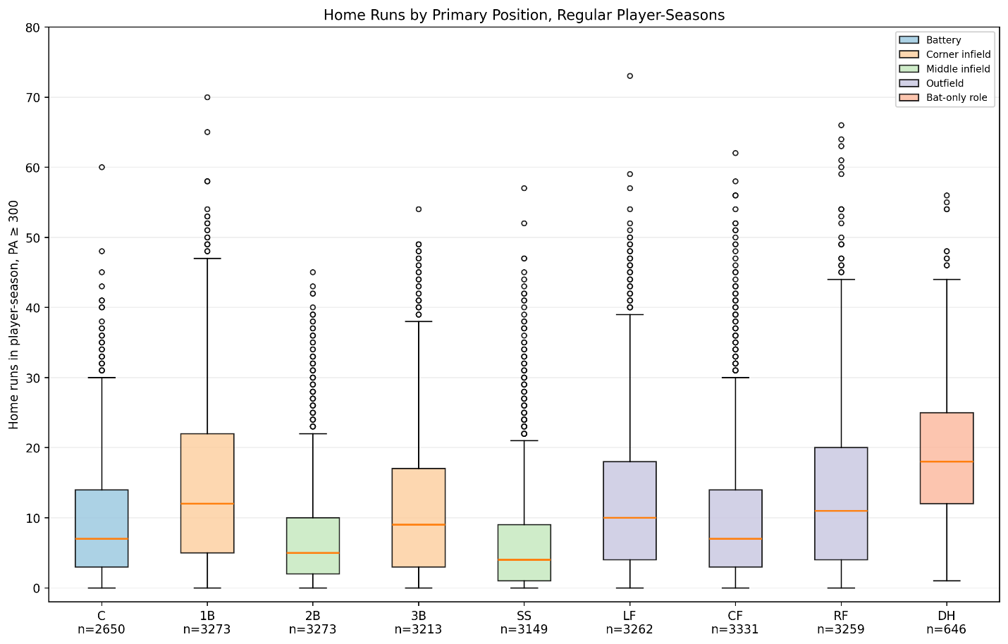
Figure 1. Home runs by primary position, regular player-seasons.
The first figure is the main result.
It includes batting positions only and uses the regular-player cutoff:
PA \geq 300The median home run totals are:
C: 7
1B: 12
2B: 5
3B: 9
SS: 4
LF: 10
CF: 7
RF: 11
DH: 18
The pattern is clear.
Designated hitters have the highest median:
\widetilde{HR}_{DH} = 18First basemen follow:
\widetilde{HR}_{1B} = 12Right fielders and left fielders are next:
\widetilde{HR}_{RF} = 11 \widetilde{HR}_{LF} = 10Third basemen sit just behind the corner outfielders:
\widetilde{HR}_{3B} = 9The middle infield positions are lower:
\widetilde{HR}_{2B} = 5 \widetilde{HR}_{SS} = 4This is the historical power spectrum in compact form.
The right side of the defensive spectrum contains more home runs. The middle of the diamond contains fewer.
The Third-Base Position in Context
The third-base result is especially relevant to the larger project.
Third base has a median of 9 home runs among regular player-seasons:
\widetilde{HR}_{3B} = 9Its mean is:
\overline{HR}_{3B} = 11.24Its 90th percentile is:
P_{90,3B} = 26Its 95th percentile is:
P_{95,3B} = 32That means a 26-home-run season by a regular third baseman sits around the 90th percentile historically, while a 32-home-run season sits around the 95th percentile.
This helps frame the third-base offensive studies. A third baseman does not need to hit like a first baseman or designated hitter to be power-relevant at the position. But third base has historically demanded more power than second base or shortstop.
In that sense, third base is not a pure defensive position and not a pure slugger position. It sits between worlds.
Summary Table: Regular Player-Seasons
The main regular-player summary is:
| Position Mean HR Median HR 90th Percentile Max | ||||||
| C 9.20 7 20 60 | ||||||
| 1B 14.68 12 31 70 | ||||||
| 2B 6.89 5 16 45 | ||||||
| 3B 11.24 9 26 54 | ||||||
| SS 6.66 4 17 57 | ||||||
| LF 12.47 10 27 73 | ||||||
| CF 10.07 7 24 62 | ||||||
| RF 13.19 11 28 66 | ||||||
| DH 19.48 18 33 56 |
The mean is higher than the median at every position. That reflects the right-skewed nature of home run totals:
\overline{HR}_p > \widetilde{HR}_pWhere:
\overline{HR}_p = \text{mean home runs at position } p \widetilde{HR}_p = \text{median home runs at position } pThis skew is exactly why box plots are useful. The median shows the typical regular. The outliers show the historical power peaks.
Figure 2: All Player-Seasons
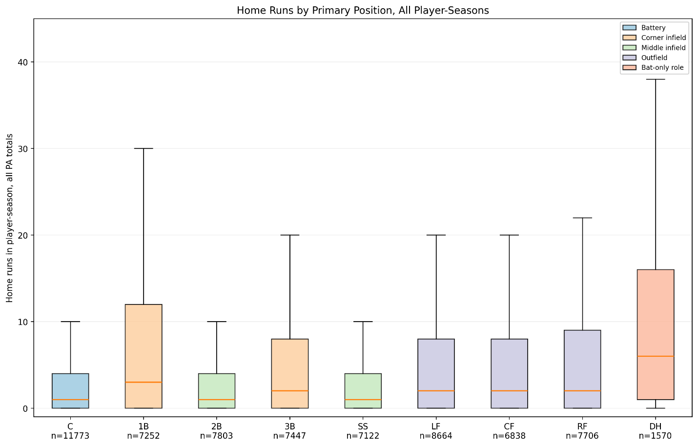
Figure 2. Home runs by primary position, all player-seasons.
The second figure includes all player-seasons, regardless of plate appearances.
This plot answers a different question.
Instead of asking what regular players do, it asks what the full population of player-seasons looks like.
The result is much more compressed toward zero.
That is expected.
All player-seasons include players who appeared briefly, bench players, injury-shortened seasons, late-season call-ups, defensive specialists, and players with very few batting opportunities. Many of these seasons have few or no home runs.
This is why the regular-player cutoff is important.
The all-player plot is useful because it shows the structure of the full record. But the regular-player plot is better for comparing positional expectations.
The difference between Figure 1 and Figure 2 is a methodological lesson:
Home run distributions depend heavily on playing-time filters.
That is not a flaw. It is part of the phenomenon.
Figure 3: Including Pitchers
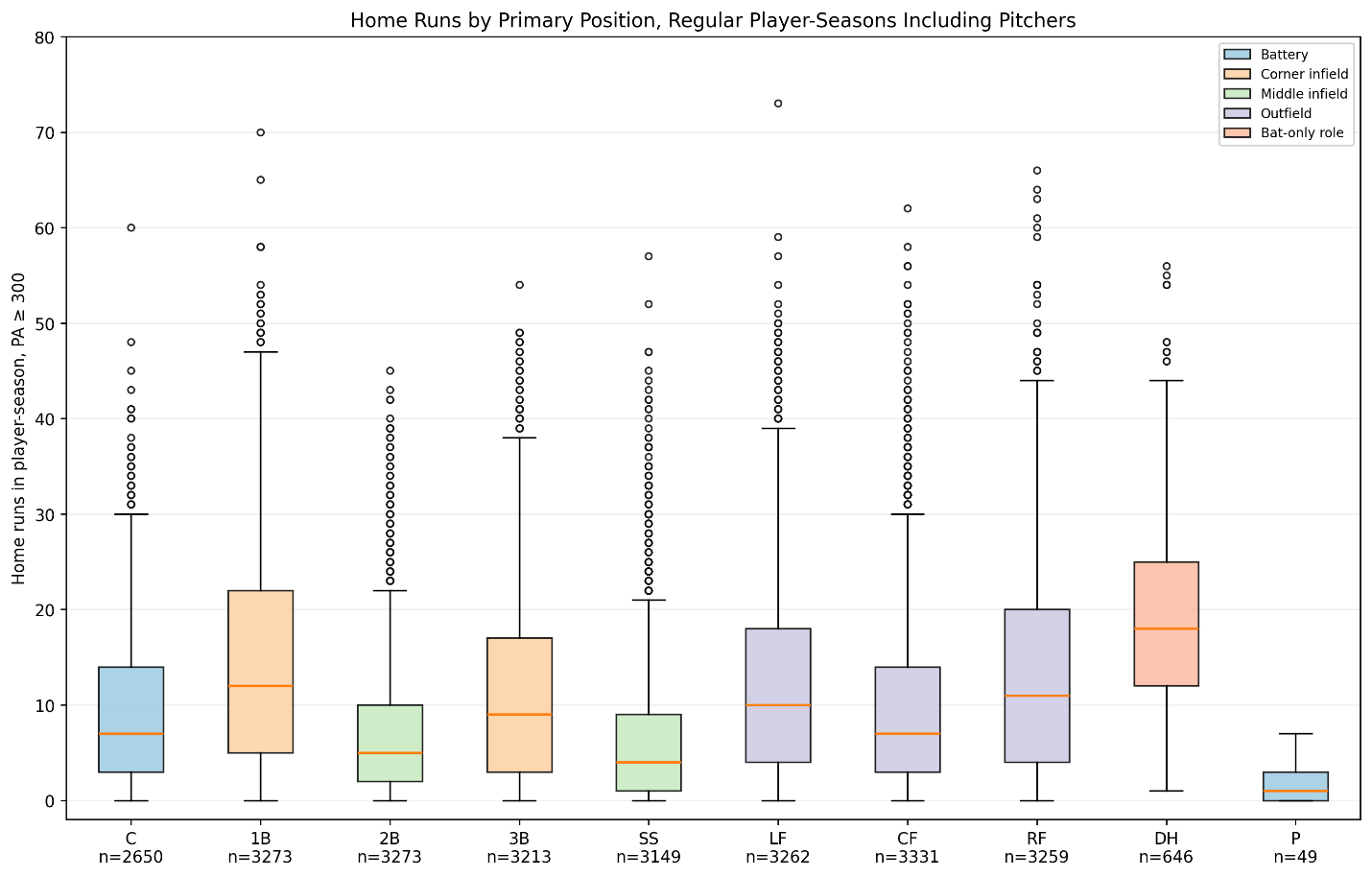
Figure 3. Home runs by primary position, regular player-seasons including pitchers.
The third figure adds pitchers to the regular-player sample.
There are only 49 pitcher seasons with at least 300 estimated plate appearances in this dataset. That is a tiny sample compared with the defensive positions.
Pitchers have a very low home run distribution:
Pn = 49
The pitcher box is compressed near the bottom of the plot.
This is why pitchers are excluded from the main batting-position comparison. Pitchers are not just another defensive position in this context. Historically, they had a very different offensive role.
Including them is still useful as a reminder of how specialized baseball’s offensive expectations have become.
The pitcher comparison also shows why the designated hitter changed the structure of the game. The DH role separated the hitting function from the pitching function.
Figure 4: Before 1994
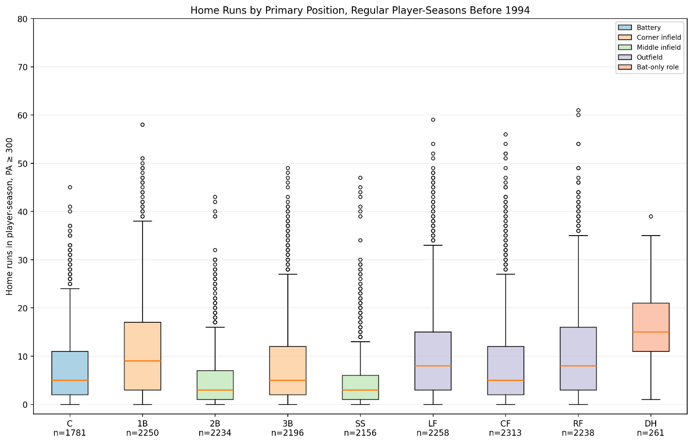
Figure 4. Home runs by primary position, regular player-seasons before 1994.
The fourth figure examines regular player seasons before 1994.
This view helps separate the long historical baseline from the more recent high-power period.
Before 1994, the positional pattern is still visible:
1B, LF, RF, and DH are higher-power positions.
2B and SS are lower-power positions.
3B sits in the middle-to-upper range.
However, the distributions are generally lower than in the modern period.
That is especially visible in the medians and upper tails. The tops of the boxes and whiskers are lower for most positions.
This matters because the modern home run environment can distort our intuition. If we only look at recent baseball, we may overestimate what a typical power season historically looked like.
The pre-1994 plot keeps the longer history visible.
Figure 5: 1994–2025
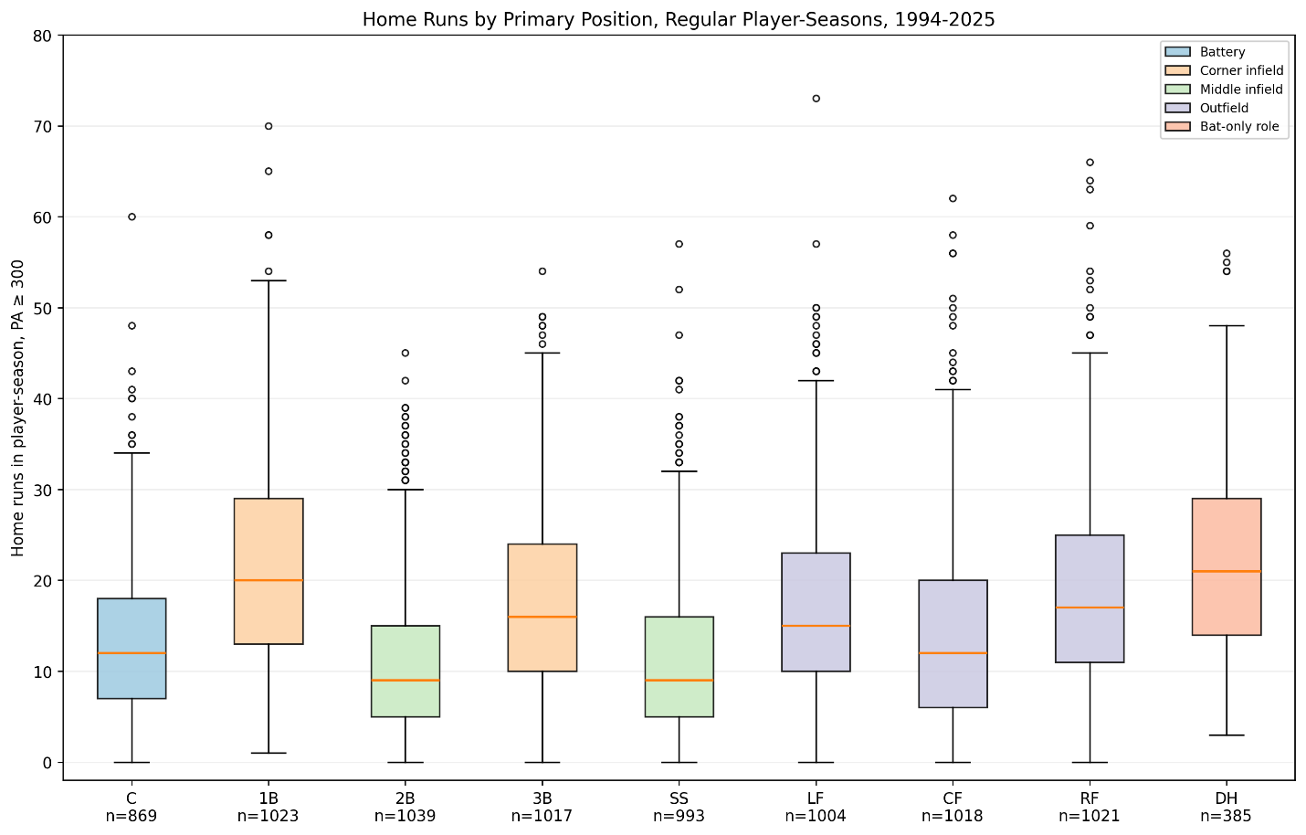
Figure 5. Home runs by primary position, regular player-seasons, 1994–2025.
The fifth figure focuses on the modern high-power period from 1994 through 2025.
Here the distributions shift upward.
The median home run totals are visibly higher at most positions than in the pre-1994 plot.
This is particularly clear at positions that historically carried lower power expectations. Second base, shortstop, catcher, and center field all show more power in the modern period than in the older baseline.
The modern plot also shows how the distinction between positions has narrowed in some ways. Shortstops and second basemen now have more home run upside than they did historically, though they still remain below first base and designated hitter in the central distribution.
Third base remains a power-relevant position. In the 1994–2025 period, the third-base distribution shifts upward, reflecting the broader increase in home run production across baseball.
Maximum Home Run Seasons by Primary Position
The maximum regular-player home run seasons by primary position are:
C: Cal Raleigh, 2025, 60 HR
1B: Mark McGwire, 1998, 70 HR
2B: Marcus Semien, 2021, 45 HR
3B: Alex Rodriguez, 2007, 54 HR
SS: Alex Rodriguez, 2002, 57 HR
LF: Barry Bonds, 2001, 73 HR
CF: Aaron Judge, 2022, 62 HR
RF: Sammy Sosa, 1998, 66 HR
DH: Kyle Schwarber, 2025, 56 HR
The maximum values show how different the upper tail can be from the median.
For third base:
\max(HR_{3B}) = 54The median regular third-base season is:
\widetilde{HR}_{3B} = 9So the highest third-base season is six times the median:
\frac{ \max(\mathrm{HR}_{\mathrm{3B}}) }{ \widetilde{\mathrm{HR}}_{\mathrm{3B}} } = \frac{54}{9} = 6This is the shape of home run history. The typical distribution matters, but the record book is made in the tails.
Positional Power Spectrum
The regular-player medians produce a rough power spectrum:
DH > 1B > RF > LF > 3B > C/CF > 2B > SS
This is not a law. It is an empirical summary of the historical data.
It shows that home run expectations follow the defensive spectrum, but imperfectly.
First base and corner outfield positions carry major power expectations. Middle infield positions carry lower typical power expectations. Third base sits between them.
That makes sense. Third base is a reaction position, an arm-strength position, and historically a position where teams have often accepted more offensive responsibility than at shortstop or second base.
Why Third Base Is Interesting
This chapter began as a positional home run study, but it also helps explain why third base is such a useful position for the larger project.
Third base is not first base. It is not a position where the bat alone defines most of the historical expectation.
But it is also not shortstop or second base. The position has carried real offensive expectations for a long time.
This makes third base analytically rich.
A third baseman can be great through power.
A third baseman can be great through defense.
A third baseman can be great through a two-way profile.
A third baseman can be average in one dimension and exceptional in another.
That is why the earlier z-score, WAR, and wRC+ studies were useful. Third base demands a multidimensional approach.
The home run box plots confirm the same idea from a different angle.
Third base lives in the middle of the power spectrum.
Limitations
This study uses primary position by games played. That is practical and transparent, but it simplifies players who split time across multiple positions.
A player-season is assigned to only one position, even if the player spent substantial time elsewhere.
The plate appearance formula is estimated from available batting columns:
PA = AB + BB + HBP + SF + SHThat is a reasonable construction, but it may differ slightly from official plate appearance totals in some historical contexts.
The 300-PA cutoff is also a choice. A different cutoff, such as 250 or 400 PA, would change the sample slightly. The broad pattern should remain, but the exact medians and percentiles would move.
Finally, the designated hitter is not available across the full historical period. It should be interpreted separately from long-running defensive positions.
Conclusion
Home runs have never been distributed evenly across the diamond.
The regular-player box plots show a clear positional structure. Designated hitters, first basemen, right fielders, left fielders, and third basemen occupy the higher-power part of the spectrum. Second basemen and shortstops occupy the lower-power part. Catchers and center fielders sit in between, with major outlier seasons but lower typical medians.
For regular player-seasons:
DH: 18 median HR
1B: 12 median HR
RF: 11 median HR
LF: 10 median HR
3B: 9 median HR
C: 7 median HR
CF: 7 median HR
2B: 5 median HR
SS: 4 median HR
Third base sits in a revealing place.
It is not the highest-power position. It is not the lowest. It is a position where power matters, but not alone.
That is why the position works so well for this larger study.
Third base is a bridge between offensive and defensive expectations.
The home run distributions show that clearly.
Postscript: Where the Home Runs Came From
The box plots in this chapter show the distribution of home run seasons by position. They answer a question about typical and exceptional seasons:
What does a home run season usually look like at each position?
But there is another question worth asking:
Where did the historical home run volume come from?
To answer that, I summed all home runs by primary position.
\mathrm{TotalHR}_{p} = \sum_{i,y} HR_{i,y,p}Where:
p = \text{primary position}The first postscript figure uses all player-seasons from 1871 through 2025.
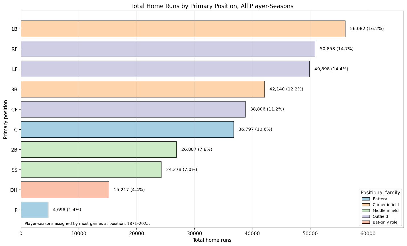
Postscript Figure 1. Total home runs by primary position, all player-seasons, 1871–2025.
The largest total comes from first base:
\mathrm{TotalHR}_{1B} = 56{,}082Right field and left field follow closely:
\mathrm{TotalHR}_{RF} = 50{,}858 \mathrm{TotalHR}_{LF} = 49{,}898Third base ranks fourth:
\mathrm{TotalHR}_{3B} = 42{,}140This reinforces the larger pattern. The historical home run supply has come disproportionately from the corners: first base, corner outfield, and third base.
The second postscript figure uses only regular player-seasons:
PA \geq 300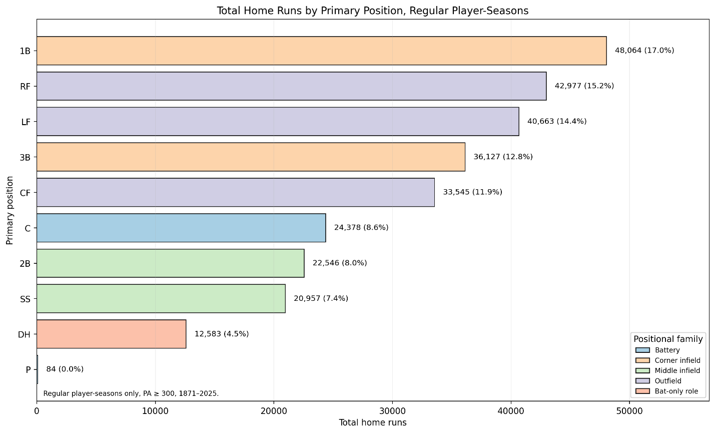
Postscript Figure 2. Total home runs by primary position, regular player-seasons, PA ≥ 300, 1871–2025.
The regular-player version tells the same basic story. First base remains first:
\mathrm{TotalHR}_{1B} = 48{,}064Right field remains second:
\mathrm{TotalHR}_{RF} = 42{,}977Left field remains third:
\mathrm{TotalHR}_{LF} = 40{,}663Third base remains fourth:
\mathrm{TotalHR}_{3B} = 36{,}127The designated hitter is the important caution. DH has the highest median home run total among regular player-seasons, but it does not rank near the top in total historical home runs because it is not present across the full 1871–2025 record.
Keep that distinction in mind.
The box plots show rate and distribution.
The bar charts show accumulated historical volume.
They are related, but they are not the same thing.
A position can have a high typical power profile but a smaller historical total if it has fewer seasons in the record. That is exactly what happens with designated hitters.
Third base, by contrast, has both a long historical presence and a meaningful power profile. It does not lead the home run record, but it sits clearly among the power-producing positions.
That is the key postscript result:
First base produced the most historical home run volume.
Corner outfield followed.
Third base remained a major source of home runs.
Designated hitter had the strongest power profile but a shorter historical runway.